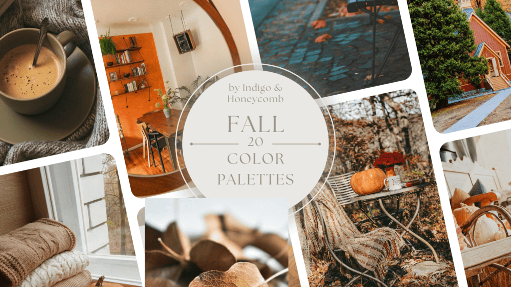
As the temperatures cool and the leaves turn, fall provides the perfect opportunity to refresh home interiors with warm and inviting color palettes. The essence of autumnal design is rooted in coziness, natural beauty, and the rich colors found in nature this time of year. Below, we’ll explore the top 20 fall color palettes for home design in depth, looking at why these palettes are so popular for fall, the trends behind them, and some of their history.
Top 20 Fall Color Palettes
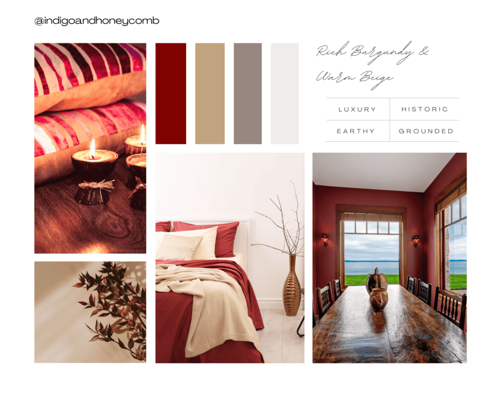
1. Rich Burgundy and Warm Beige
Colors: Deep burgundy, warm beige, taupe, soft white
Why it works: Burgundy evokes the deep, dark shades of fall foliage and pairs beautifully with soft neutrals like beige and taupe to create a warm, grounded atmosphere.
Trends: Burgundy has historical connections to luxury, once derived from rare dyes. Now, it’s used to bring a sense of richness and depth to interiors.
History: Burgundy has been used for centuries in design, from Renaissance tapestries to Victorian interiors.
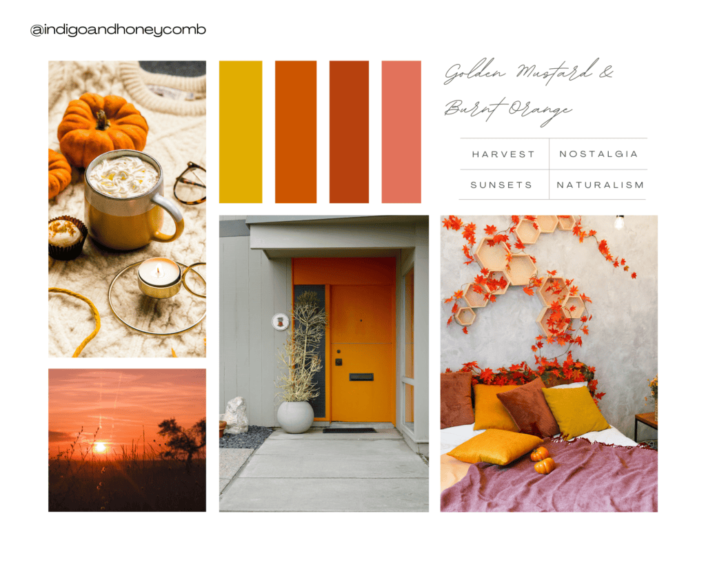
2. Golden Mustard and Burnt Orange
Colors: Mustard yellow, burnt orange, rust, terracotta
Why it works: These warm, earthy tones capture the essence of falling leaves and harvest season. Mustard and burnt orange together evoke sunsets and autumnal harvests.
Trends: Terracotta and mustard hues are staples of the ’70s design resurgence, adding warmth and nostalgia.
History: Earth tones became prominent in mid-century modern design, reflecting a shift toward naturalism.
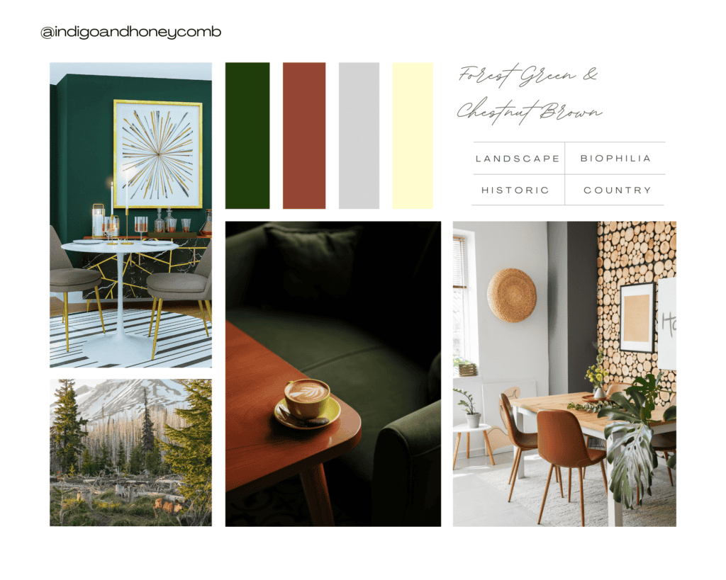
3. Forest Green and Chestnut Brown
Colors: Deep forest green, chestnut brown, soft gray, cream
Why it works: Inspired by wooded landscapes, this scheme brings nature indoors, creating a grounded, earthy feeling.
Trends: Forest green has become a staple in biophilic design, which emphasizes connecting interiors with the outdoors.
History: Historically, forest green was a favored color in English country homes and is associated with rich, natural environments.
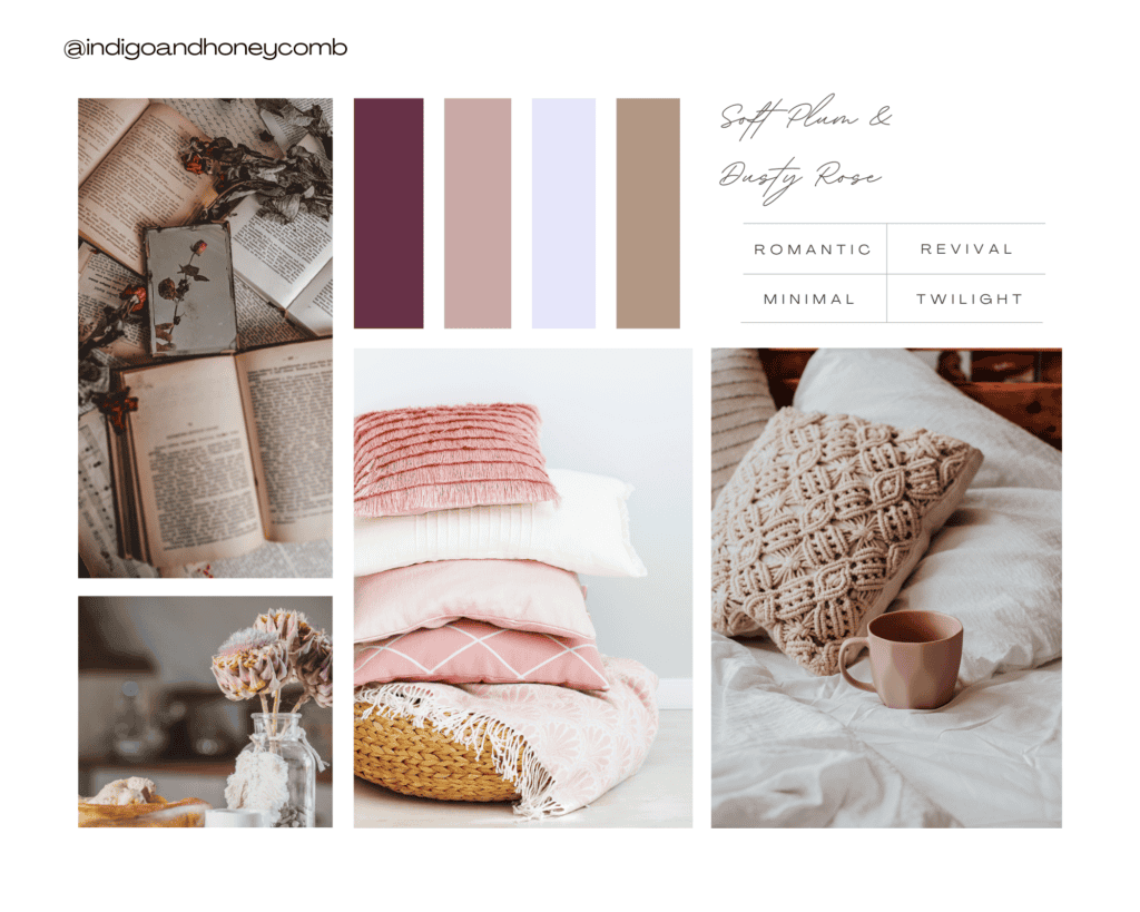
4. Soft Plum and Dusty Rose
Colors: Soft plum, dusty rose, lavender, warm taupe
Why it works: These muted, romantic shades evoke twilight and cool autumn evenings. Dusty rose softens the deeper plum tones, creating a balanced palette.
Trends: Plum and dusty rose have seen popularity with the rise of warm minimalism, where muted tones take center stage.
History: Plum hues have long been associated with nobility, while dusty rose has made a resurgence due to the popularity of vintage-inspired design.
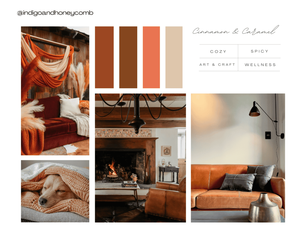
5. Cinnamon and Caramel
Colors: Cinnamon, caramel, burnt sienna, warm cream
Why it works: These warm, spicy tones conjure thoughts of cozy fall treats and offer a sense of comfort.
Trends: Natural, food-inspired hues have become popular as part of the move toward organic, wellness-oriented design.
History: Cinnamon tones became more prominent in interiors during the Arts and Crafts movement, which emphasized handcrafted, natural materials.
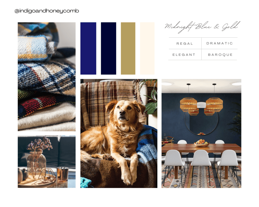
6. Midnight Blue and Gold
Colors: Midnight blue, deep navy, antique gold, pale cream
Why it works: This regal combination balances the coolness of deep blue with the warmth of gold, creating a sense of luxury and elegance.
Trends: Deep blue has become a go-to for those looking to create dramatic yet sophisticated spaces, while gold accents bring a touch of glamour.
History: Blue and gold were common in Baroque and Renaissance design, symbolizing wealth and status.
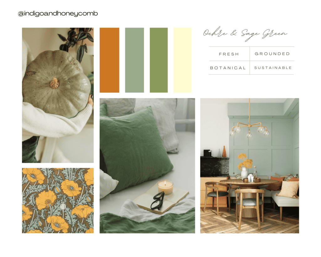
7. Ochre and Sage Green
Colors: Ochre, sage green, moss, cream
Why it works: Ochre’s earthy warmth pairs beautifully with calming sage green for a look that’s both grounding and fresh.
Trends: This combination ties into the broader trend of botanical and sustainable-inspired designs, which use green as a neutral.
History: Ochre is one of the oldest pigments used in art, symbolizing connection to the earth.
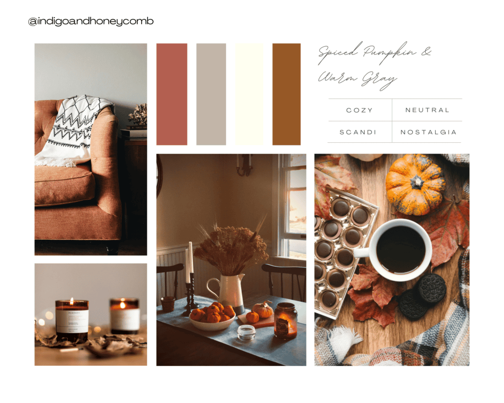
8. Spiced Pumpkin and Warm Gray
Colors: Spiced pumpkin, warm gray, soft ivory, muted brown
Why it works: This cozy palette mimics the natural colors of autumn squash and adds warmth to neutral spaces.
Trends: The pumpkin spice craze has extended into home decor, influencing this color trend, which brings nostalgic comfort.
History: Shades of orange and gray have been popular in Scandinavian interiors for their balance of warmth and calm.
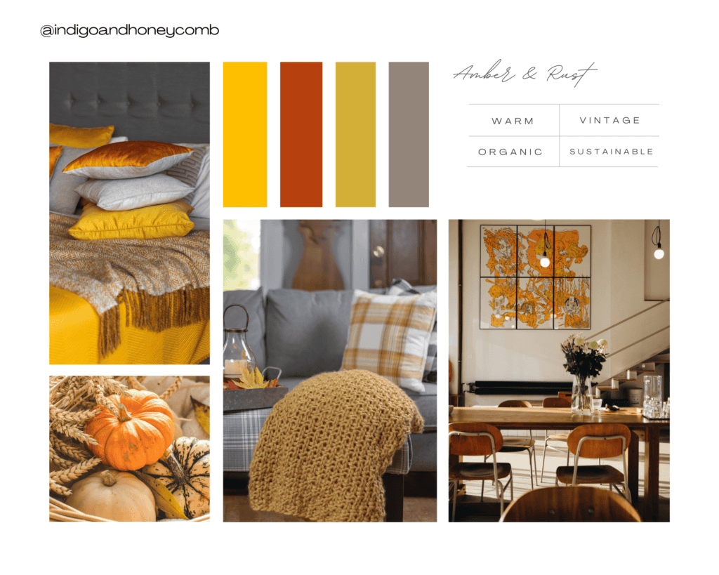
9. Amber and Rust
Colors: Amber, rust, gold, soft taupe
Why it works: Inspired by the colors of fall leaves, this scheme creates a warm and inviting space. Amber and rust bring an almost vintage charm.
Trends: Rusty tones are key in the ongoing trend toward earthy, sustainable designs that mimic nature.
History: These colors were especially popular during the 1970s, reflecting a shift toward warmer, organic colors.
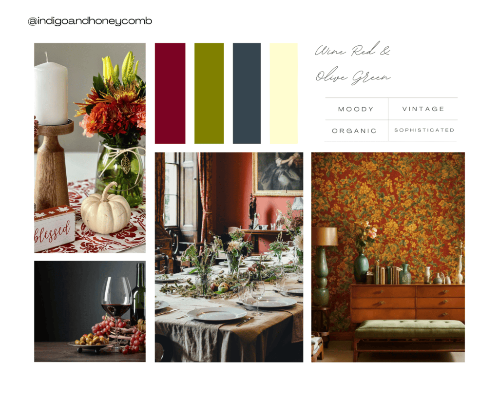
10. Wine Red and Olive Green
Colors: Wine red, olive green, charcoal gray, cream
Why it works: These rich, natural tones pair beautifully together, offering a sophisticated and slightly moody fall palette.
Trends: Wine red brings in the trend of luxurious colors, while olive green continues to grow in popularity due to its versatility and connection to nature.
History: Olive green has long been used in military and historical European design, symbolizing endurance and stability.
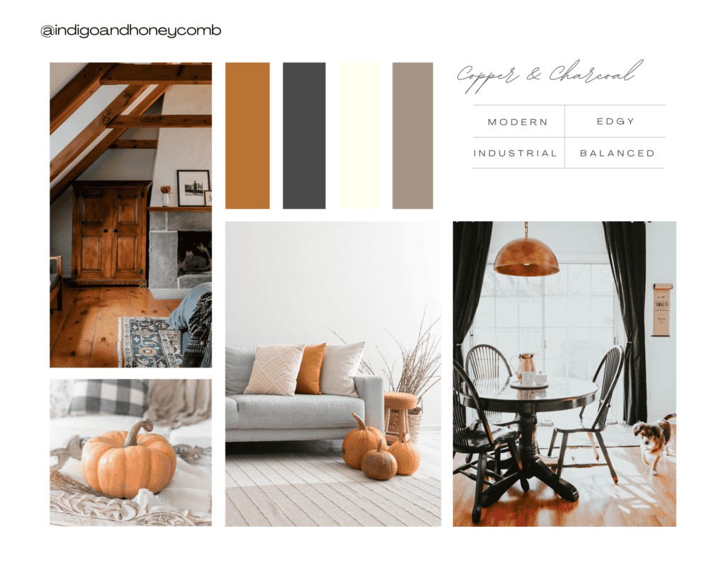
11. Copper and Charcoal
Colors: Metallic copper, charcoal gray, soft ivory, warm taupe
Why it works: The warmth of copper contrasts beautifully with the coolness of charcoal, creating a modern, edgy aesthetic.
Trends: Metallic accents, especially in copper and brass, are popular in modern and industrial-inspired interiors.
History: Copper has been used for centuries in both functional and decorative design, especially in the Victorian era.
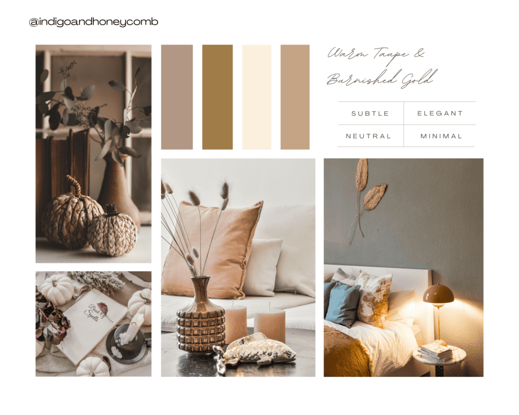
12. Warm Taupe and Burnished Gold
Colors: Warm taupe, burnished gold, soft ivory, light brown
Why it works: This palette brings together the cozy neutrality of taupe with the subtle elegance of gold, perfect for adding a touch of luxury without being overwhelming.
Trends: This scheme ties into the warm minimalism trend, where soft neutrals with understated accents create a calm, inviting atmosphere.
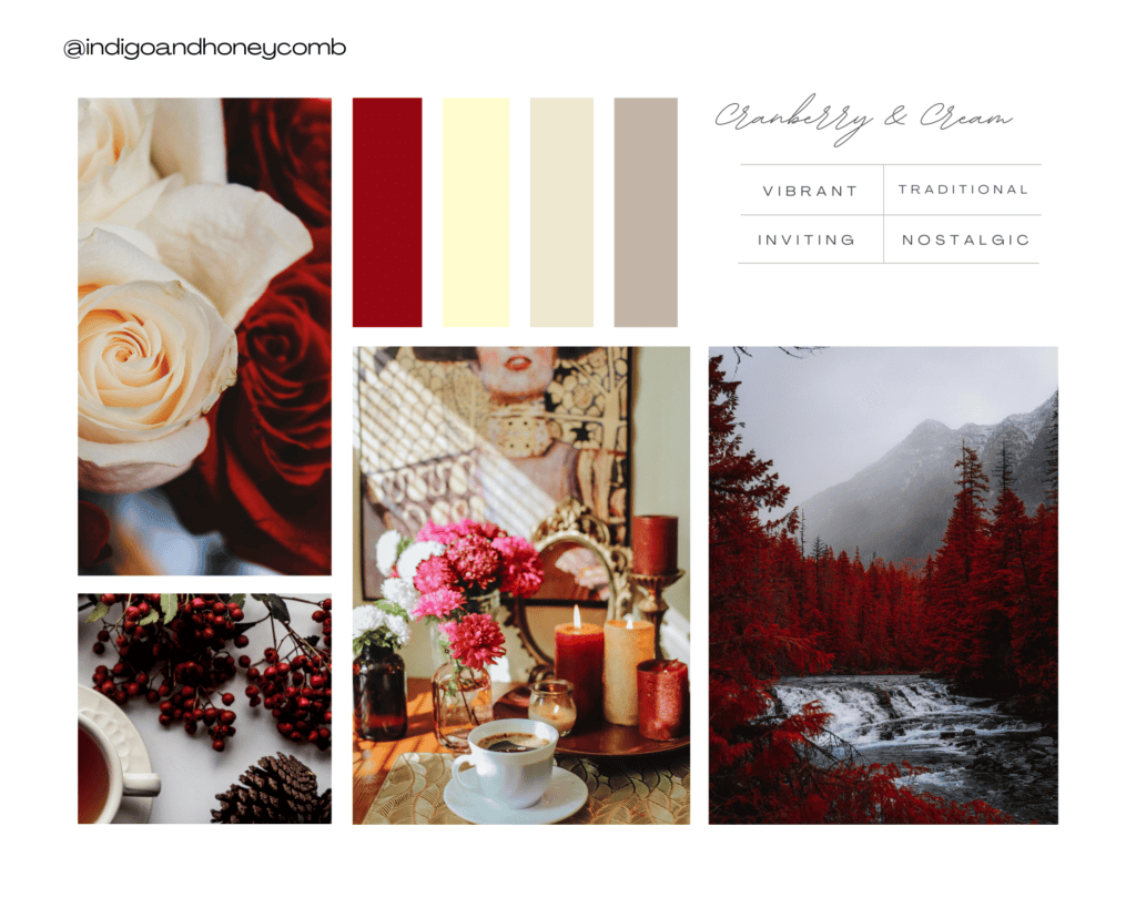
13. Cranberry and Cream
Colors: Cranberry red, cream, soft beige, warm gray
Why it works: The vibrancy of cranberry adds a touch of energy to any room, while cream and beige tones keep the palette cozy and inviting.
Trends: Cranberry has gained traction as a more sophisticated alternative to bright red, reflecting the trend of deeper, richer tones.
History: Cranberry red has been used in traditional holiday decor for centuries, making it a nostalgic favorite in fall design.
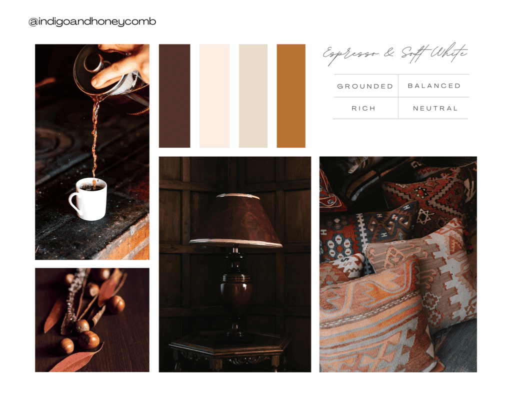
14. Espresso and Soft White
Colors: Espresso brown, soft white, linen, warm caramel
Why it works: Espresso provides a deep, grounding base, while soft white and linen tones brighten and soften the space, creating balance.
Trends: Dark wood tones, like espresso, have seen a resurgence in recent years as a counterpoint to the light, airy interiors of Scandinavian design.
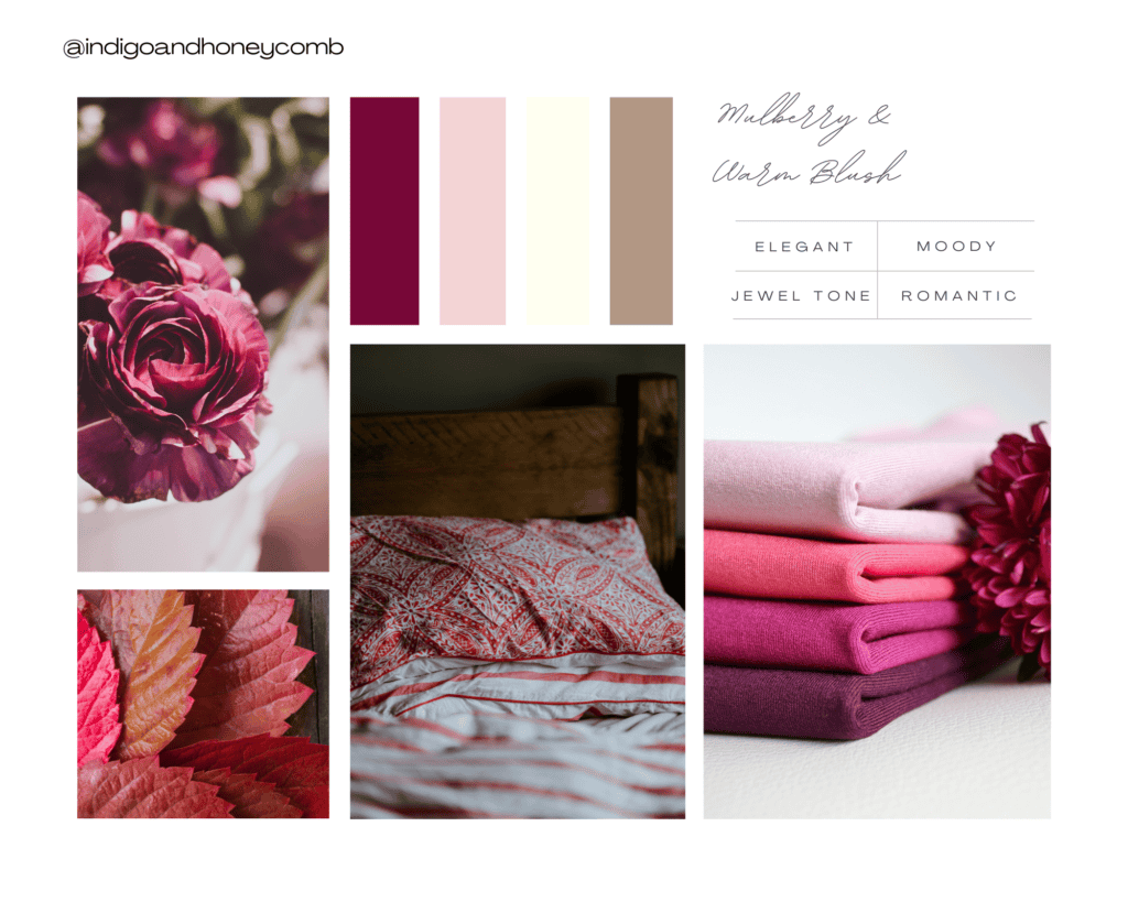
15. Mulberry and Warm Blush
Colors: Mulberry, blush pink, soft ivory, warm taupe
Why it works: Mulberry brings in deep, moody tones, while blush pink softens the palette, creating an elegant and cozy fall atmosphere.
Trends: Mulberry is part of the growing popularity of jewel tones in interior design, which provide richness and depth to spaces.
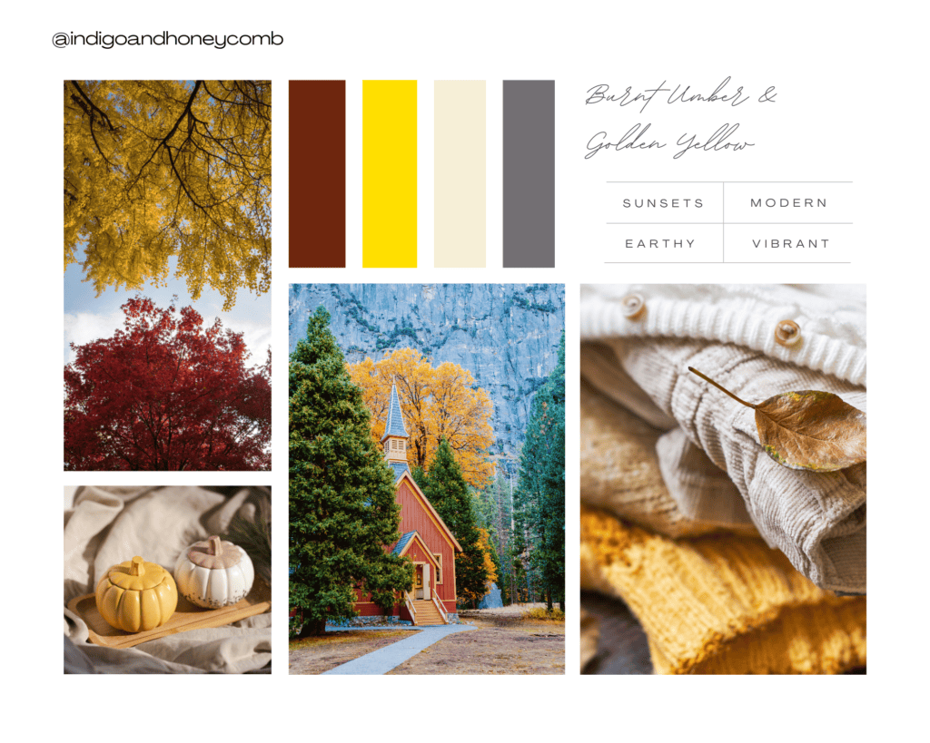
16. Burnt Umber and Golden Yellow
Colors: Burnt umber, golden yellow, soft cream, muted gray
Why it works: This palette echoes the warm tones of autumn sunsets, with golden yellow adding a vibrant touch to the grounded burnt umber.
Trends: Burnt umber, like many other earthy tones, is central to the modern trend of using nature as inspiration for design.
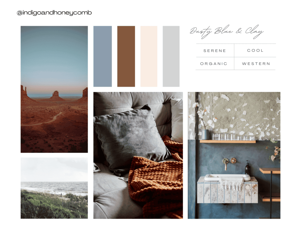
17. Dusty Blue and Clay
Colors: Dusty blue, warm clay, soft white, light gray
Why it works: Dusty blue cools down the space, while warm clay balances it with earthiness, creating a serene yet cozy fall vibe.
Trends: Dusty blue is a staple in calming, tranquil designs, while clay tones add warmth and organic texture.
History: Clay tones harken back to traditional Mediterranean and southwestern design.
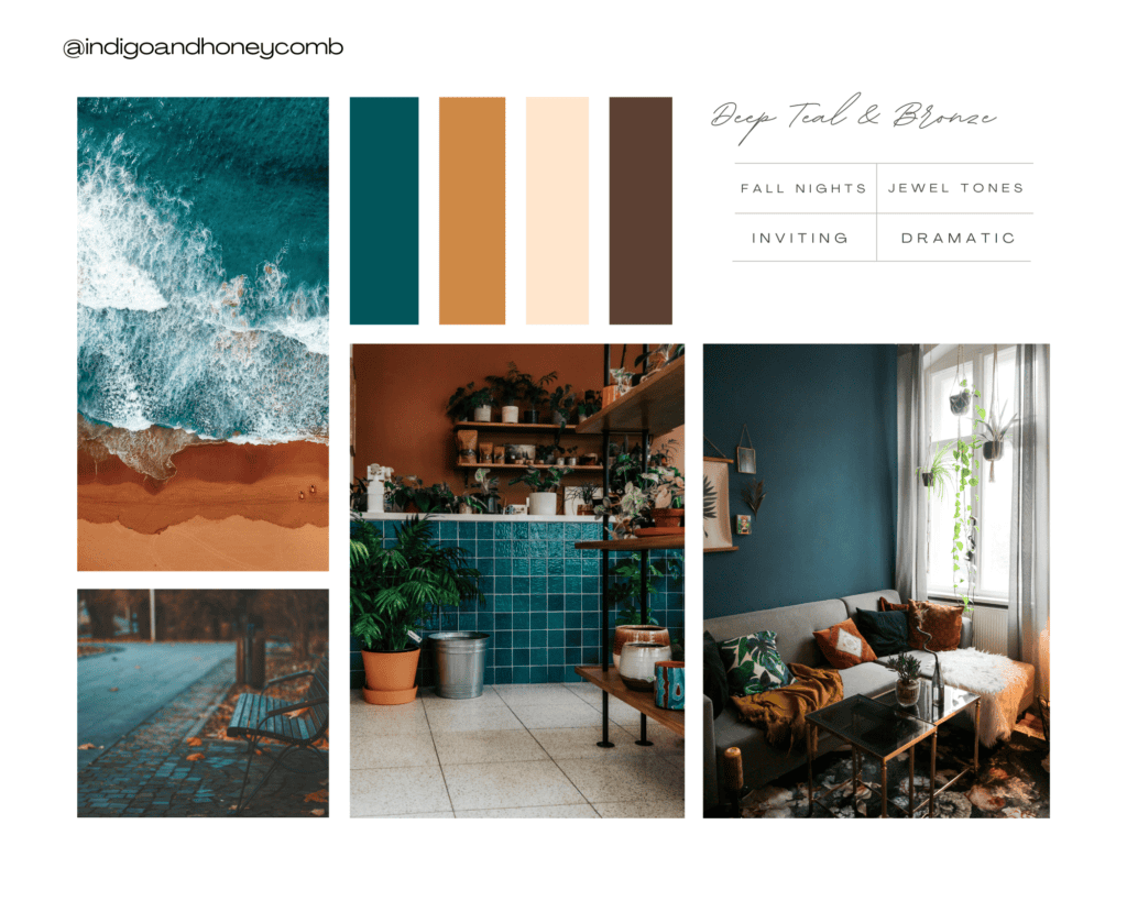
18. Deep Teal and Bronze
Colors: Deep teal, bronze, soft cream, dark brown
Why it works: Deep teal brings in the coolness of fall nights, while bronze adds a touch of metallic warmth, creating a sophisticated and inviting look.
Trends: Jewel tones like teal have been on the rise, adding richness and drama to interiors. Bronze, meanwhile, continues the trend of incorporating metallics in subtle ways.
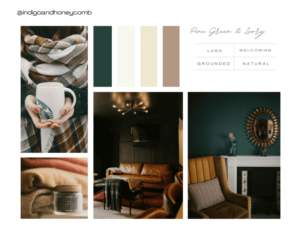
19. Pine Green and Ivory
Colors: Pine green, ivory, soft beige, warm taupe
Why it works: This palette brings the lushness of the forest into the home, while ivory and beige lighten and soften the space, creating a cozy, nature-inspired look.
Trends: Green tones like pine are being used more frequently in minimalist designs to add subtle color while keeping a neutral base.
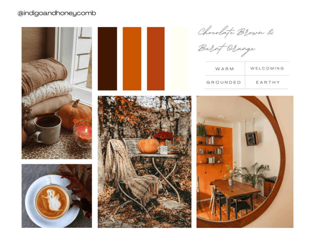
20. Chocolate Brown and Burnt Orange
Colors: Chocolate brown, burnt orange, rust, soft ivory
Why it works: The deep, rich brown tones balance the fiery energy of burnt orange, creating a warm, welcoming environment perfect for fall.
Trends: Chocolate brown is a grounding color that is increasingly popular in contemporary interiors as people seek warm, earthy tones.
Final Thoughts on Fall Color Palettes
These top fall color palettes emphasize the warmth, richness, and comfort that the season brings, making spaces feel cozier and more inviting. Whether inspired by nature, history, or modern trends, these palettes help transform homes into autumnal sanctuaries.

