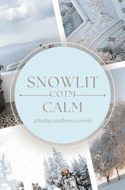
As the new year dawns and the world takes on a quiet stillness, we welcome Snowlit Calm as January’s Color of the Month. This light, soft blue color captures the essence of fresh starts, winter’s serenity, and the reflective pause that comes with the season. Perfectly embodying the tranquil beauty of frosted landscapes and the cool elegance of icy mornings, Snowlit Calm invites a retreat into peace and renewal.
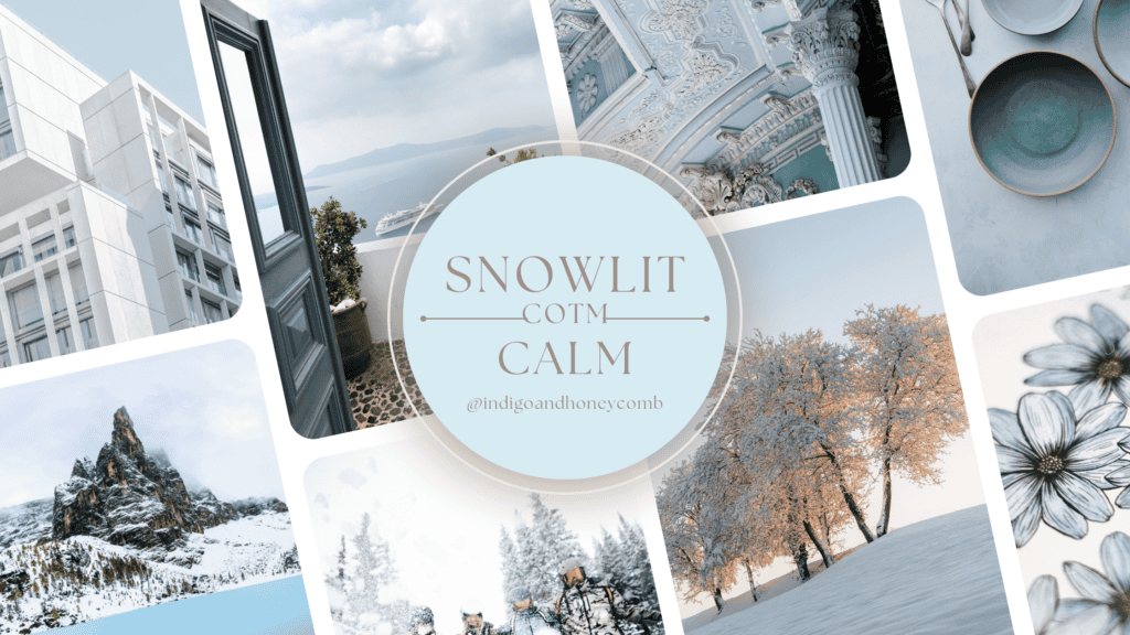
The Inspiration Behind Snowlit Calm
January is a time of beginnings—a moment to set intentions, start anew, and embrace the quiet promise of what’s ahead. Snowlit Calm reflects this spirit with its soothing hue, reminiscent of snow-kissed skies and shimmering frost.
The soft blue color draws inspiration from:
- New Beginnings: A pastel tone that symbolizes clarity and optimism, Snowlit Calm mirrors the clean slate the new year offers. Its softness evokes a sense of readiness to embrace what lies ahead, with an air of calm determination.
- Winter’s Quiet: The calming stillness of January’s chill elicits feelings of retreat and introspection. Snowlit Calm captures the essence of frosty mornings where everything feels paused, offering a serene backdrop for reflection and self-renewal.

- Nature’s Palette: Inspired by the natural world, Snowlit Calm mimics the delicate blues found in icy lakes, frozen streams, and clear winter skies. Its understated beauty reminds us of the restorative power of nature’s quiet moments.
- Design Trends: Pastel tones, particularly soft blues, are dominating interiors and fashion in 2025, emphasizing minimalism and subtle elegance. Snowlit Calm aligns with the ongoing trend of creating spaces and designs that promote relaxation and mindfulness.
- Emotional Wellness: Blue hues are known to awaken feelings of calmness and stability, making Snowlit Calm a fitting choice for a time when balance and tranquility are at the forefront of our collective consciousness.

Soft Blue Color Trends
Soft blue hues like Snowlit Calm have been growing in popularity, thanks to their versatile and calming qualities. These colors are celebrated for their ability to:
- Create an open and airy feeling in interiors, perfect for smaller spaces or minimalist aesthetics.
- Pair beautifully with other pastel shades, earth tones, and metallics, making them a design favorite.
- Inspire a sense of calm, appealing to the increasing desire for wellness-focused and serene living spaces.
A Brief History of Blue
Blue has a rich and fascinating history that spans art, culture, and science. In ancient times, blue pigments were rare and highly valued, often derived from lapis lazuli, a semi-precious stone sourced primarily from mines in Afghanistan. This rarity made blue a symbol of luxury and divinity, often reserved for depictions of royalty or sacred figures in art.
During the Middle Ages and Renaissance, blue gained prominence in religious paintings, with artists using it to depict the robes of the Virgin Mary, symbolizing purity and heaven. The invention of synthetic blue pigments, such as Prussian blue in the early 18th century and ultramarine blue in the 19th century, made the color more accessible, revolutionizing its use in art and design.
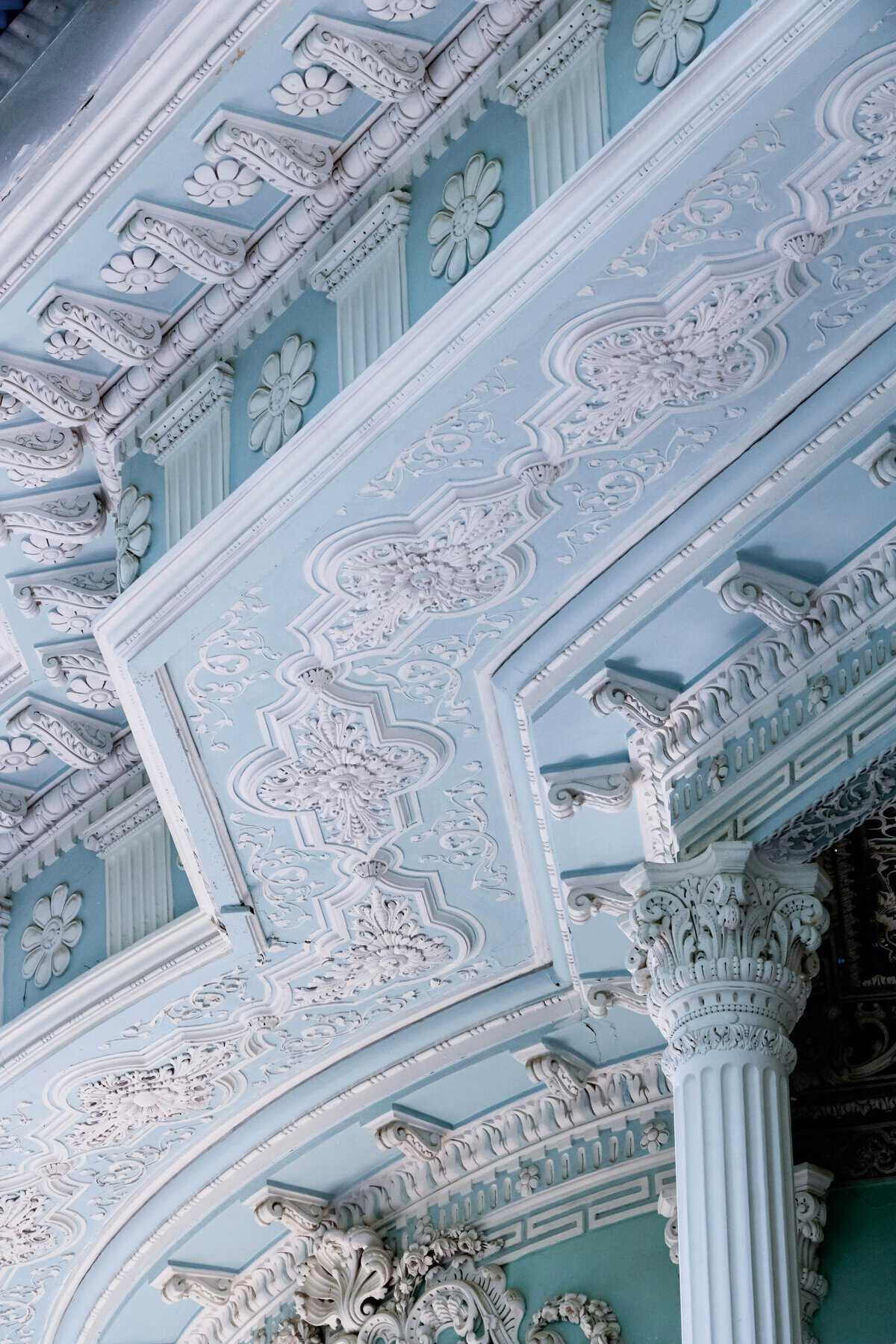
Culturally, blue has been associated with trust, calmness, and introspection. Light blues, like Snowlit Calm, have historically represented peace and serenity, from the delicate shades in Chinese porcelain to the pastel hues of 18th-century Rococo interiors. Today, blue remains a timeless and versatile color, evoking both tradition and modernity.
Design Styles That Complement Snowlit Calm
Snowlit Calm pairs effortlessly with various design styles, including:
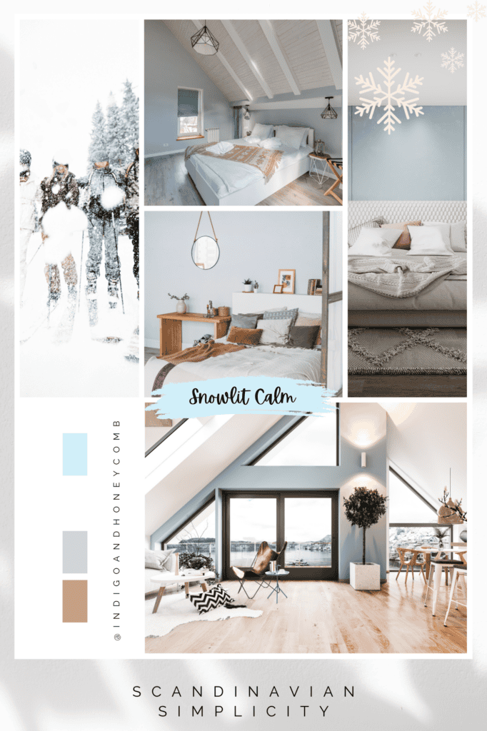
Scandinavian: Rooted in simplicity and functionality, Scandinavian design highlights Snowlit Calm’s clean, airy vibe. Paired with light woods, crisp whites, and soft grays, it creates serene, uncluttered spaces.
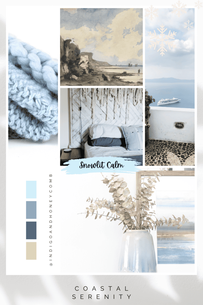
Coastal: Reflecting the serenity of sea and sky, Snowlit Calm perfectly complements breezy, beach-inspired aesthetics. Paired with sandy neutrals and oceanic accents, it delivers a tranquil coastal retreat.
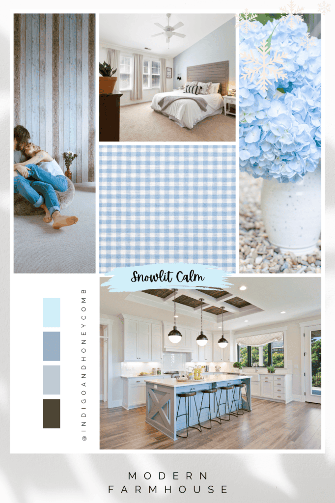
Modern Farmhouse: The welcoming warmth of modern farmhouse design harmonizes beautifully with Snowlit Calm. When combined with warm whites, rustic wood finishes, and soft textiles, it creates a cozy yet sophisticated atmosphere.
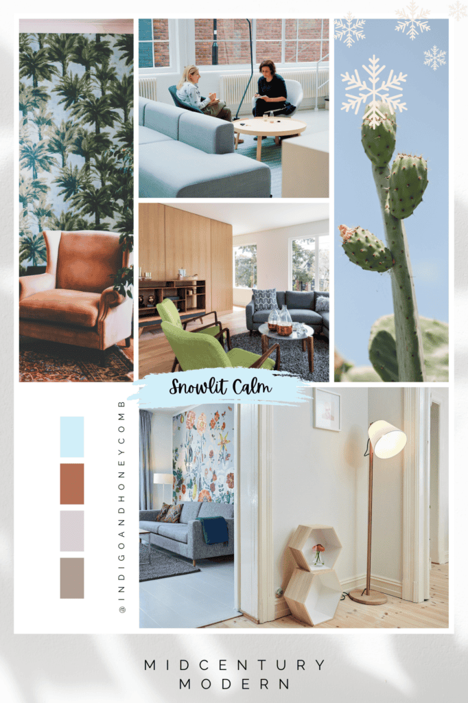
Midcentury Modern: Soft blue accents like Snowlit Calm balance the bold shapes, rich woods, and retro charm of midcentury modern interiors. It provides a subtle counterpoint to vibrant accent colors and geometric patterns.
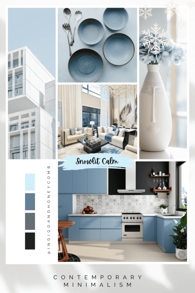
Contemporary Minimalism: In contemporary minimalist spaces, Snowlit Calm serves as either a subtle backdrop or a focal point. Its soothing tone enhances simplicity and elegance, fostering environments that prioritize calm and clarity.
5 Soft Blue Color Palettes Featuring Snowlit Calm
To inspire your use of Snowlit Calm, here are five versatile color palettes:
Winter Retreat
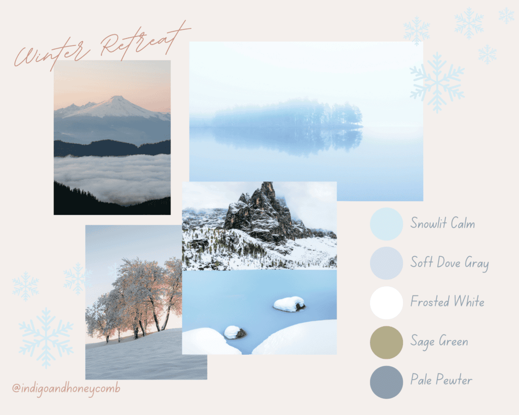
This palette captures the serene beauty of a snowy forest, blending calming neutrals and soft greens with the airy lightness of Snowlit Calm.
Pastel Serenity
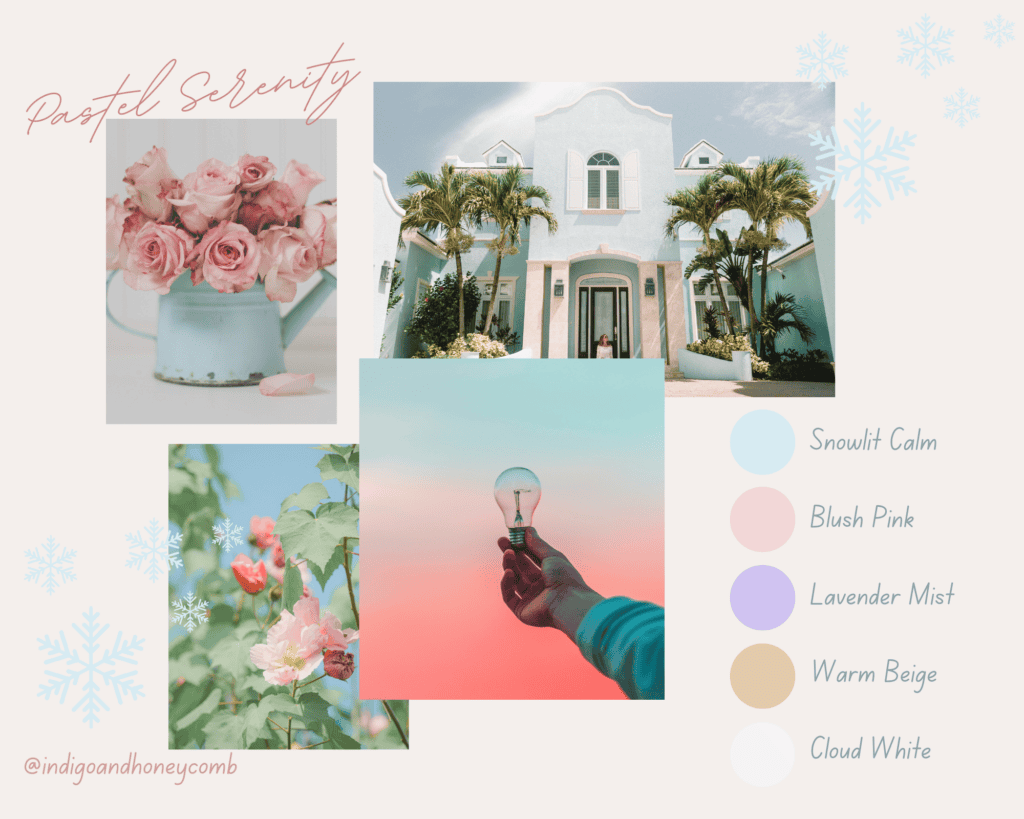
A soothing combination of pastel tones, this palette is perfect for creating dreamy interiors and elegant, understated designs.
Icy Elegance
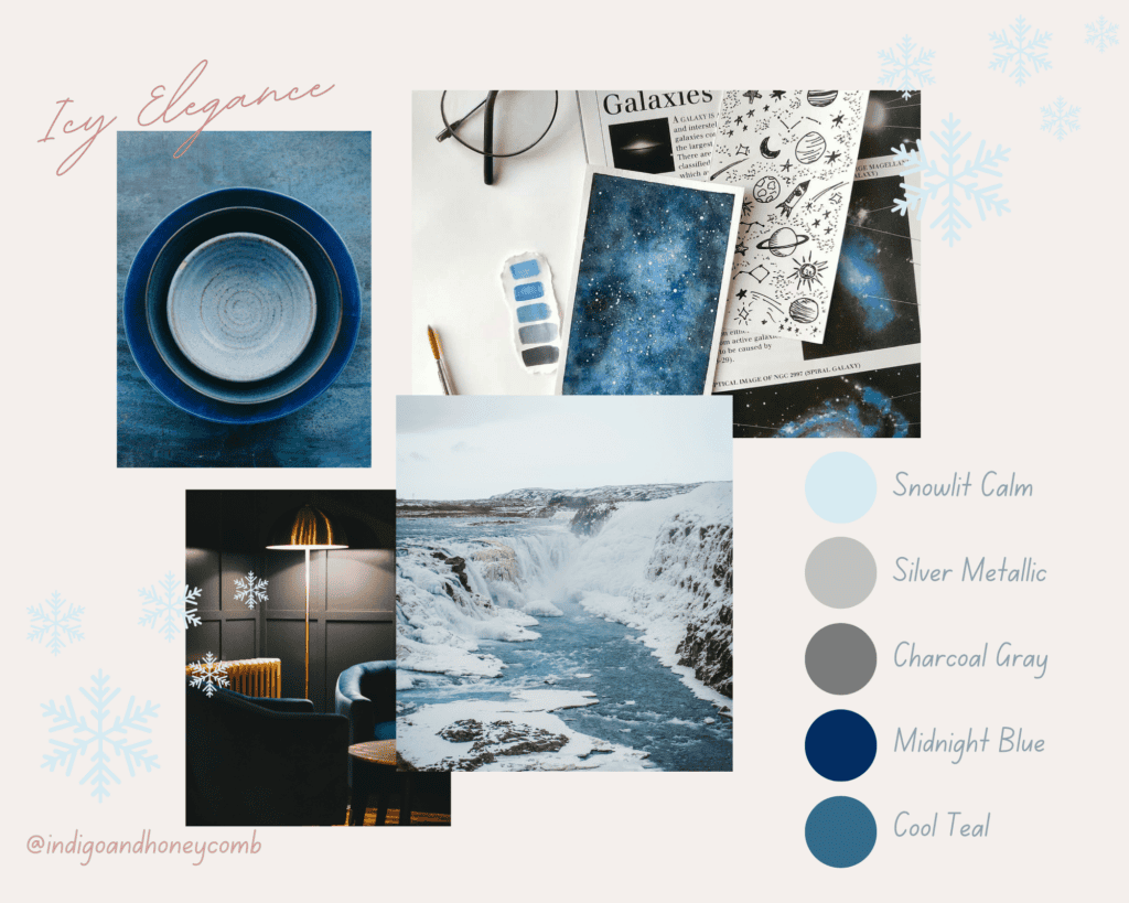
Featuring dramatic contrasts and metallic accents, this palette adds a touch of sophistication and modernity to Snowlit Calm’s soft hue.
Natural Harmony
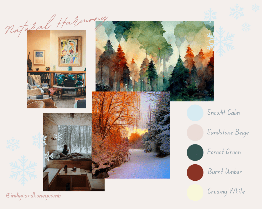
Inspired by the earthy tones of nature, this palette balances the gentle coolness of Snowlit Calm with warm, grounding colors.
New Dawn
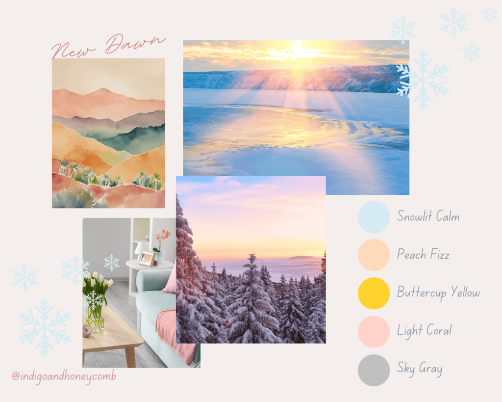
This uplifting palette captures the optimism of a sunrise, blending cheerful warm tones with the tranquil charm of Snowlit Calm.
Final Thoughts
Snowlit Calm isn’t just a color—it’s an invitation to embrace the quiet beauty of winter and the hope of a fresh start. Whether used in interiors, fashion, or branding, this soft blue serves as a gentle reminder to pause, reflect, and find peace in simplicity. Let Snowlit Calm guide your January with its tranquil charm and timeless elegance.

