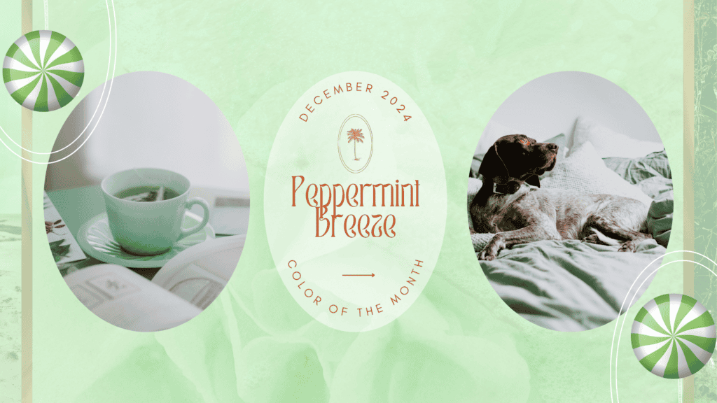
As the year comes to a close, we embrace a refreshing sense of renewal and tranquility with Peppermint Breeze, a soft and invigorating mint green color. This color embodies the spirit of December: crisp, cool, and full of quiet charm. A perfect balance between fresh pastels and wintery elegance, Peppermint Breeze invites a serene yet modern aesthetic into our lives.
About the Color
Peppermint Breeze is a delicate hue that blends pale green with icy undertones, reminiscent of frosty mornings and the soothing scent of mint leaves. Its lightness adds a breath of fresh air to any space, making it versatile and easy to incorporate into design schemes.
Pastels for Winter 2024: A Growing Trend
Traditionally associated with spring, pastel colors are taking center stage this winter. Designers are rethinking seasonal palettes, moving away from dark and moody tones to embrace softer shades like Peppermint Breeze. This trend reflects a collective desire for calm and optimism, offering a gentle contrast to the harsher winter landscapes. From interiors to fashion, pastel hues are adding a modern twist to winter design in 2024.
The History of Mint Green Color
Mint green’s delicate yet vibrant hue has made it a cherished color throughout history, symbolizing freshness, renewal, and tranquility. Its journey through time reflects changing tastes in design and cultural shifts, with each era leaving its mark on how mint green was used and perceived.
Early Associations: Nature and Healing
Mint green’s roots are deeply connected to nature. As its name suggests, the color mirrors the cool, soft hue of mint leaves, evoking a sense of vitality and calm. In ancient times, green shades, including mint, were often associated with growth and fertility, and the use of natural pigments in art and textiles created early versions of this soothing tone.
The Art Deco Era (1920s-1930s)
Mint green reached new heights of popularity during the Art Deco movement. Known for its bold geometric patterns and luxurious materials, this era embraced soft pastels like mint green to balance the opulence of metallic accents and rich textures. Mint green was a favorite in both fashion and interior design, often paired with black, gold, and white for a glamorous yet refined look.

The Midcentury Modern Boom (1950s-1960s)
In the post-World War II era, mint green became a staple of midcentury modern design, a movement that emphasized clean lines, functionality, and optimism. Kitchens and bathrooms were often adorned with mint green tiles, appliances, and cabinetry, reflecting a desire for freshness and innovation in everyday spaces. The color’s association with cleanliness and modernity made it a popular choice for both residential and commercial settings.

The 1980s Revival
The 1980s saw a resurgence of pastel tones, including mint green, in both fashion and interior design. This decade was all about playful, lighthearted aesthetics, and mint green was a key player in creating bright, cheerful spaces. It was often paired with other pastels like peach and lavender, creating a soft and inviting palette.
Mint Green in Contemporary Design
Today, mint green continues to captivate designers and homeowners alike for its versatility and calming qualities. It’s used in a wide range of styles, from minimalist and Scandinavian interiors to eclectic Bohemian spaces. Its ability to evoke nostalgia while remaining fresh and modern makes it a timeless choice for everything from fashion to home décor.
Symbolism of Mint Green
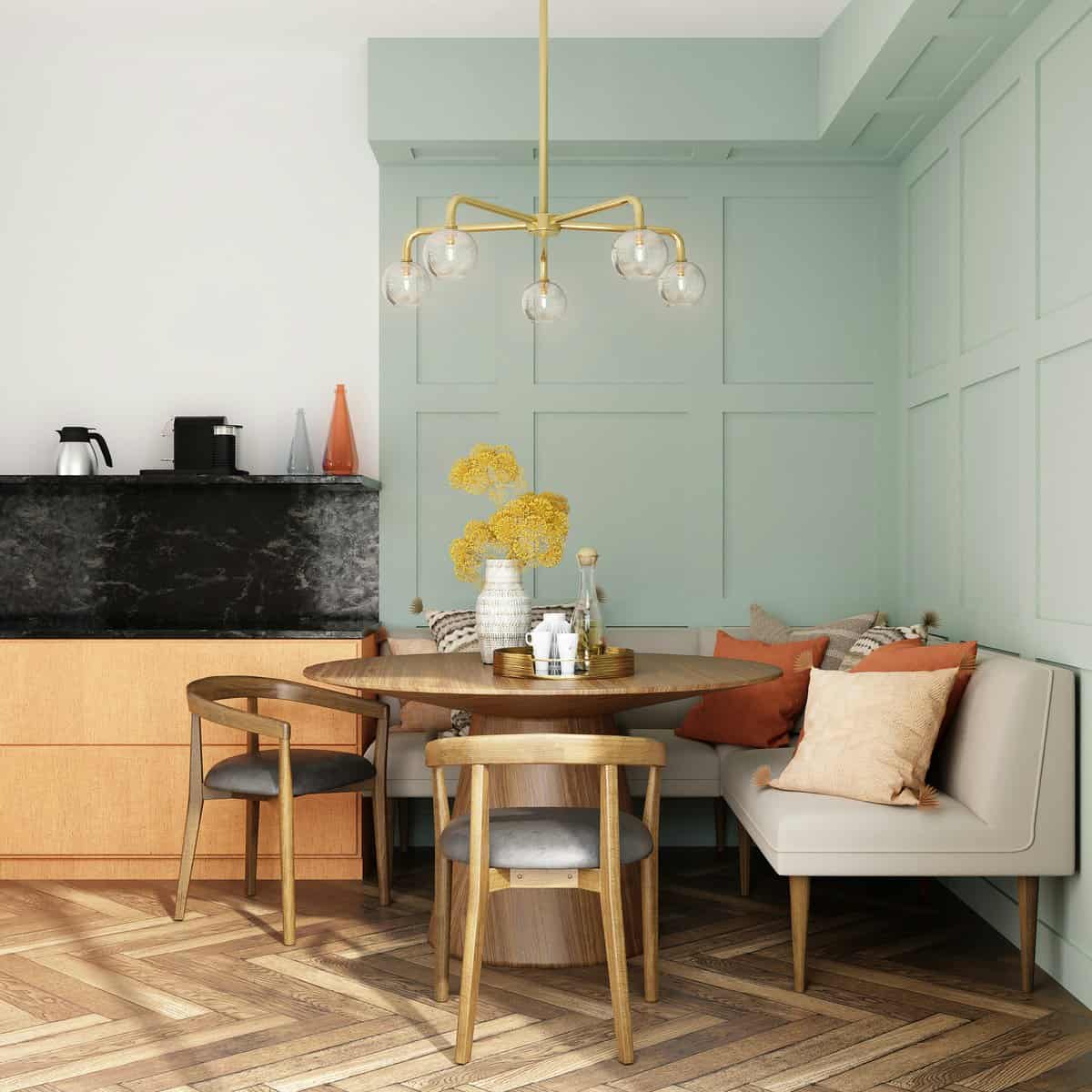
Beyond its aesthetic appeal, mint green color carries significant symbolic meaning. It’s often associated with tranquility, health, and renewal, making it a popular choice in wellness-focused spaces. Whether used as a wall color in a serene bedroom or as an accent in a lively kitchen, mint green has a way of uplifting and refreshing any environment.
Mint green’s storied past and enduring charm prove that some colors never go out of style. Its unique ability to balance tradition and modernity makes it a perfect choice for celebrating December and embracing the hope and possibilities of a new year.
Design Styles That Pair Perfectly with Peppermint Breeze
Peppermint Breeze is a versatile mint green color that effortlessly integrates into a variety of design styles. Its soft, refreshing hue provides a perfect backdrop or accent, adding a sense of calm and sophistication. Here’s a deeper dive into how this stunning color complements different aesthetics:
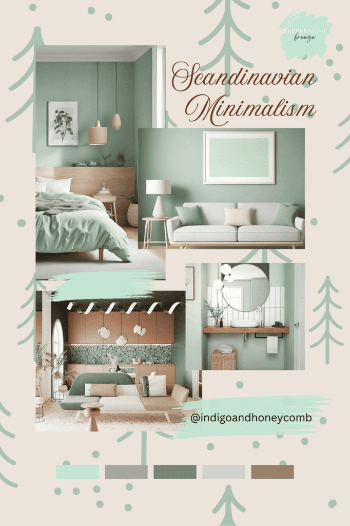
1. Scandinavian Minimalism
Known for its clean lines, light color palettes, and functional simplicity, Scandinavian design embraces the subtle charm of Peppermint Breeze. The color pairs beautifully with natural materials like light oak, wool, and linen, creating a serene and inviting environment. Use it for accent walls, throw pillows, or kitchen cabinetry to add a hint of mint green color without overwhelming the space.
2. Midcentury Modern
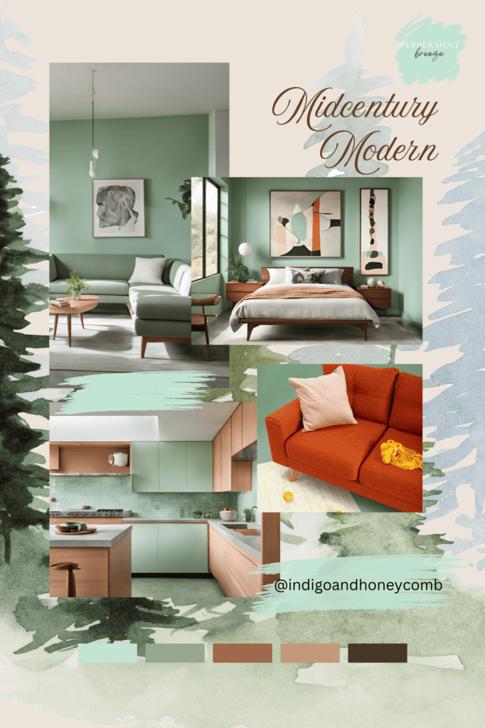
Midcentury modern design thrives on bold, iconic shapes and retro color schemes. Peppermint Breeze fits seamlessly into this style, reminiscent of the mint greens popular in the 1950s. Pair it with teak furniture, mustard yellow, and gold accents to create a nostalgic yet contemporary look. Incorporate the color through upholstered chairs, geometric wallpaper, or ceramic décor.
3. Coastal Chic
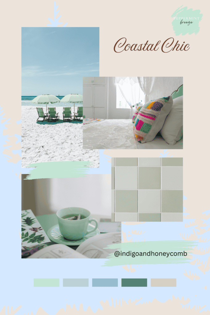
Peppermint Breeze evokes the breezy, tranquil feel of seaside living, making it an ideal match for coastal-inspired spaces. Pair it with crisp whites, sandy beige tones, and soft blues to mimic the natural hues of the ocean and shore. Use it in lightweight curtains, painted furniture, or as a fresh take on traditional coastal stripes for a relaxed, beachy vibe.
4. Bohemian Elegance
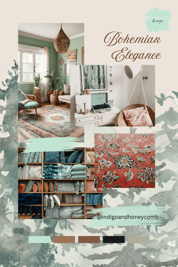
The earthy, layered aesthetic of Bohemian design gets a modern update with Peppermint Breeze. This shade of mint green provides a soothing counterbalance to the rich textures, patterns, and eclectic mix of furniture typical in Boho interiors. Combine it with warm terracotta, deep burgundy, and natural wood tones. Think woven wall hangings, hand-thrown pottery, and painted accent pieces.
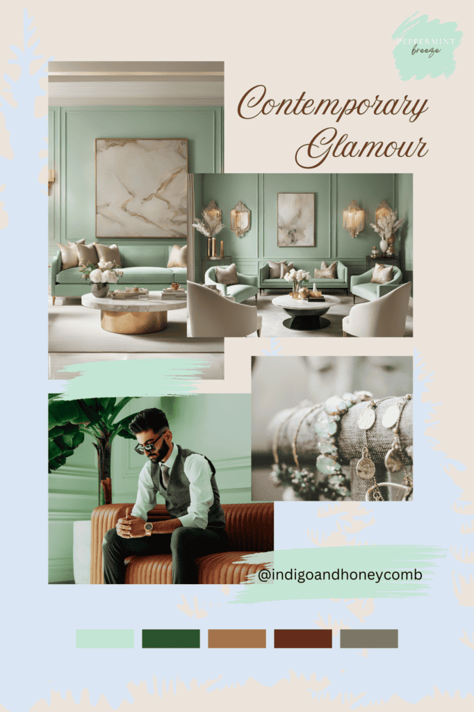
5. Contemporary Glamour
In contemporary spaces, Peppermint Breeze acts as a refreshing alternative to stark neutrals. Its understated coolness adds depth and interest while maintaining a sleek, modern feel. Pair it with monochromatic palettes, polished metallics like silver or chrome, and high-gloss finishes. Use the color in abstract artwork, glass vases, or a dramatic statement rug.
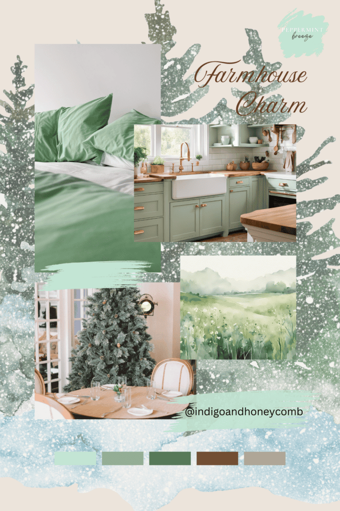
6. Farmhouse Charm
Peppermint Breeze complements the rustic warmth of farmhouse interiors by bringing a touch of freshness to the cozy aesthetic. Pair it with distressed wood, creamy whites, and vintage-inspired décor for a welcoming, lived-in feel. Use it in painted cabinets, barn doors, or soft textiles like quilts and curtains for a charming country vibe.
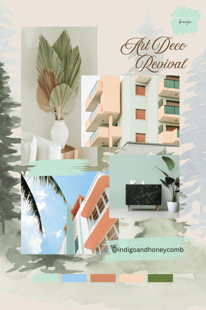
7. Art Deco Revival
For spaces with a touch of glamour and drama, Peppermint Breeze can serve as a playful contrast to the bold geometric patterns and luxurious materials of Art Deco design. Pair it with black, gold, and marble to echo the classic Deco palette, and incorporate it into velvet upholstery, painted accent walls, or retro light fixtures for a unique twist.
Peppermint Breeze’s adaptability ensures it can enhance and elevate any design style. Whether you want to evoke nostalgia, create a tranquil retreat, or add a modern pop of color, this versatile mint green is the perfect choice for transforming your space this December.
Five Stunning Color Palettes Featuring Peppermint Breeze
Peppermint Breeze is a versatile and refreshing hue that serves as both a focal point and a complementary tone in various palettes. Whether you’re designing a cozy living space, planning seasonal décor, or revamping your wardrobe, these curated palettes highlight the transformative power of this minty shade.
1. Winter Wonderland
This ethereal palette captures the magic of a snow-covered landscape with frosty and delicate hues.
- Peppermint Breeze: Adds a crisp, fresh accent.
- Frost White: Reflects the purity of winter snow.
- Icy Silver: Introduces a subtle shimmer for a touch of glamour.
- Soft Lavender: Offers a hint of whimsy and warmth.
- Powder Blue: Evokes the serene beauty of icy skies.
Perfect for: Holiday décor, bedrooms, or creating a tranquil, wintery atmosphere.
2. Cozy Retreat
This warm, inviting palette pairs Peppermint Breeze with earthy neutrals to create a haven of comfort.
- Peppermint Breeze: Brings a refreshing contrast to the warm tones.
- Warm Taupe: Provides a grounding, neutral base.
- Creamy Beige: Adds softness and warmth.
- Cocoa Brown: Deepens the palette with richness and texture.
- Burnished Gold: Introduces a touch of luxury and glow.
Perfect for: Living rooms, reading nooks, or rustic dining spaces.
3. Nature’s Serenity
Inspired by the calming beauty of natural landscapes, this palette is all about harmony.
- Peppermint Breeze: Reflects the vitality of fresh greenery.
- Sage Green: Enhances the palette’s earthy undertones.
- Clay Beige: Adds warmth and a sense of grounding.
- Deep Forest Green: Provides depth and richness.
- Dusty Rose: Infuses a subtle blush for balance.
Perfect for: Bathrooms, yoga studios, or serene outdoor-inspired interiors.
4. Fresh & Festive
Celebrate the holiday season with a vibrant, cheerful palette that feels both classic and modern.
- Peppermint Breeze: A cool counterpoint to the rich holiday hues.
- Holly Red: Brings traditional holiday vibrancy.
- Snowy White: Adds crispness and balance.
- Golden Amber: Introduces warmth and a festive glow.
- Evergreen: Evokes the lushness of holiday foliage.
Perfect for: Holiday tablescapes, wreaths, or cozy living rooms with a festive twist.
5. Modern Mint
This sleek, contemporary palette uses Peppermint Breeze as a fresh take on minimalism.
- Peppermint Breeze: Acts as the statement color.
- Charcoal Gray: Adds sophistication and depth.
- Steel Blue: Complements with a cool, industrial touch.
- Crisp White: Keeps the palette clean and bright.
- Blush Pink: Softens the look with a touch of warmth.
Perfect for: Modern kitchens, office spaces, or fashion-forward interiors.
How to Use These Palettes
Each palette is designed to showcase the versatility of Peppermint Breeze, whether as a dominant color or an accent. Pair it with lighter hues for a serene and airy feel or contrast it with deeper tones for drama and sophistication. Experiment with textures, patterns, and materials to bring these palettes to life in a way that reflects your personal style.
Peppermint Breeze: The Refreshing December Color of the Month
In this blog, we celebrated Peppermint Breeze as December’s color of the month, exploring its refreshing charm and timeless appeal. From its roots in design history to its role in the winter 2024 pastel trend, Peppermint Breeze proves its versatility across styles and settings. We showcased its ability to enhance Scandinavian minimalism, coastal chic, and more while offering five thoughtfully curated color palettes to inspire creativity. Whether you’re transforming a space or adding seasonal accents, this soothing mint green brings elegance, renewal, and a touch of magic to the holiday season.


