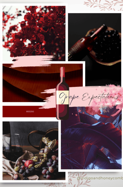
As the last days of summer fade away, we eagerly anticipate the arrival of fall, with its vibrant foliage, crisp air, and cozy traditions. The September Color of the Month, Grape Expectations, is inspired by the rich, warm hues of this beloved season. This captivating burgundy shade embodies the essence of fall, evoking feelings of comfort, nostalgia, and joy. As the leaves begin to change, painting the landscape with brilliant shades of orange, red, and purple, Grape Expectations is the perfect color to welcome the harvest season.
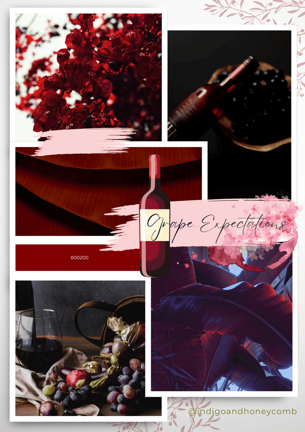
The warmth of Grape Expectations is reminiscent of ripe grapes, freshly picked from the vine, and the cozy atmosphere of a crackling fire on a chilly fall evening. This color is also inspired by the vibrant hues of fall foliage, as leaves transform into brilliant shades of crimson, scarlet, and burgundy. As we embark on the harvest season, Grape Expectations captures the essence of abundance, gratitude, and celebration.
As the seasons change, our surroundings become a kaleidoscope of color, with nature’s final dance before the slumber of winter. The inspiration for Grape Expectations comes from this fleeting moment, when the world is bathed in warm, golden light, and the air is filled with the sweet scent of ripe fruits and woodsmoke. This color is an ode to the cozy traditions of fall, from leaf peeping and hayrides to warm apple cider and pumpkin pie. Grape Expectations is the perfect shade to envelop yourself in the warmth and magic of the season.
Color History: Unveiling the Rich Heritage of Burgundy
Burgundy, the inspiration behind the September Color of the Month, Grape Expectations, has a fascinating history that spans centuries. This captivating color has evolved over time, influenced by various cultures, art movements, and historical events.
Middle Ages: Nobility and Power
In the Middle Ages, burgundy was a symbol of wealth, power, and nobility. The color was associated with the Burgundy region in France, known for its luxurious textiles, fine wines, and rich history. Only the elite could afford garments dyed with the expensive and highly prized burgundy pigment, making it a status symbol.
Renaissance: Artistic Expression
During the Renaissance, burgundy became a popular color in art, particularly in portraits of royalty and nobility. Artists like Rubens and Rembrandt used burgundy to convey luxury, elegance, and refinement. The color also appeared in ornate furnishings, tapestries, and decorative arts.
18th and 19th Centuries: Romanticism and Industrialization
As Romanticism emerged, burgundy became linked to emotions, creativity, and individuality. The color was used in literature, poetry, and music to evoke feelings of passion and intensity. With the advent of industrialization, synthetic dyes made burgundy more accessible, leading to its widespread use in fashion and home decor.
20th Century: Revival and Reinvention
In the 20th century, burgundy experienced a revival, particularly in the 1920s and 1980s. During the Roaring Twenties, burgundy was a popular color in fashion, symbolizing glamour and sophistication. In the 1980s, the color was reinterpreted in the context of luxury branding, high-end fashion, and interior design.
Present Day: Timeless Elegance
Today, burgundy continues to evoke feelings of luxury, creativity, and wisdom. Grape Expectations, our September Color of the Month, embodies this timeless elegance, making it perfect for designs that require sophistication and refinement. Whether used in fashion, interior design, or branding, burgundy remains a captivating color with a rich history and enduring appeal.
Best Design Styles: Elevating Your Creations with Grape Expectations
Grape Expectations, the September Color of the Month, is a versatile shade that complements a variety of design styles. Here are some of the most stunning ways to incorporate this captivating burgundy hue into your designs:
Luxury Design
- Use Grape Expectations as the primary color for high-end branding, packaging, and marketing materials.
- Pair with metallic accents like gold, silver, or copper to amplify the luxurious feel.
- Incorporate rich textures, such as velvet or leather, to add depth and opulence.
Bohemian Chic
- Add Grape Expectations as an accent color to create a unique, eclectic look.
- Combine with earthy tones like olive green, terracotta, and sandy beige for a global-inspired aesthetic.
- Incorporate natural textures like woven baskets, jute, or linen to add warmth and coziness.
Vintage Glam
- Use Grape Expectations as a dominant color for a sophisticated, retro-inspired look.
- Pair with rich jewel tones like emerald green, sapphire blue, or amethyst for a luxurious, vintage feel.
- Incorporate ornate patterns, metallic accents, and luxurious fabrics like silk or velvet to amplify the glamour.
Modern Sophisticate
- Use Grape Expectations as an accent color to add depth and sophistication to modern designs.
- Pair with crisp whites, deep grays, or taupe for a clean, contemporary look.
- Incorporate sleek textures like glass, metal, or leather to add a touch of modernity.
Whimsical Romance
- Use Grape Expectations as a primary color for a soft, feminine look.
- Pair with pastel shades like pale pink, lavender, or peach for a whimsical, romantic feel.
- Incorporate delicate patterns, florals, or lace to add a touch of sweetness and charm.
Dramatic Elegance
- Use Grape Expectations as a dominant color for a dramatic, sophisticated look.
- Pair with deep, rich colors like navy blue, charcoal gray, or dark green for a luxurious, elegant feel.
- Incorporate metallic accents, luxurious fabrics, or ornate patterns to amplify the drama and sophistication.
By incorporating Grape Expectations into your designs, you’ll add a touch of luxury, creativity, and wisdom. Experiment with different design styles to unlock the full potential of this captivating Burgundy hue!
8 Color Palette Ideas: Unleashing the Potential of Grape Expectations
Grape Expectations, our September Color of the Month, is a versatile shade that can be paired with a variety of colors to create stunning palettes. Here are eight color palette ideas to inspire your designs:
Wine & Cheese
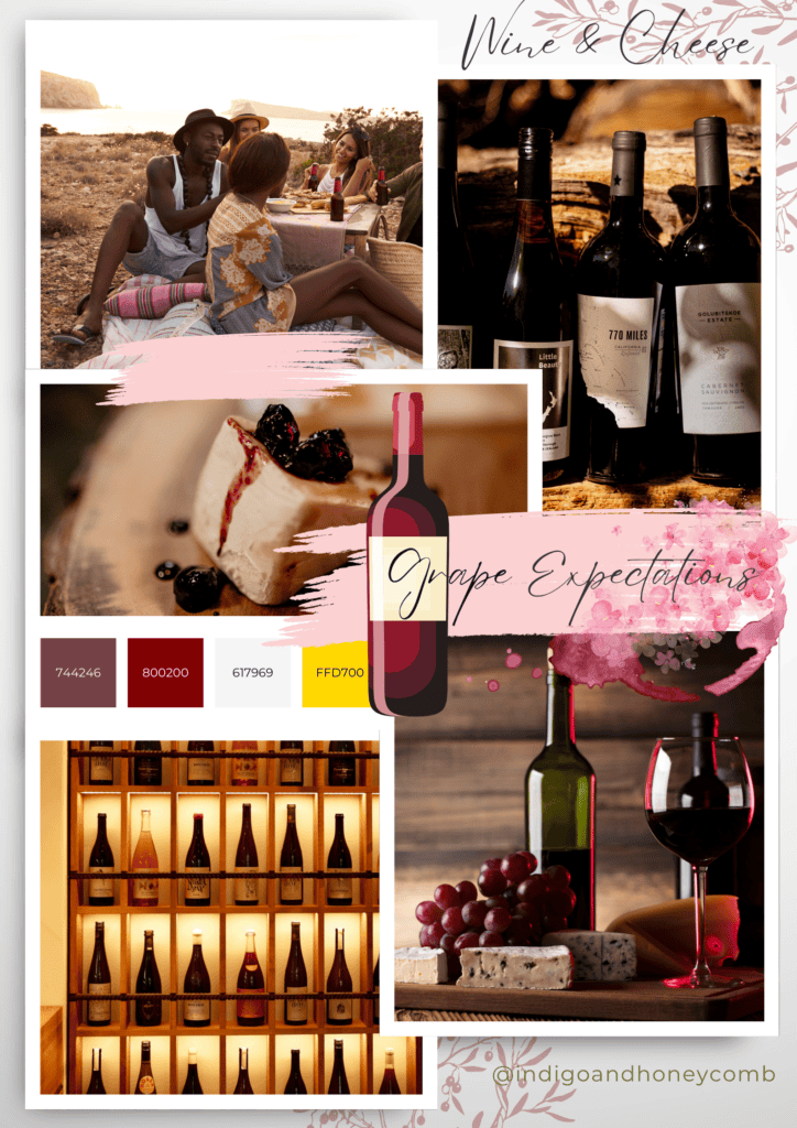
Perfect for luxury branding, packaging, and marketing materials, this palette combines the sophistication of Grape Expectations with the warmth of off white and the opulence of rich gold.
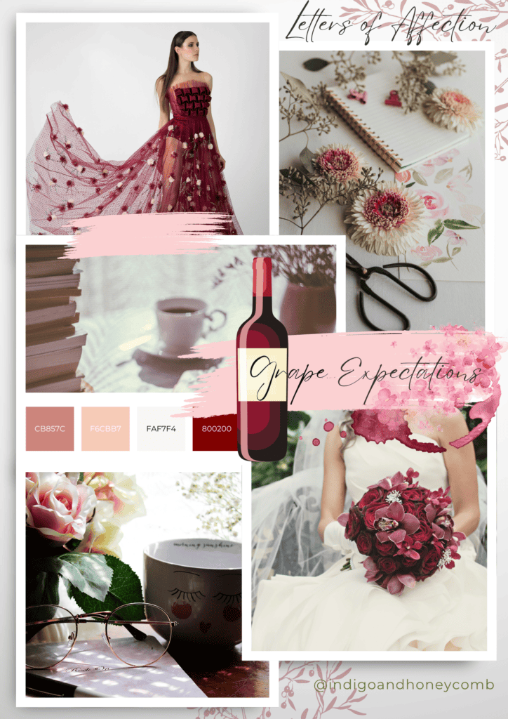
Cool Berry Scoop
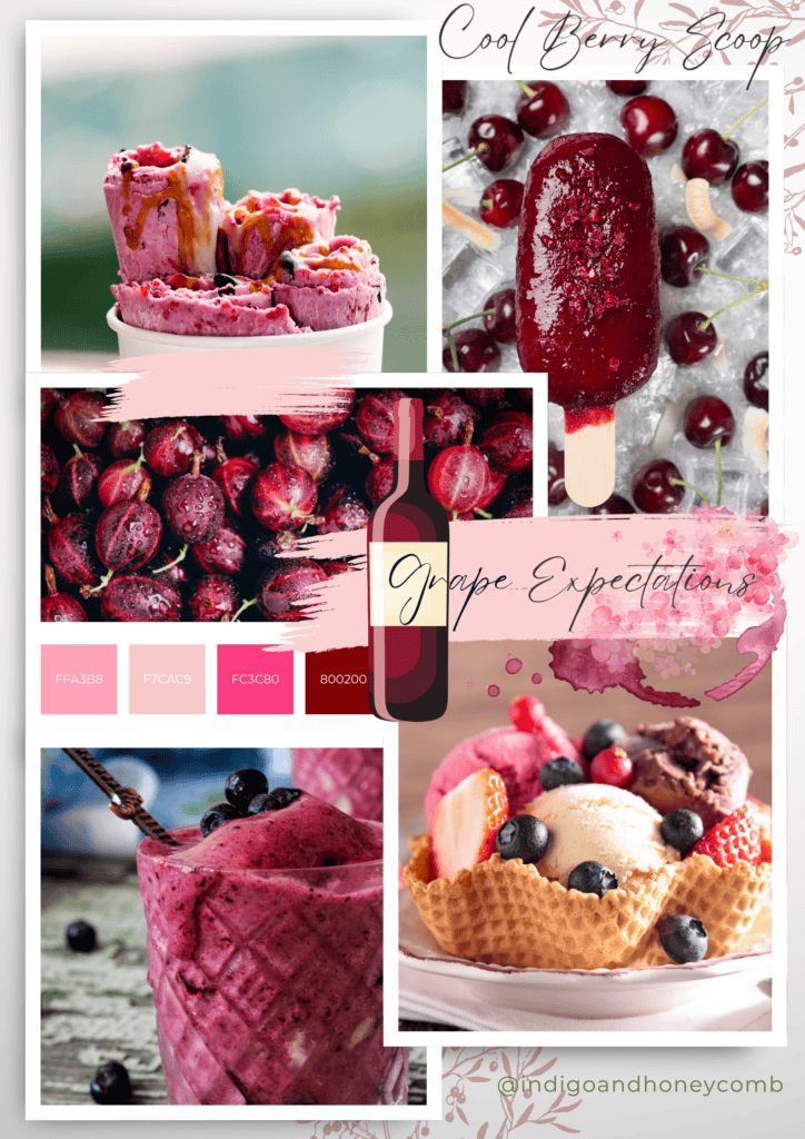
This palette is ideal for whimsical, romantic designs. The soft peach adds a touch of warmth, while the bright pink provides a refreshing contrast to the rich Grape Expectations.
Little Luxuries
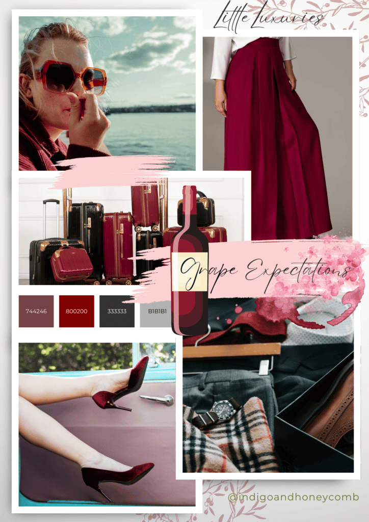
This palette is perfect for high-end branding, packaging, and marketing materials. The deep charcoal adds depth, while the metallic silver amplifies the luxury feel.
Boho Chic
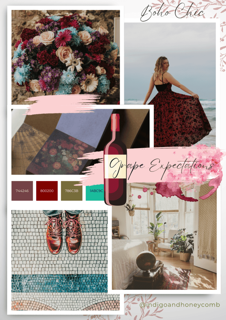
This palette is ideal for bohemian-inspired designs. The earthy brown adds warmth, while the turquoise provides a pop of color and energy.
Vintage Romance
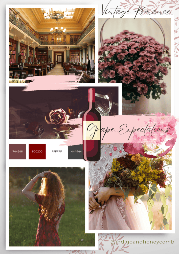
Perfect for vintage-inspired designs, this palette combines the elegance of Grape Expectations with the softness of charcoal and the romance of dusty rose.
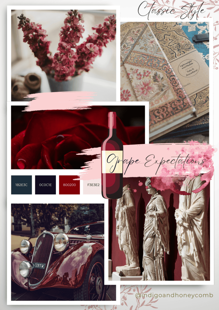
Modern Style
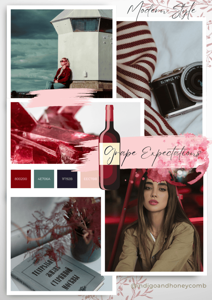
This palette is ideal for modern designs that require sophistication and elegance. The crisp white adds cleanliness, while the dark gray provides depth.
Whispers of Nature
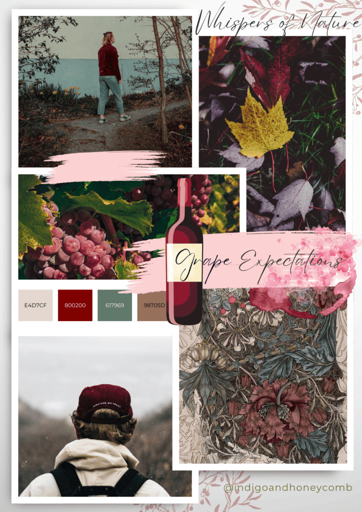
This palette is perfect for autumn-inspired designs. The warm neutrals adds a hint of depth, while the olive green provides a natural contrast.
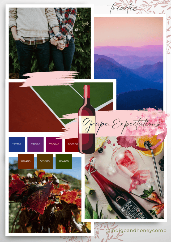
Varsity Squad
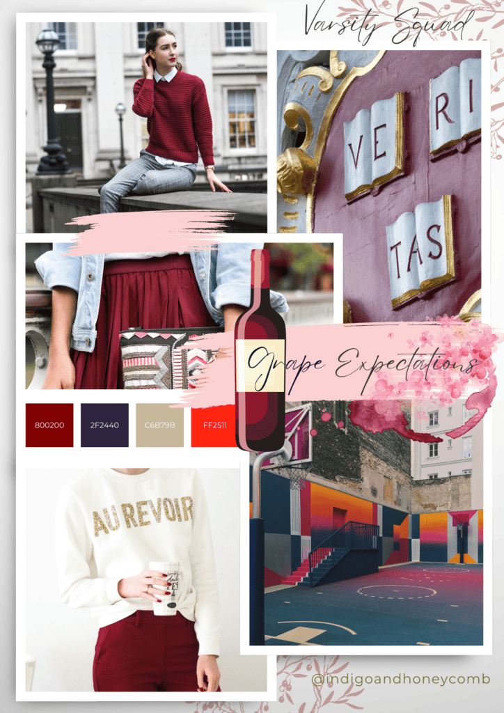
This classic, Ivy League color palette is youthful, yet sophisticated. The regal navy adds depth, while the vivid red amplifies the luxury feel.
Feel free to experiment with these color palettes and adjust them to suit your design needs. Grape Expectations is a versatile shade that can be paired with a wide range of colors to create stunning designs!
Embracing the Warmth of Fall with Grape Expectations
As we’ve explored the richness of Grape Expectations, our September Color of the Month, we’ve uncovered a world of inspiration rooted in the warmth and magic of fall. From its origins in the luxurious Burgundy region to its connections with harvest season, leaf peeping, and cozy traditions, this captivating color embodies the essence of the season. With its versatility in design, from luxury branding to bohemian chic, Grape Expectations invites us to embrace the warmth and nostalgia of fall. As the seasons change, let this enchanting color guide you in creating designs that exude comfort, sophistication, and joy. Welcome the warmth of Grape Expectations into your world and let the cozy traditions of fall be your inspiration.