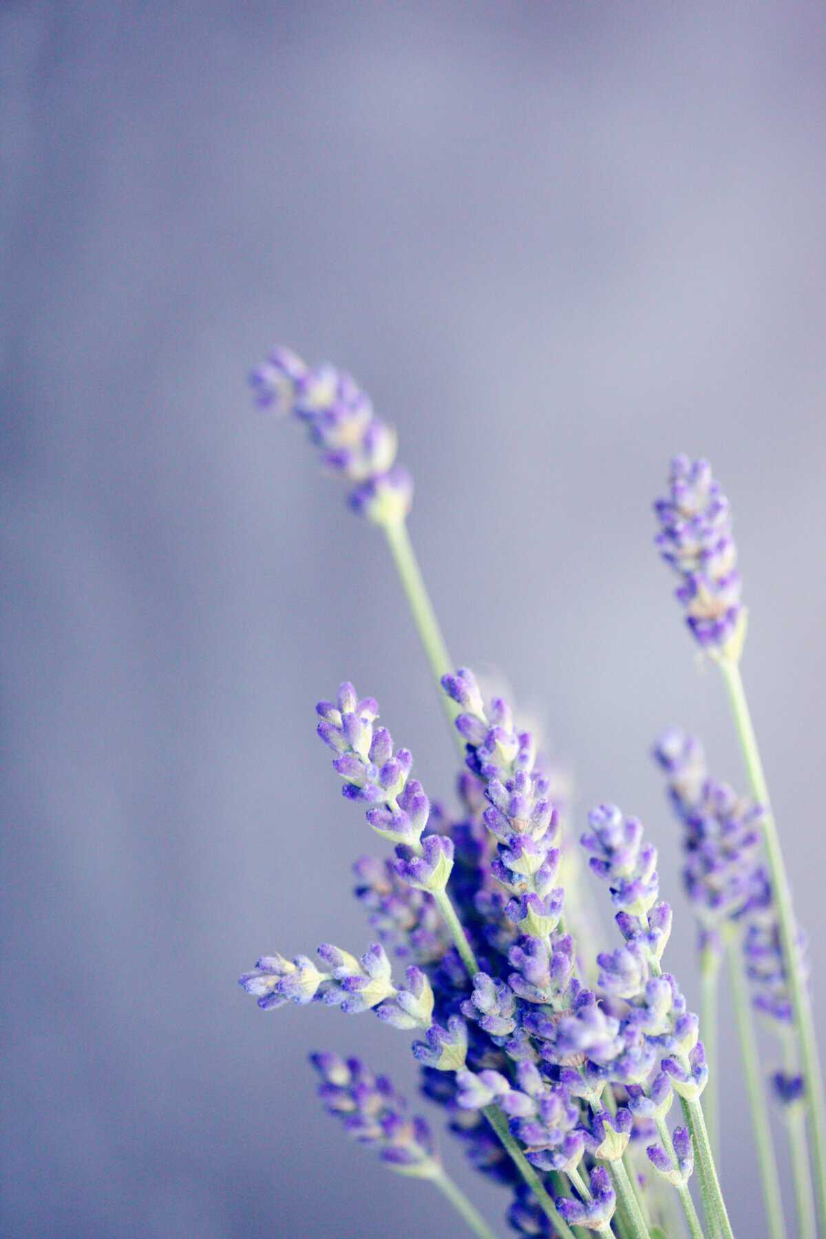
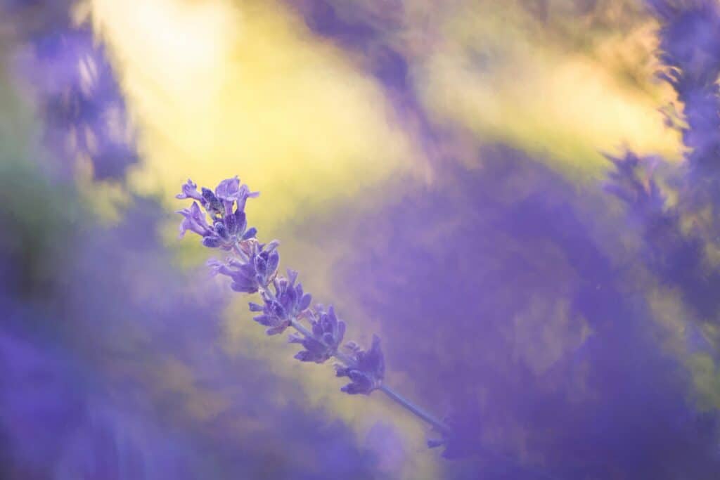
Awakening Serenity: Lovely Lavender Blossoms as April’s Tranquil Hue
As April unfolds its petals, it brings with it a subtle yet enchanting hue that embodies the essence of springtime renewal. Lovely Lavender, with its delicate blend of calmness and vibrancy, takes center stage as the color of the month, evoking a sense of serenity amidst the blooming landscape. So let’s delve into the captivating history of lavender and explore why it’s the perfect choice to usher in the season of rejuvenation.

A Brief History of Lavender
Lavender’s story is as rich and aromatic as the plant itself. With roots tracing back thousands of years, lavender has been cherished for its many uses, from ancient rituals to modern-day aromatherapy. The name “lavender” originated from the Latin word “lavare,” meaning “to wash,” a nod to its early application in bathing rituals by the ancient Romans.
Throughout history, lavender was prized for its medicinal properties, culinary delights, and aromatic allure. From ancient Egypt, where it was used in the embalming process, to medieval Europe, where it adorned royal gardens and perfumed castles, lavender left an indelible mark on cultures worldwide.
Why Lavender for April?
April unveils a spectrum of pastel hues echoing nature’s reawakening. Lovely Lavender, with its soft and soothing tones, emerges as a beacon of tranquility amidst this symphony of colors. Indeed, its gentle purple hue symbolizes renewal, growth, and the promise of a new beginning, making it the perfect embodiment of spring’s spirit.
Lavender communicates and expresses both cheerfulness and serenity in harmonious fashion. In this sense, its qualities work well with both healing, earthly color palettes as well as cheerful, friendly and bolder color palettes.
In a world increasingly influenced by digital escapism, this color serves as a gentle reminder to pause, breathe, and immerse oneself in the present moment. Moreover, its serene allure encourages mindfulness and reflection, offering a respite from the constant barrage of screens and notifications.

The Influence of Digital Escapism
These days, technology permeates every aspect of our lives, so the need for moments of digital detox has never been more pronounced. Lavender, with its calming presence, provides a much-needed sanctuary amidst the chaos of the digital realm. Accordingly, its understated elegance invites us to unplug, unwind, and reconnect with the world around us.
Lavender appeals to both designers and consumers, so it has emerged as a coveted hue, gracing runways, interiors, and digital screens alike. Its ethereal charm adds a touch of sophistication to any space. Furthermore, its versatility allows it to seamlessly blend with a variety of palettes.

Color Palette Inspiration
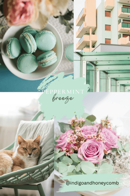
In contemporary design, lavender has become a versatile staple in color palettes, offering a sophisticated yet soothing touch to various settings. When paired with soft neutrals such as whites, grays, and creams, lavender exudes a sense of elegance and tranquility, making it ideal for creating serene living spaces or cozy bedrooms. For a bolder statement, combining this hue with complementary hues like mint green or dusty rose can infuse a room with a playful yet sophisticated vibe, perfect for adding personality to modern interiors.
Additionally, in digital design and branding, lavender can evoke a sense of creativity and innovation when paired with crisp whites or deep blues, making it a popular choice for websites, social media themes, and marketing materials. Whether used as a subtle accent or as the main attraction, lavender continues to inspire designers to explore new possibilities in color harmonies and aesthetics.

The Versatility in Interior Design
In interior design, lavender offers a versatile and calming palette that can be incorporated in various ways to enhance the ambiance of a space. One approach is to use lavender as a dominant color for walls or large furniture pieces, creating a serene backdrop that sets a tranquil tone throughout the room. For those seeking a more subtle touch, accents such as throw pillows, curtains, or artwork featuring hints of lavender can add pops of color and visual interest without overwhelming the space. Mixing lavender with complementary colors like soft greens, blues, or neutrals can create a harmonious and balanced look, while bold contrasts with darker shades like charcoal or navy can make a striking statement.
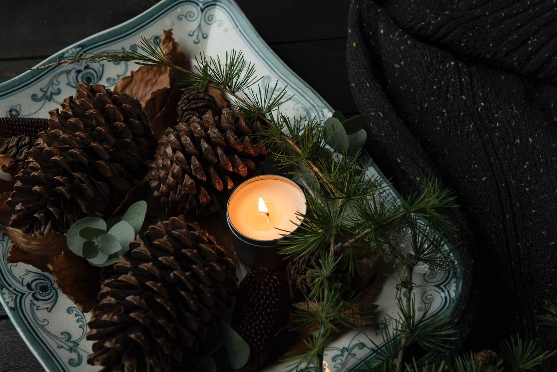
Additionally, integrating natural elements such as fresh lavender sprigs, botanical prints, or textured fabrics can further evoke a sense of tranquility and bring the beauty of the outdoors inside. Whether used sparingly or as a focal point, incorporating lavender into interior design can infuse any space with a timeless elegance and soothing atmosphere.

Final Thoughts
As we transition into April and witness nature’s revival, let’s appreciate the calming essence of Lovely Lavender. Whether it’s adding touches to our living spaces, incorporating it into our fashion choices, or integrating it into our digital environments, let this color prompt us to take a moment, breathe deeply, and cherish the present. In a fast-paced world, embracing moments of stillness can be revolutionary in fostering a sense of peace and contentment amidst the chaos.