Techniques to Ensure Your Designs Are Visually Engaging
Welcome back to Indigo & Honeycomb COLOR LAB! In our previous articles, we’ve covered various aspects of color theory, including color harmonies, psychology of color, and choosing a base color. Today, we’ll focus on creating contrast, a vital element in any design. Contrast not only enhances visual interest but also improves readability and helps to highlight key elements. Let’s explore how to create contrast effectively in your designs.
What is Contrast?
Contrast refers to the difference between two or more elements in a design. This difference can be in color, size, shape, texture, or other properties. Effective use of contrast makes your designs more dynamic, directs viewers’ attention, and ensures that your message is communicated clearly.
Techniques for Creating Contrast
- Color Contrast
- Size Contrast
- Shape and Form Contrast
- Texture Contrast
- Space and Position Contrast
Let’s dive into each technique and how you can apply it to your designs.
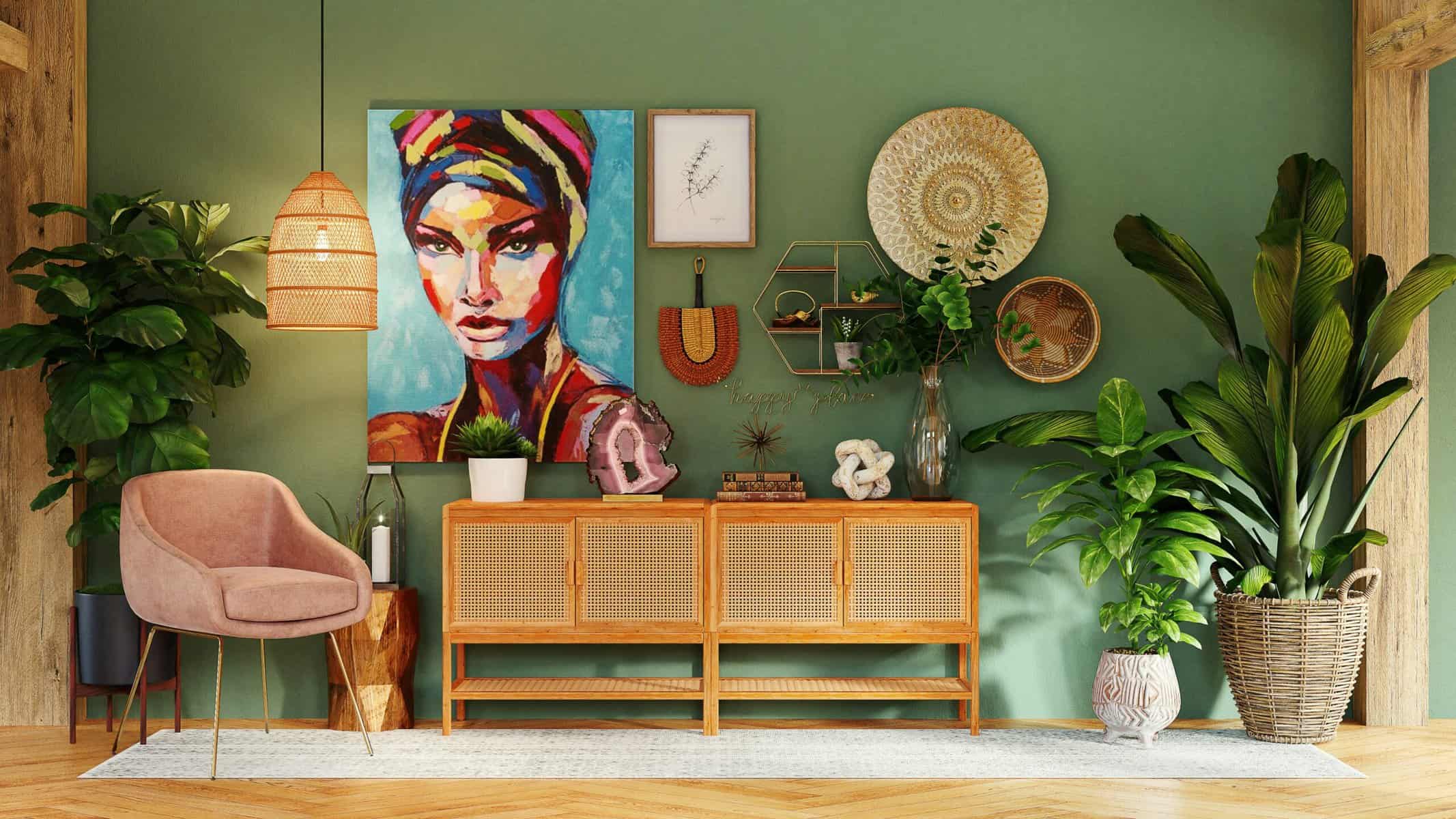
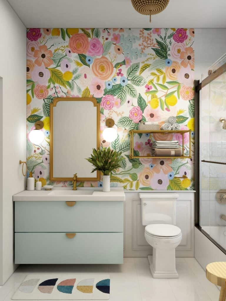
1. Color Contrast
Color contrast is one of the most powerful ways to create visual interest. It involves using colors that are significantly different from each other.
- Complementary Colors: Use colors opposite each other on the color wheel, such as blue and orange or red and green. This creates a vibrant and high-energy contrast.
- Light vs. Dark: Pair light colors with dark colors to create a striking contrast. This is particularly effective for smaller spaces.
- Warm vs. Cool: Combine warm colors (reds, oranges, yellows) with cool colors (blues, greens, purples) to create a balanced yet contrasting look.
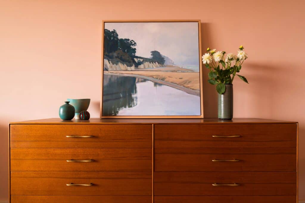
Example: Use a bright floral wall covering on a crisp white background to draw attention.
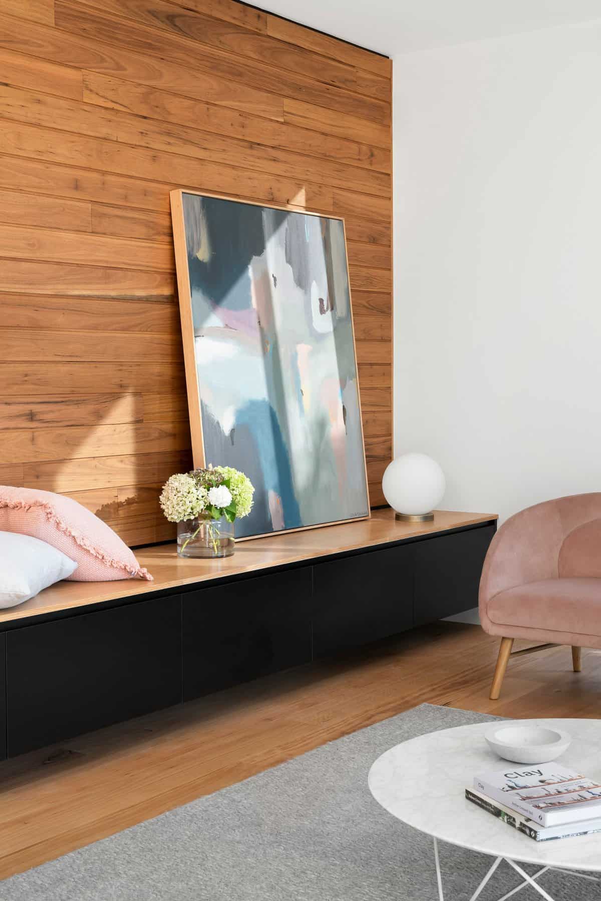
2. Size Contrast
Varying the size of elements in your design can create a focal point and emphasize important information.
- Large vs. Small: Use different sizes of main furnishings in a room to create a visual hierarchy.
- Scaling Elements: Increase the size of key elements, such as artwork or area rugs, to make them stand out.
Example: In interior design, use a large, bold piece of artwork to draw attention, followed by smaller decor accents for added layers and to emphasize a design aesthetic.
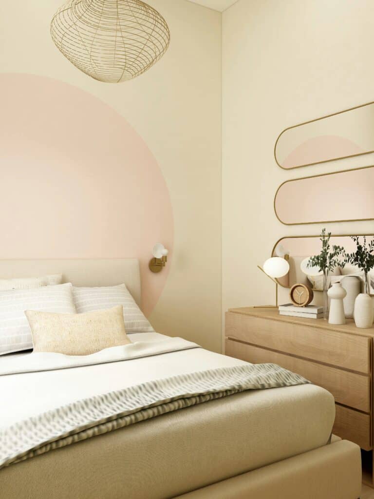
3. Shape and Form Contrast
Using different shapes and forms can create a dynamic and engaging design.
- Geometric vs. Organic: Combine geometric shapes (squares, circles) with organic shapes (freeform, irregular shapes) to add interest.
- Hard vs. Soft Edges: Use a mix of sharp, angular shapes with soft, rounded shapes for a balanced contrast.
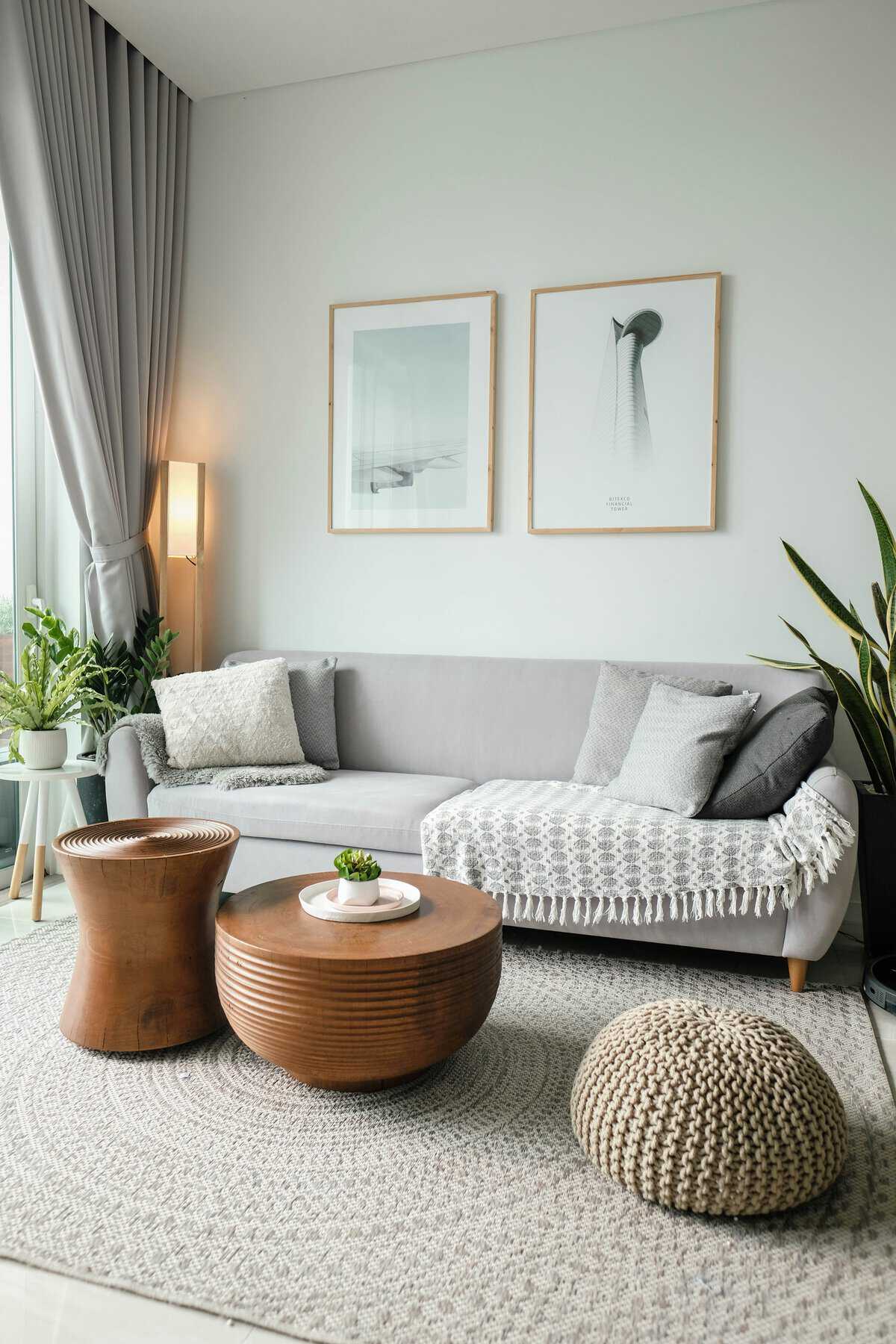
Example: In a space, use circular shapes to highlight key points against rectangular furnishings.
4. Texture Contrast
Texture contrast adds depth and tactile interest to your designs, making them more engaging.
- Smooth vs. Rough: Combine smooth, glossy textures with rough, matte textures to create a tactile contrast.
- Pattern vs. Solid: Use patterned elements against solid backgrounds to create visual intrigue.
Example: In an interior design, pair a sleek, shiny table with a rough, textured rug to create a cozy yet modern look.
5. Space and Position Contrast
Effective use of space and positioning can guide the viewer’s eye and highlight important elements.
- Positive vs. Negative Space: Use negative space (empty space) to let key elements breathe and stand out.
- Alignment: Vary the alignment of elements (left, right, centered) to create a dynamic layout.
Example: In design, create space around a central piece of furniture or art to draw attention to it and create a clean, uncluttered look.
Tips for Effective Contrast
- Consistency: Maintain consistency in your contrast choices to avoid a chaotic look. Stick to a few contrasting elements rather than overloading your design.
- Balance: Ensure that contrast is balanced and doesn’t overwhelm the viewer. Too much contrast can be jarring, while too little can be boring.
- Purpose: Use contrast with a purpose. Every contrast choice should help convey your message more effectively.
Final Thoughts
Creating contrast is essential for making your designs visually engaging and effective. By using techniques such as color contrast, size contrast, shape and form contrast, texture contrast, and space and position contrast, you can create dynamic and compelling designs that capture attention and communicate your design message clearly.
Stay tuned for more insightful articles from Indigo & Honeycomb COLOR LAB as we continue to explore the fascinating world of color and design. Next, we’ll share practical tips on how to create cohesive and balanced color palettes for your projects.
Happy designing!