Understanding Primary, Secondary, and Tertiary Colors
Welcome to Indigo & Honeycomb COLOR LAB! Today, we’re diving into the foundational principles of color theory, starting with the color wheel. Understanding the basics of this tool is essential for anyone involved in design, art, or any field where color plays a crucial role. Let’s explore the primary, secondary, and tertiary colors and how they interact to create visually appealing designs.
What is the Color Wheel?
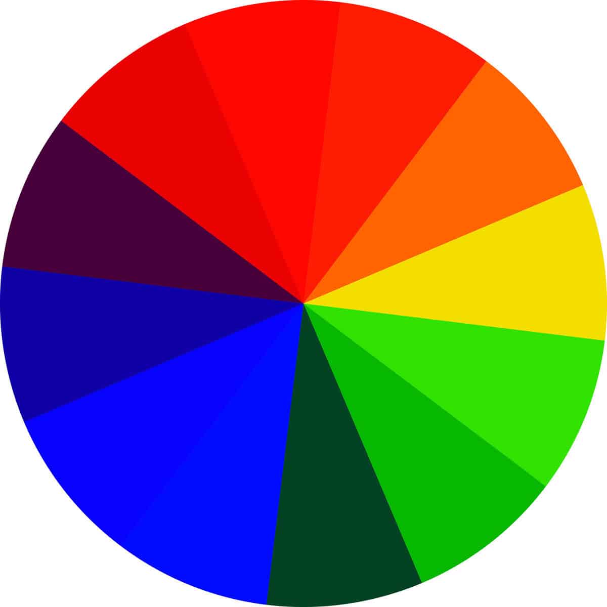
The color wheel is a circular diagram that represents the relationships between colors. It was first developed by Sir Isaac Newton in the 17th century and has since become a fundamental tool in color theory. It helps us understand how colors mix, relate to each other, and work together to create harmonious designs.
Primary Colors
Primary colors are the building blocks of all other colors. They cannot be created by mixing other colors together. In the traditional color wheel, the primary colors are:
- Red
- Yellow
- Blue
These colors are positioned equidistant from each other on the color wheel. They are the source of all other colors through various combinations and mixtures.
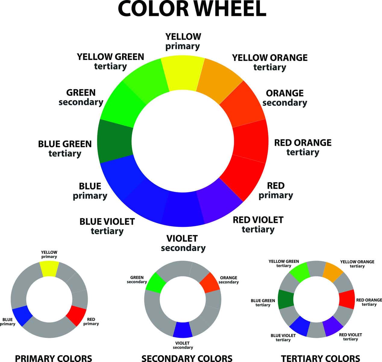
Secondary Colors
Secondary colors are created by mixing two primary colors in equal parts. On the traditional color wheel, the secondary colors are:
- Green (Yellow + Blue)
- Orange (Red + Yellow)
- Purple (Blue + Red)
These colors are located between the primary colors on the color wheel, forming a triangle that connects each primary color.
Tertiary Colors
Tertiary colors, also known as intermediate colors, are created by mixing a primary color with a secondary color. These colors have two-part names, combining the names of the primary and secondary colors used to create them. The tertiary colors are:
- Red-Orange (Red + Orange)
- Yellow-Orange (Yellow + Orange)
- Yellow-Green (Yellow + Green)
- Blue-Green (Blue + Green)
- Blue-Purple (Blue + Purple)
- Red-Purple (Red + Purple)
Tertiary colors are positioned between the primary and secondary colors on the color wheel, filling the gaps and creating a more nuanced spectrum of hues.
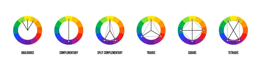
Using the Color Wheel in Design
Understanding the color wheel allows you to create visually appealing and harmonious designs. Here are some key concepts to keep in mind:
- Complementary Colors: These are colors that are opposite each other (e.g., red and green, blue and orange). Using complementary colors can create high contrast and vibrant designs.
- Analogous Colors: These are colors that are next to each other (e.g., blue, blue-green, green). Analogous color schemes are harmonious and pleasing to the eye, often found in nature.
- Triadic Colors: This scheme uses three colors that are evenly spaced around the color wheel (e.g., red, yellow, blue). Triadic color schemes are vibrant and balanced, providing a strong visual contrast while maintaining harmony.
- Split-Complementary Colors: This scheme involves a base color and two colors adjacent to its complementary color (e.g., blue with red-orange and yellow-orange). It offers high contrast with less tension than a complementary color scheme.
Final Thoughts
Mastering the basics of the color wheel is a crucial step in becoming proficient in color theory. By understanding primary, secondary, and tertiary colors, you can create more effective and visually appealing designs. Whether you’re working on a graphic design project, painting, or interior decorating, this tool will be an invaluable tool in your creative arsenal.
Stay tuned for more articles from Indigo & Honeycomb COLOR LAB as we continue to explore the fascinating world of color. Next, we’ll dive into color harmonies and how to create cohesive and captivating color schemes for your projects.
Happy designing!