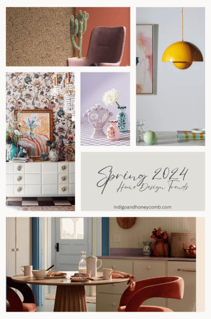
Color has the power to transform spaces, evoke emotions, and create a sense of harmony in our surroundings. Whether designing interiors, curating a fashion collection, building a brand identity, or drawing inspiration from nature, mastering the art of color pairing is essential. In this guide, we explore the principles of color theory and practical strategies for crafting stunning palettes that inspire and captivate.

The Foundations of Color Harmony
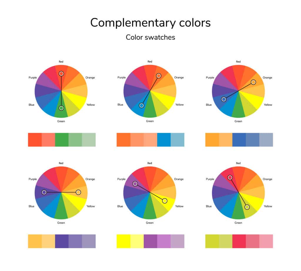
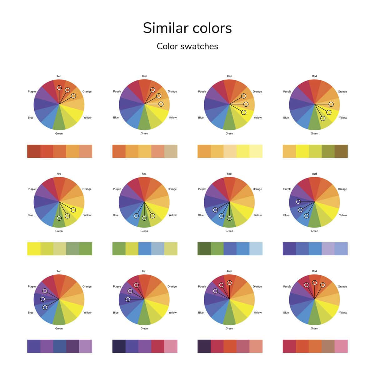
Understanding the fundamentals of color is the first step in achieving cohesive and impactful designs. The color wheel, a tool used by artists and designers alike, serves as a roadmap for pairing hues effectively.
- Complementary Colors: These are positioned opposite each other on the color wheel, such as blue and orange or red and green. This contrast creates a dynamic and visually striking effect.
- Analogous Colors: Found next to each other on the color wheel, these hues—such as teal, blue, and violet—offer a seamless and harmonious look.
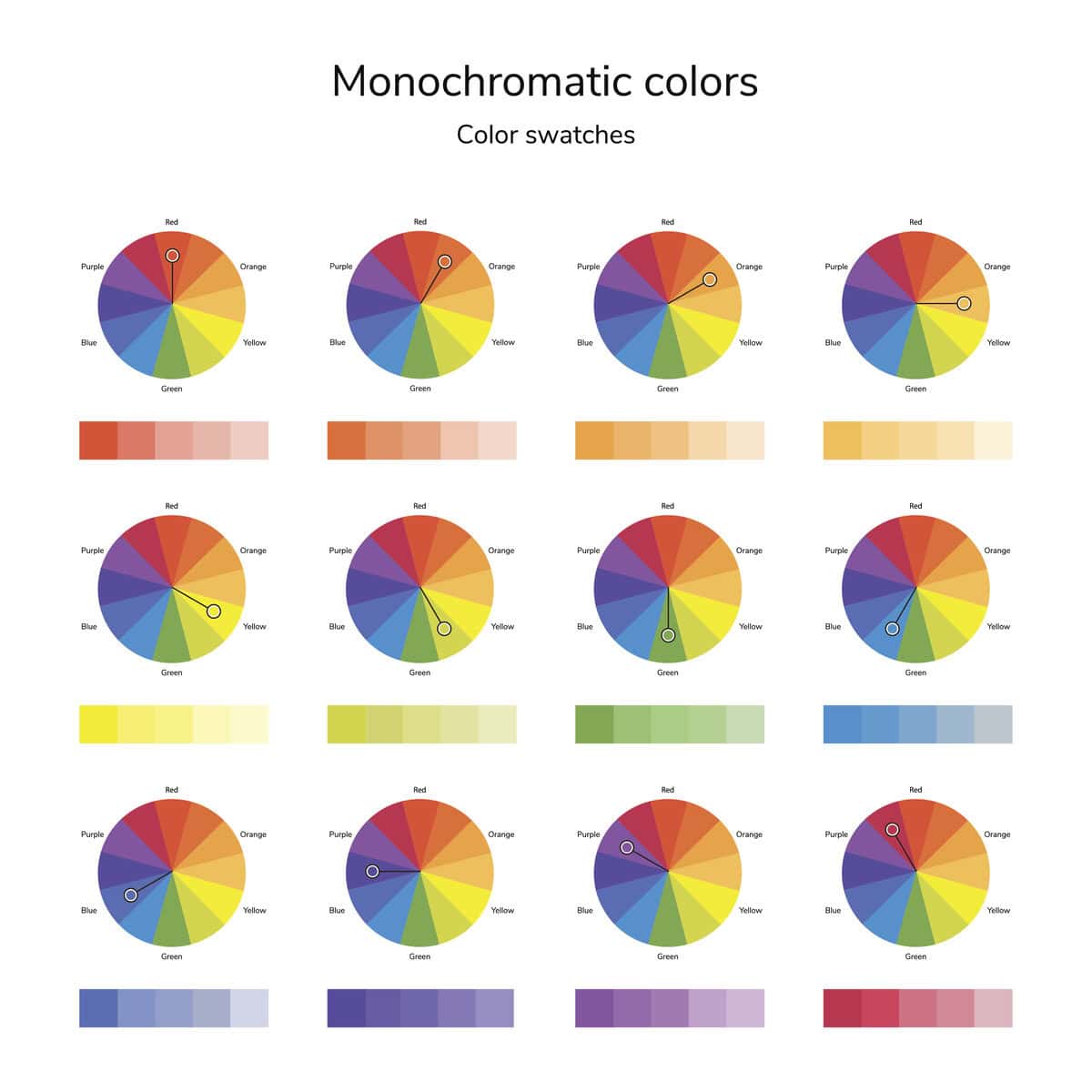
- Monochromatic Schemes: Using variations of a single color, this approach brings depth and elegance while maintaining a sophisticated simplicity.
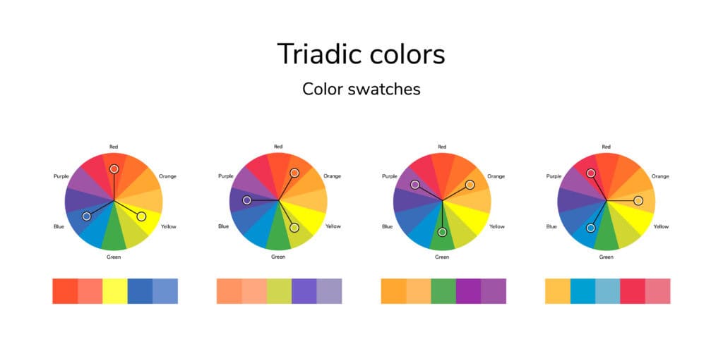
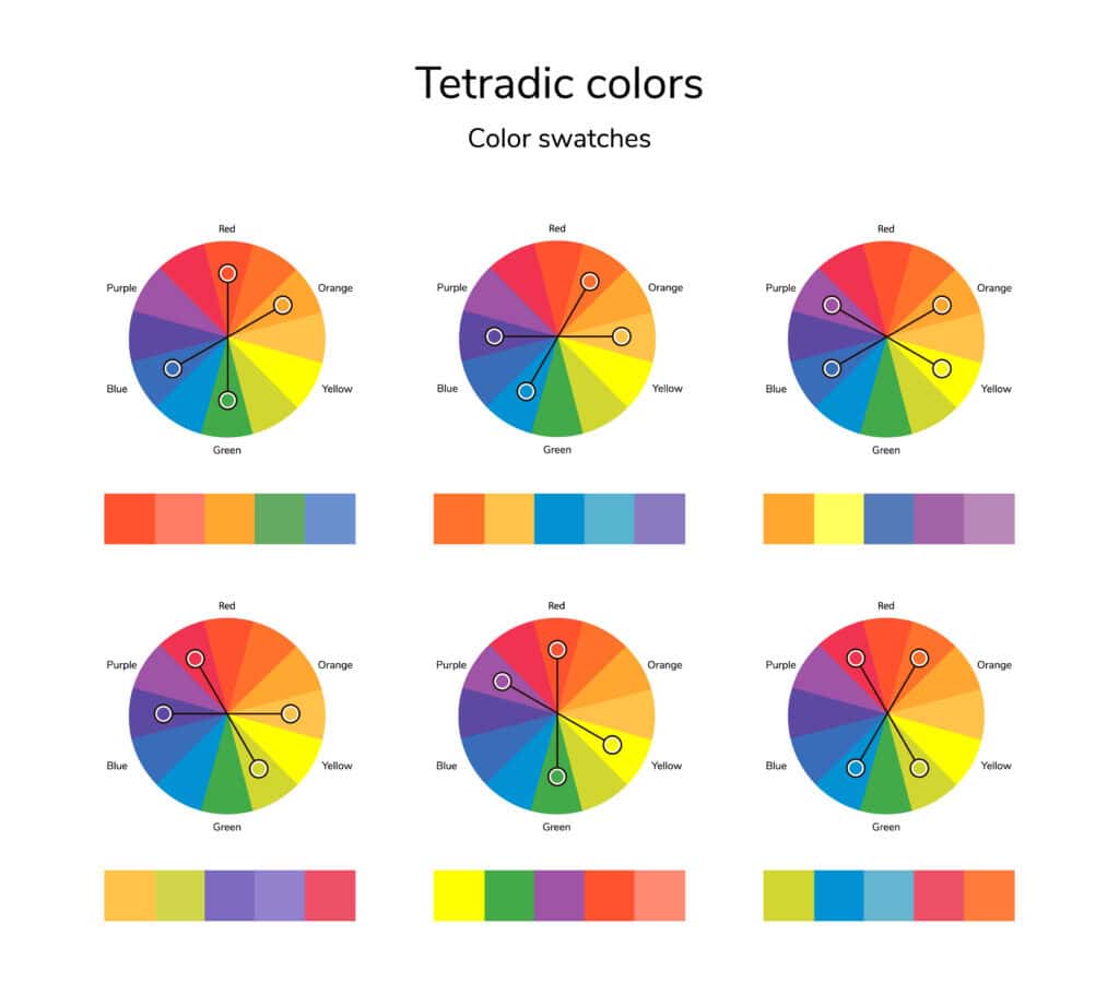
- Triadic and Tetradic Palettes: These combinations balance vibrancy and contrast, ensuring a dynamic yet cohesive aesthetic.
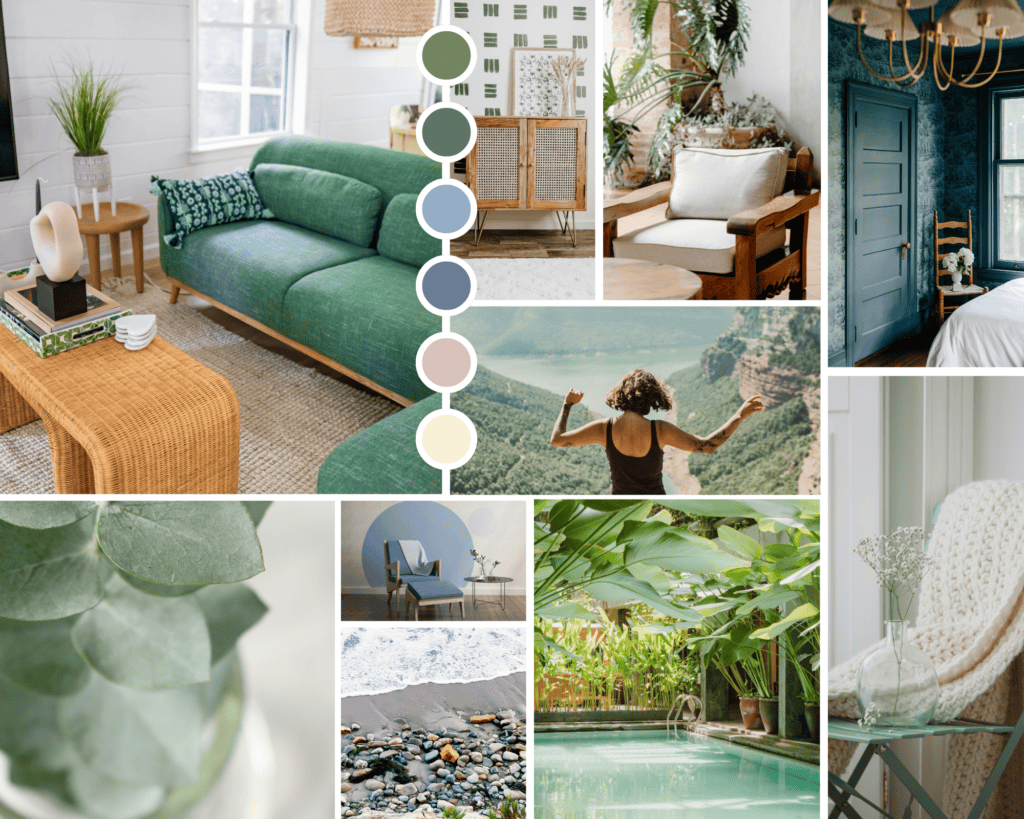
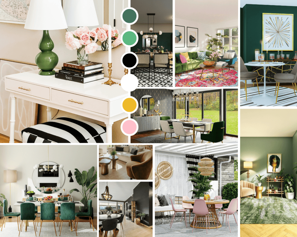
Color Pairing in Interior Design
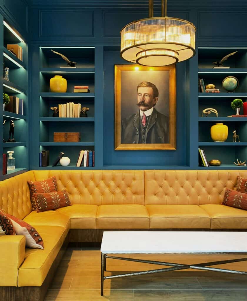
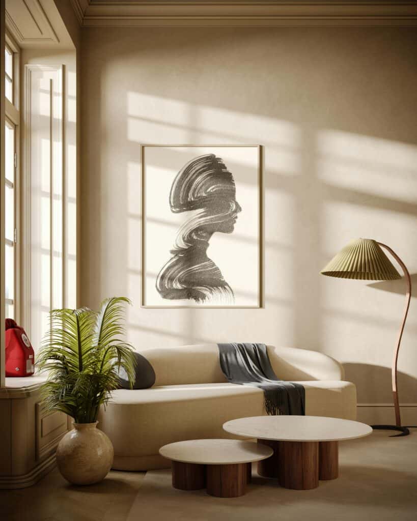
Interior designers leverage color to set moods and define spaces. Soft neutrals like beige and warm gray create serene environments, while bold pairings—such as deep navy and mustard yellow—inject energy and character. Texture and lighting also influence how colors appear, making material selection a crucial consideration in home styling.
- Texture & Material Influence: Different materials absorb and reflect light differently, altering how colors appear. Matte surfaces soften colors, while glossy finishes enhance vibrancy. For example, a velvet emerald green sofa exudes luxury, whereas a linen version of the same color appears more muted and relaxed.
- Lighting Considerations: Natural light changes throughout the day, affecting color perception. North-facing rooms tend to amplify cooler tones, while warm lighting enhances earth tones and soft neutrals. Testing color swatches under various lighting conditions ensures the desired effect is achieved.
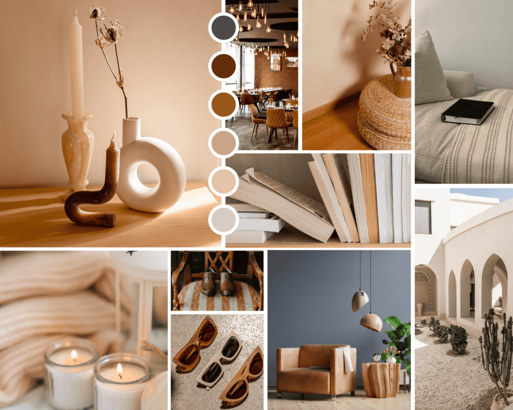
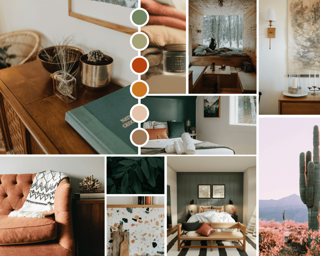
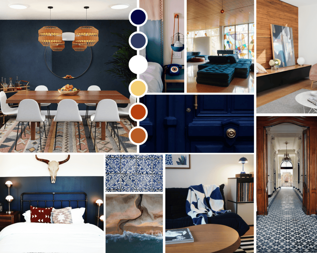
- Designer-Approved Color Palettes:
- Timeless Neutrals: Warm beige, taupe, soft white, and charcoal gray
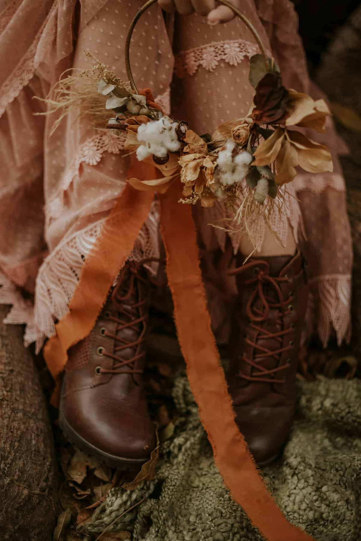
- Earthy Elegance: Olive green, terracotta, ochre, and warm brown
- Modern Contrast: Deep navy, crisp white, mustard yellow, and rust red
- Serene Retreat: Sage green, dusty blue, warm sand, and ivory
- Bold & Sophisticated: Emerald green, black, gold, and deep plum
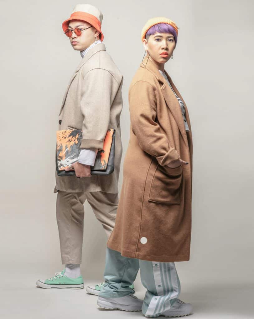
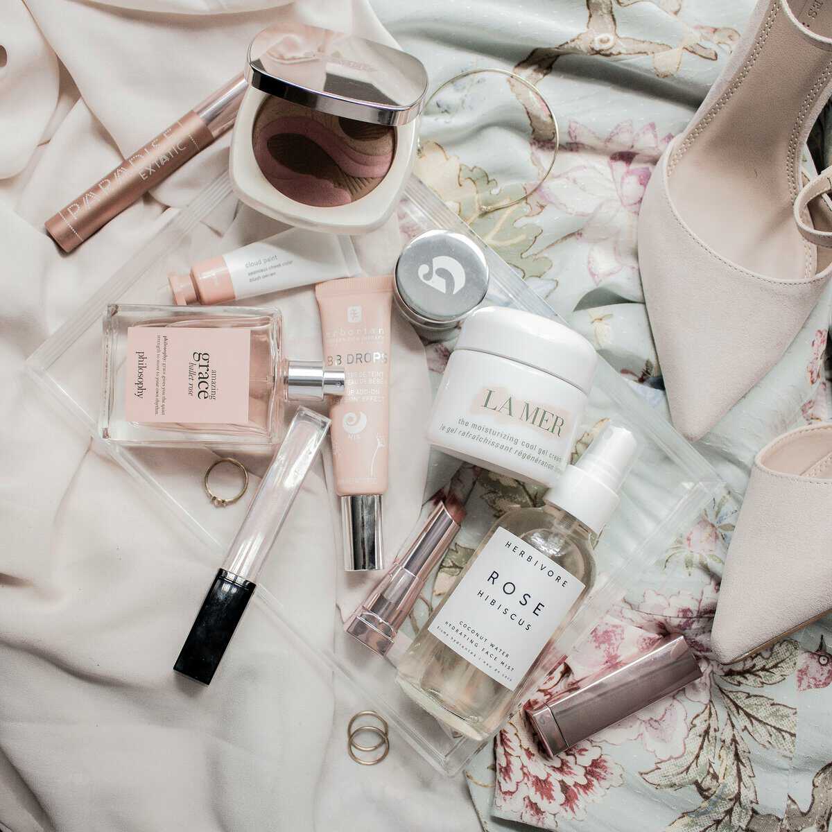
Fashion & Personal Style
Fashion is a canvas for color experimentation. Classic combinations like black and white exude timeless elegance, while trend-driven pairings—think lavender and chartreuse—make bold statements. Understanding how different hues interact with skin tones, fabrics, and seasonal trends ensures a wardrobe that feels both intentional and expressive.

- Skin Tone Considerations:
- Cool Undertones: Best complemented by jewel tones like sapphire blue, emerald green, and rich purples. Soft pastels like powder blue and icy pink also enhance cool skin tones.
- Warm Undertones: Earthy hues like terracotta, mustard yellow, and olive green enhance warm skin tones. Rich shades like deep red and warm coral add vibrancy.
- Neutral Undertones: Those with neutral undertones can experiment widely, balancing both cool and warm hues—think classic camel, soft white, navy blue, and dusty rose.
- Fabric & Texture Influence:
- Light, airy fabrics like chiffon and silk soften bright colors, making them more wearable.
- Rich, textured fabrics like velvet, wool, and tweed intensify deeper colors, creating a luxurious look.
- Matte fabrics subdue bold colors, while shiny or satin finishes enhance vibrancy.
- Seasonal Color Trends:
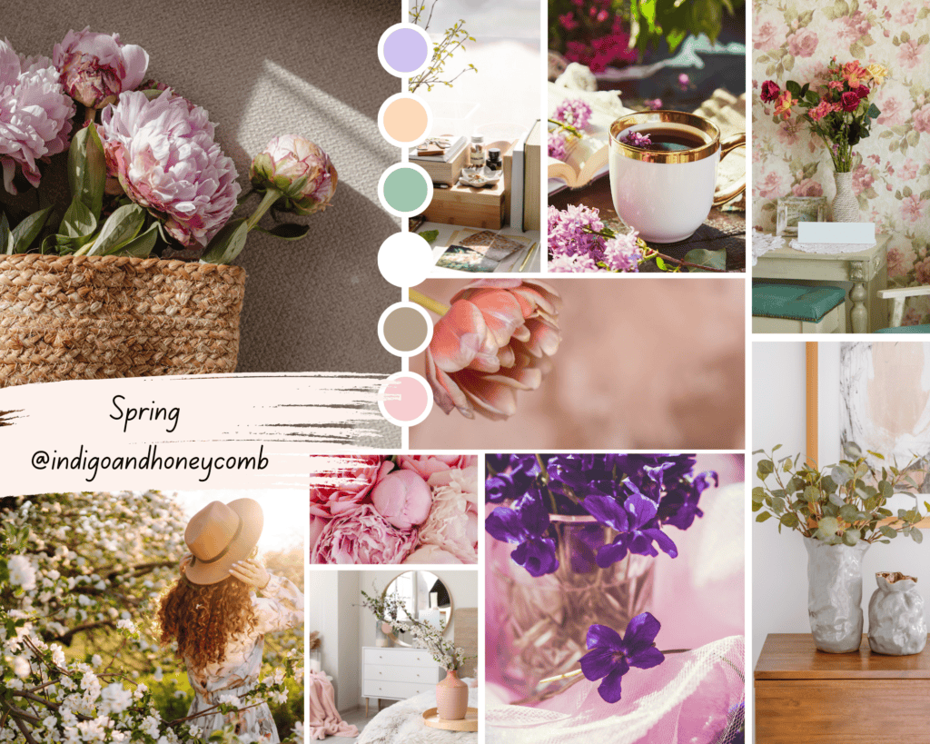
- Spring: Soft pastels (lavender, peach, mint green) and fresh neutrals (warm white, taupe).
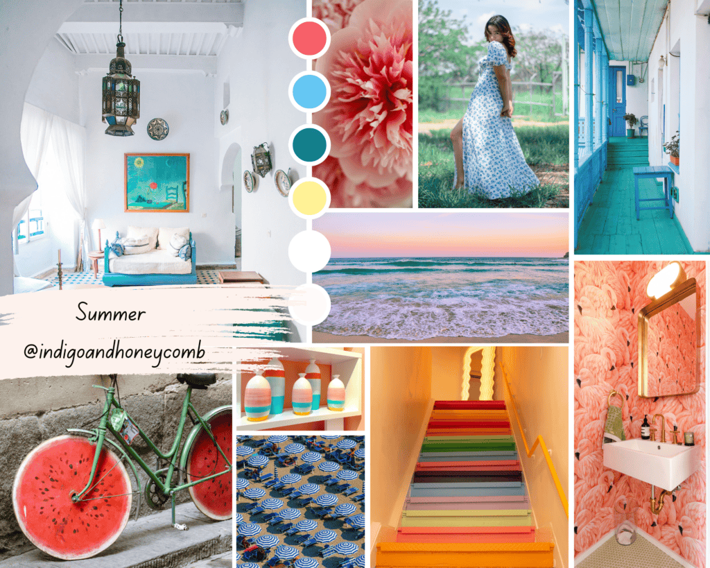
- Summer: Bright, saturated hues (coral, turquoise, lemon yellow) alongside breezy whites.
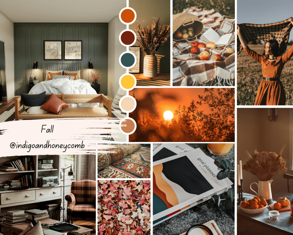
- Autumn: Deep, earthy tones (rust, burgundy, forest green) paired with warm neutrals.
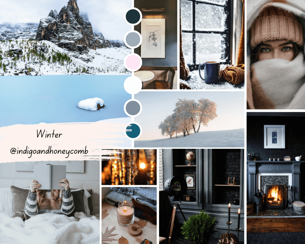
- Winter: Cool, dramatic shades (midnight blue, charcoal, icy gray) with metallic accents.
- Designer-Approved Color Palettes:
- Parisian Chic: Black, cream, navy, and deep red
- Bohemian Luxe: Burnt orange, mustard yellow, olive green, and rich brown
- Modern Minimalist: Soft gray, white, camel, and muted blush
- Bold & Playful: Fuchsia, cobalt blue, lemon yellow, and teal
- Timeless Elegance: Emerald green, champagne gold, midnight blue, and warm ivory
Branding & Visual Identity
Color plays a pivotal role in brand recognition and messaging. Companies strategically use palettes to communicate emotions—calm blues for trust, fiery reds for passion, and earthy tones for sustainability. Successful brands maintain color consistency across their digital and physical presence, reinforcing their identity with every visual touchpoint.
- How Companies Use Color to Communicate:
- Trust & Professionalism: Many banks and tech companies, such as Chase and IBM, use blue tones to convey reliability.
- Luxury & Sophistication: Black and gold, seen in brands like Chanel and Rolex, evoke prestige and elegance.
- Energy & Excitement: Red, found in brands like Coca-Cola and Target, creates a sense of urgency and enthusiasm.
- Eco-Friendly & Organic Appeal: Green is used by companies like Whole Foods and Starbucks to signify sustainability.
- Minimalist & Modern: Neutral palettes with white, black, and gray, as used by Apple and Tesla, highlight sleek innovation.
- Branding Go-To Color Palettes:
- Corporate Confidence: Navy blue, steel gray, and crisp white (e.g., IBM, Visa)
- Elegant Luxury: Black, gold, and deep burgundy (e.g., Chanel, Rolex)
- Energetic & Playful: Bright red, yellow, and bold white (e.g., McDonald’s, Lego)
- Natural & Sustainable: Olive green, warm brown, and soft beige (e.g., Whole Foods, Patagonia)
- Innovative Minimalism: Charcoal gray, silver, and stark white (e.g., Apple, Tesla)
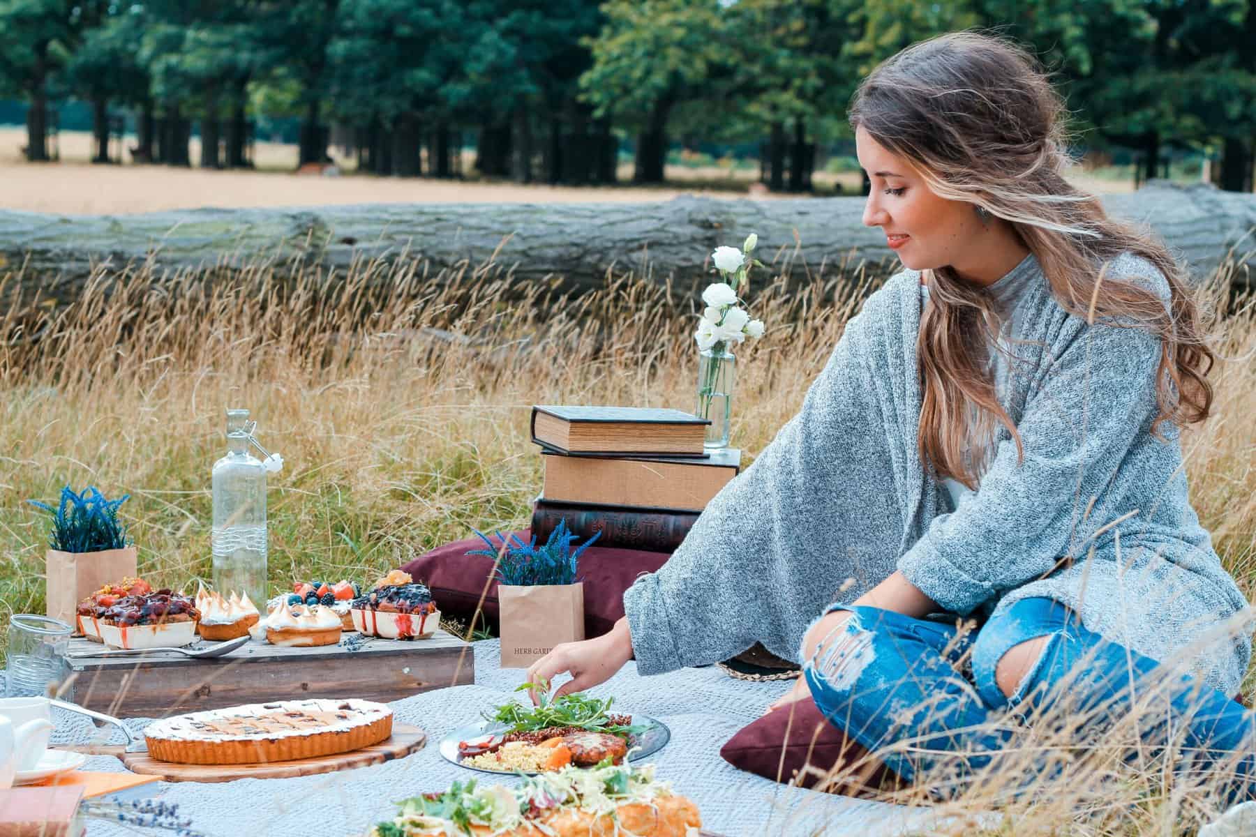
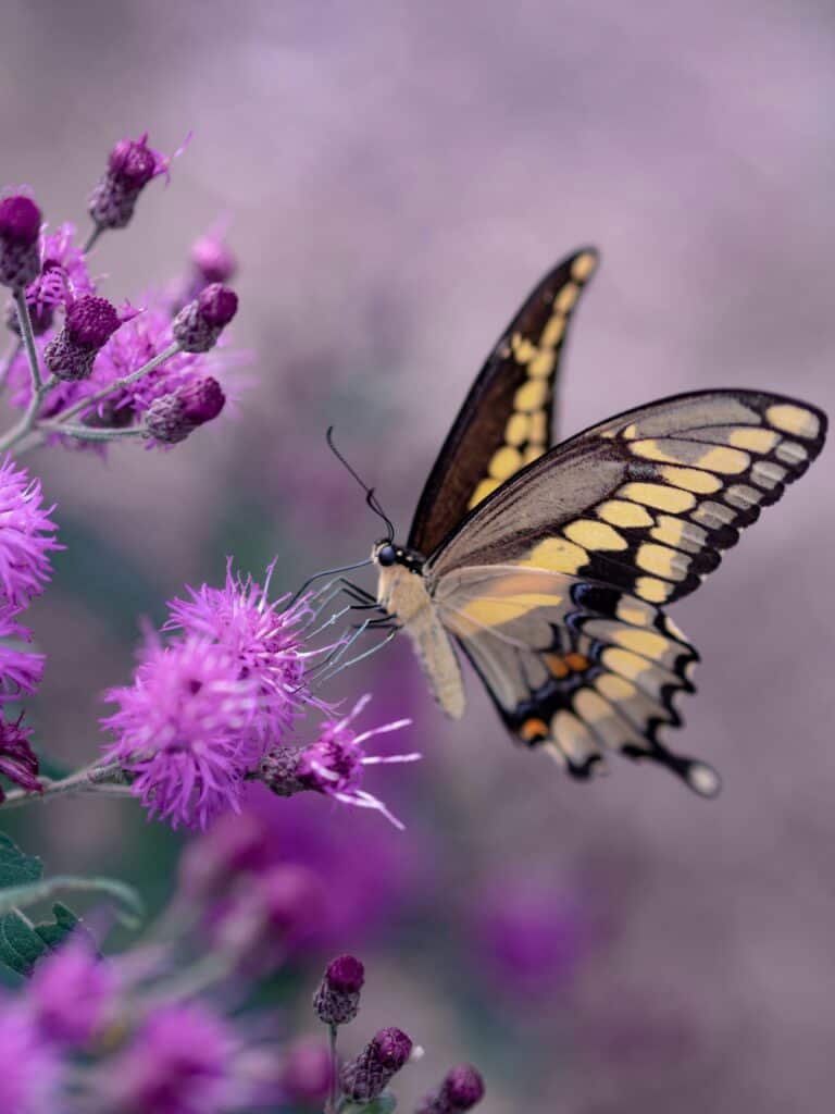
Nature-Inspired Combinations
Some of the most stunning color pairings come directly from nature. From the rich contrast of a sunset’s fiery oranges and purples to the muted elegance of moss green and stone gray, the natural world offers endless inspiration. Observing landscapes, flowers, and even wildlife can spark fresh ideas for design and decor.
- Seasonal Shifts in Color: The hues of nature change with the seasons, influencing our perception of warmth and coolness in design. Spring introduces fresh pastels and lively greens, summer is dominated by vibrant blues and bright yellows, autumn embraces deep earth tones, and winter brings icy blues, soft grays, and deep jewel tones.
- Texture and Depth in Nature: The softness of petals, the roughness of bark, the shimmer of ocean waves—these textures affect how colors are perceived. Translating this into design means considering fabric finishes, material surfaces, and layering techniques for maximum impact.
- Lighting in the Natural World: Sunlight, moonlight, and shadows alter how colors appear. Just as golden hour enhances warm tones, cool overcast skies bring out muted shades. Understanding natural lighting effects helps in selecting the right colors for interior spaces and photography.
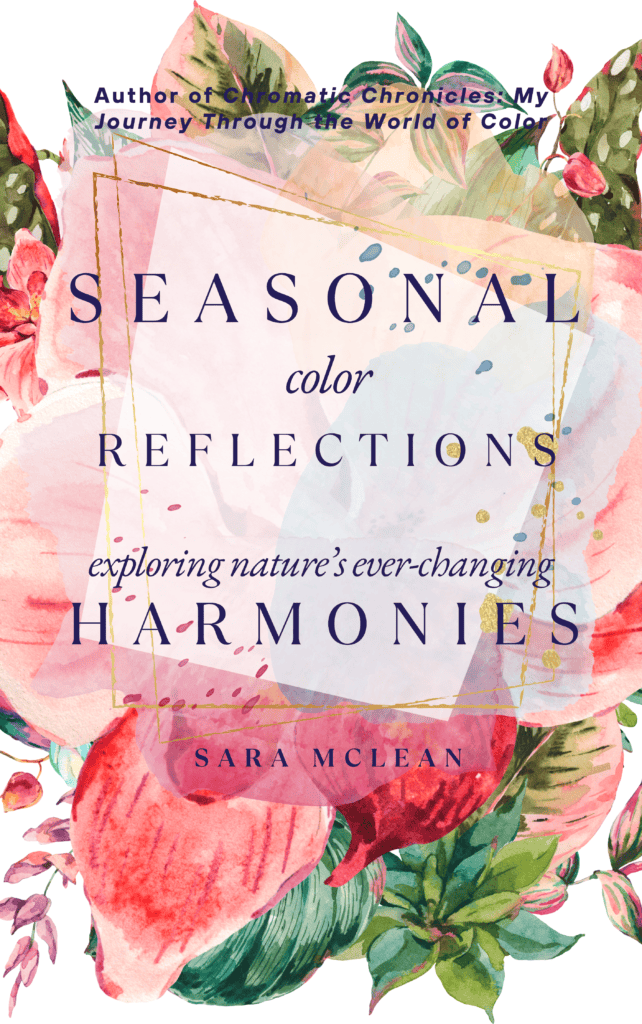
For a deeper exploration of how nature influences color harmonies across seasons, my book Seasonal Color Reflections: Exploring Nature’s Ever-Changing Harmonies delves into the nuances of nature-inspired palettes, offering research and visual examples to guide your color journey.
Developing Your Signature Palette
Finding your personal color signature requires exploration and creativity. Start by gathering inspiration from nature, art, travel, and personal memories. Experiment with mood boards, fabric swatches, and digital color tools to visualize different combinations. Research color psychology and cultural influences to ensure your palette aligns with your aesthetic and emotional preferences.
Testing colors in real-life settings—whether through wardrobe choices, home decor, or digital design—will help refine your unique signature. Trust your instincts and embrace the journey of discovering colors that truly resonate with you.
Conclusion
Mastering the art of color pairing unlocks limitless creative possibilities. Whether in interiors, fashion, branding, or nature-inspired designs, understanding the principles of color harmony empowers you to craft visually stunning compositions. This guide serves as the foundation for a journey into the transformative world of color—a journey that will eventually evolve into an inspiring book on the subject.