Creating Visually Appealing Color Schemes
Welcome back to Indigo & Honeycomb COLOR LAB! In our previous article, we explored the basics of the color wheel and the different types of colors. Today, we’re delving into the world of color harmony. Understanding color harmony is essential for creating visually appealing and cohesive designs. Let’s explore the different types of color harmonies and how you can use them to elevate your design projects.
What are Color Harmonies?
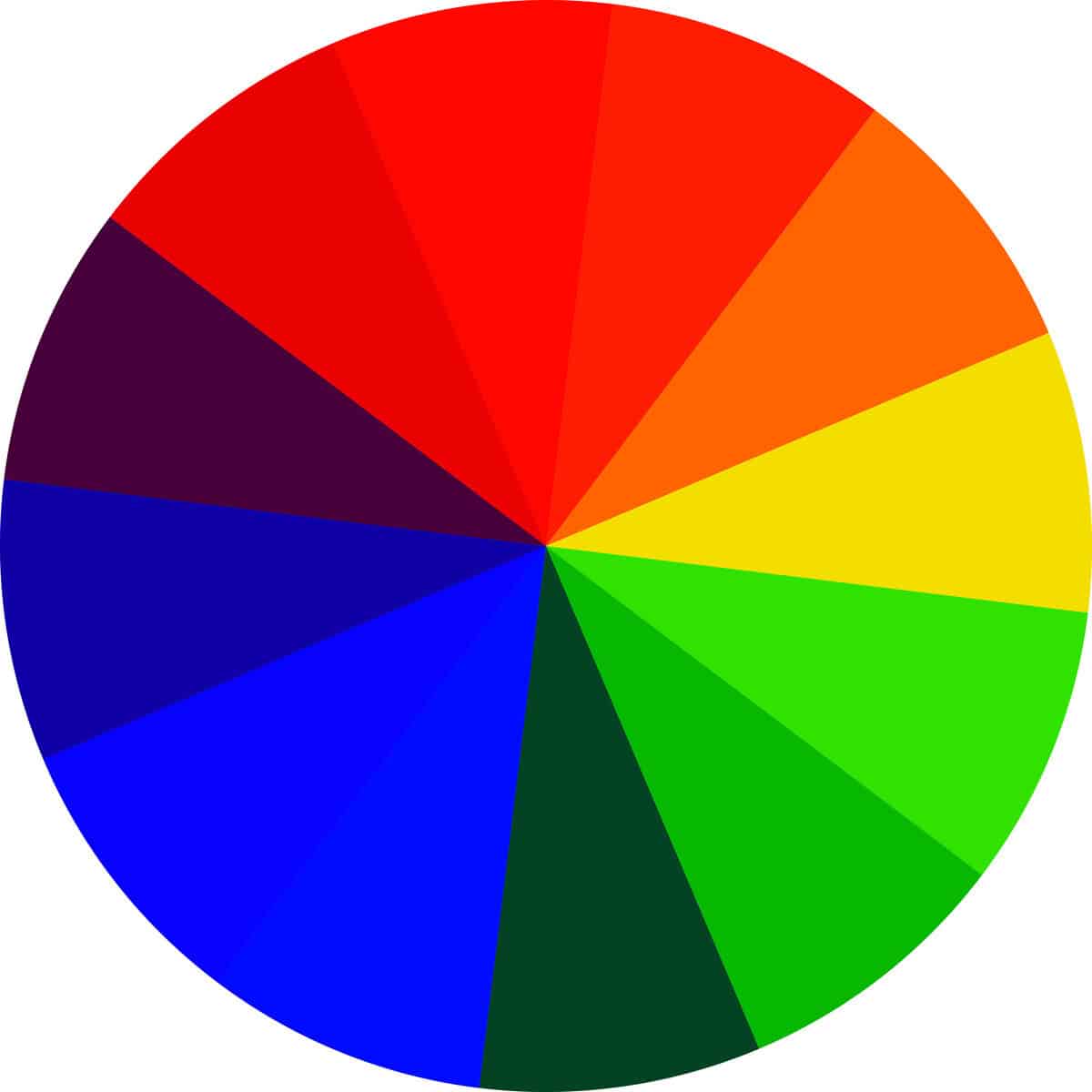
Color harmony refers to specific combinations of colors that are visually pleasing and create a sense of balance and order. These harmonious combinations are derived from the color wheel and can be used to evoke various emotions, set a mood, or highlight certain aspects of a design.
Types of Color Harmonies
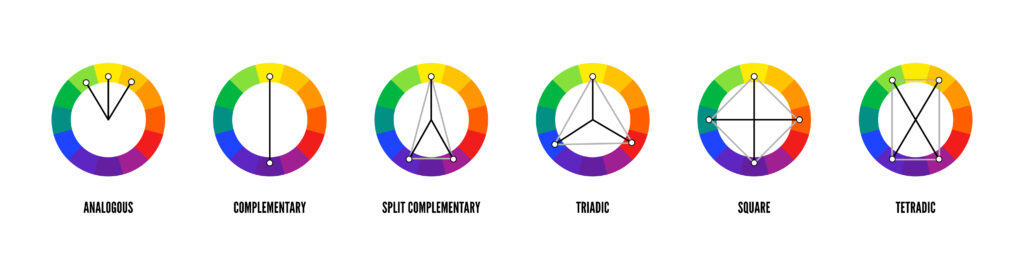
There are several types of color harmonies that designers commonly use:
- Monochromatic Color Scheme
- Analogous Color Scheme
- Complementary Color Scheme
- Split-Complementary (Dual) Color Scheme
- Triadic Color Scheme
- Tetradic (Double Complementary) Color Scheme
Let’s explore each of these in detail.
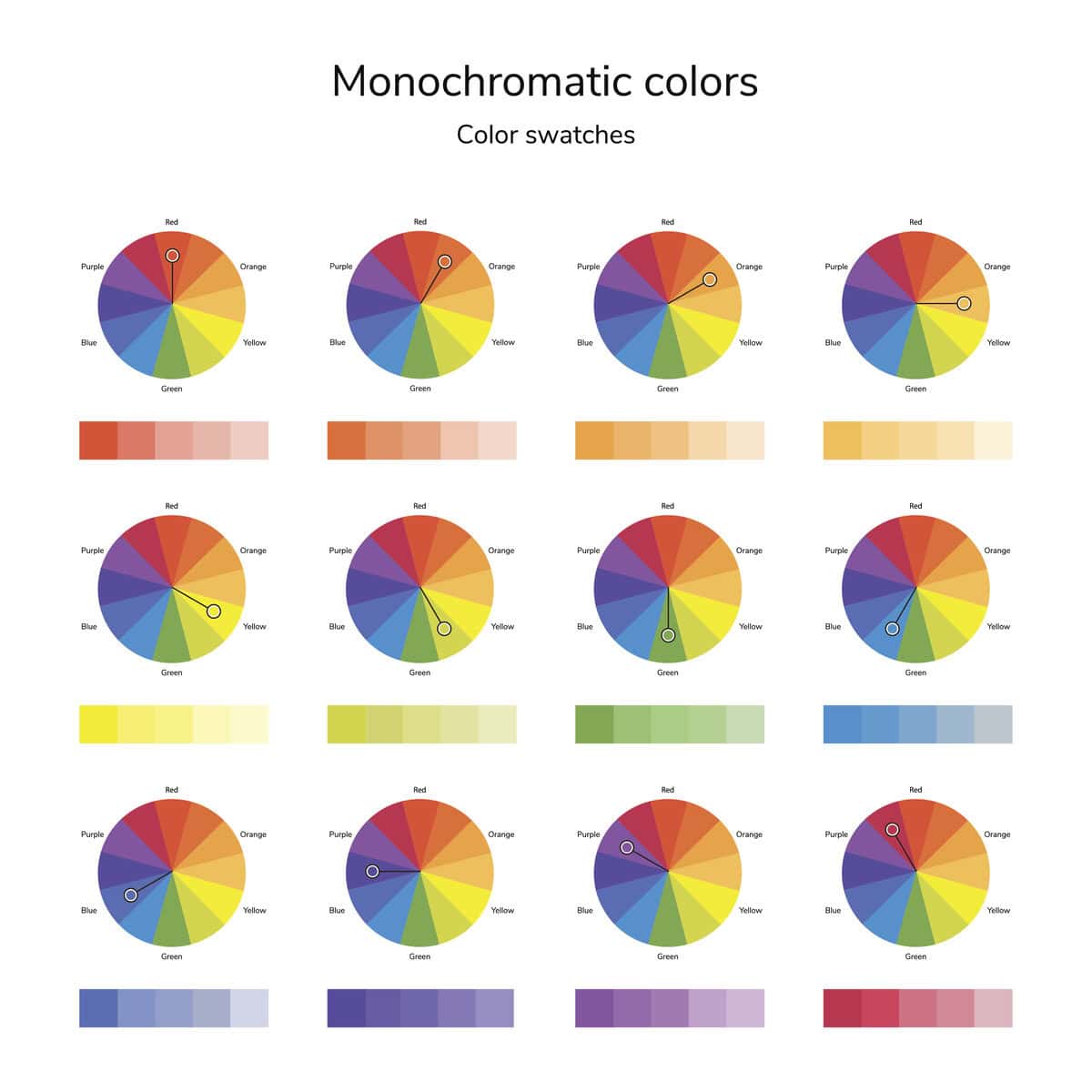
Monochromatic Color Scheme
A monochromatic color scheme uses variations in lightness and saturation of a single color. This scheme is simple and cohesive, often resulting in a soothing and unified look.
- How to Use: Start with a base color and use its tints (lighter versions) and shades (darker versions) to create depth and interest. This approach is great for minimalist designs or when you want to emphasize texture and form without the distraction of multiple colors.
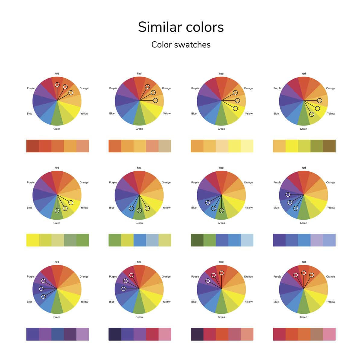
Analogous Color Scheme
An analogous color scheme uses colors that are next to each other on the color wheel. These colors usually match well and create serene and comfortable designs.
- How to Use: Choose one dominant color, a second to support, and a third as an accent. For example, you could use blue, blue-green, and green. This scheme works well in nature-inspired designs and is easy on the eyes.
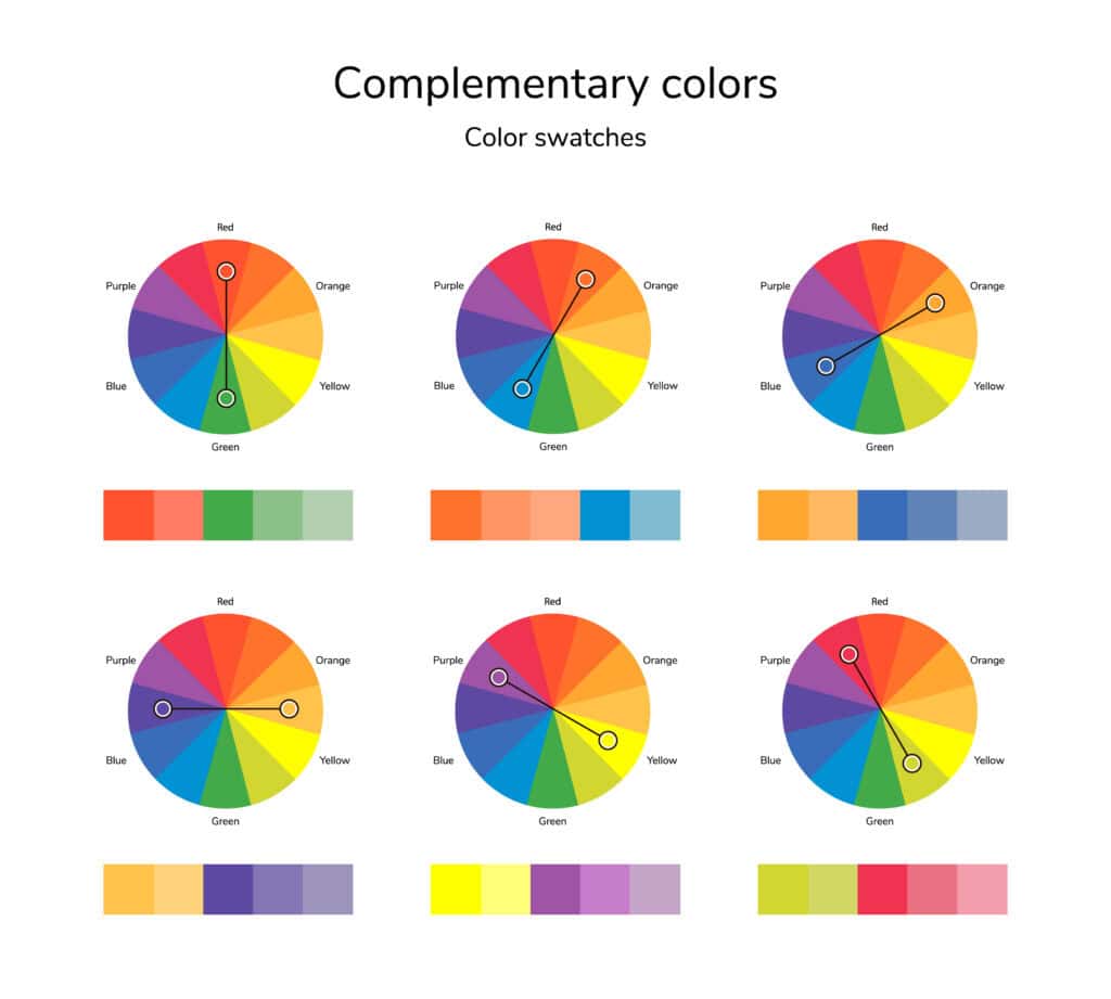
Complementary Color Scheme
A complementary color scheme uses colors that are opposite each other on the color wheel. This scheme offers high contrast and high impact.
- How to Use: Use one color as the dominant color and the other as an accent. For example, pair blue with orange or red with green. This approach is great for making elements stand out and creating dynamic, energetic designs.
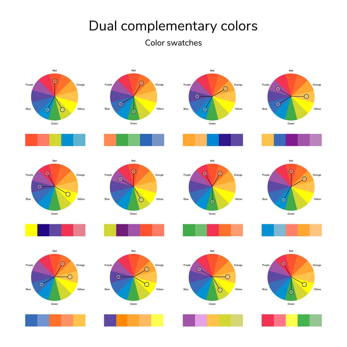
Split-Complementary Color Scheme
A split-complementary (or dual) color scheme involves one base color and the two colors adjacent to its complementary color. This provides high contrast with less tension than a straight complementary scheme.
- How to Use: Choose a base color and find its complementary color, then use the two colors on either side of the complementary color. For example, if your base color is blue, you would use red-orange and yellow-orange as the accents. This scheme is versatile and offers visual interest without being too overwhelming.
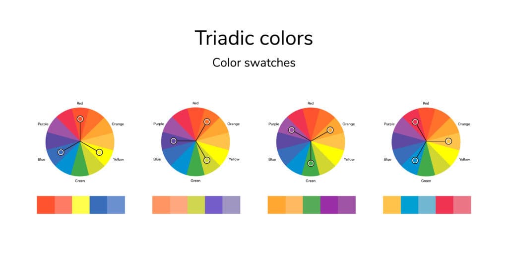
Triadic Color Scheme
A triadic color scheme uses three colors that are evenly spaced around the color wheel. This scheme is vibrant and offers strong visual contrast while maintaining harmony.
- How to Use: Choose three colors that form an equilateral triangle on the color wheel, such as red, yellow, and blue. Use one color as the dominant color and the other two as accents. This approach is perfect for playful and colorful designs.
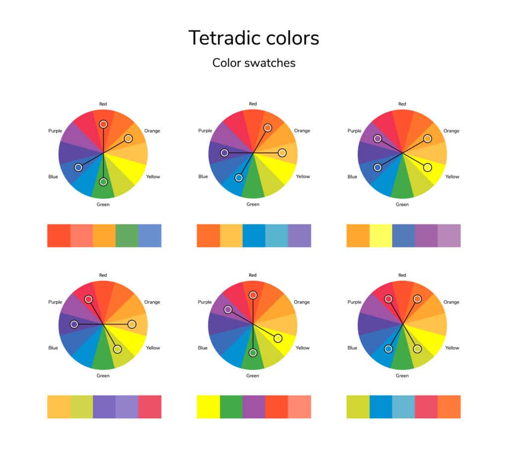
Tetradic (Double Complementary) Color Scheme
A tetradic color scheme uses four colors together, consisting of two complementary color pairs. This scheme is rich and offers plenty of possibilities for creating diverse color palettes.
- How to Use: Choose two complementary color pairs, such as red and green with blue and orange. One color should dominate, and the others should be used as accents. This scheme provides a lot of variety and works well when you want a colorful and balanced design.
Tips for Creating Visually Appealing Color Schemes
- Balance: Ensure that one color dominates while the others support. This prevents the design from becoming overwhelming.
- Contrast: Use contrasting colors to draw attention and create visual interest.
- Context: Consider the context in which your color scheme will be used. Different colors evoke different emotions and responses.
- Experiment: Don’t be afraid to experiment with different color combinations. Use tools like color scheme generators to explore new possibilities.
- Test: Always test your color scheme in the actual environment it will be used to ensure it looks good in real-world conditions.
Final Thoughts
Understanding color harmonies is a powerful tool in any designer’s toolkit. By using the color wheel and experimenting with different harmonious combinations, you can create designs that are visually appealing and effective. Whether you’re working on graphic design, interior design, or any other creative project, mastering color harmonies will help you achieve a cohesive and balanced look.
Stay tuned for more insightful articles from Indigo & Honeycomb COLOR LAB. Next, we’ll share some insider tips on how to choose the perfect color palettes for your projects.
Happy designing!