How to Select a Dominant Color that Sets the Tone
Welcome back to Indigo & Honeycomb COLOR LAB! Today, we’re focusing on a crucial aspect of any design project: choosing a base color. The base color, or dominant color, sets the tone for your entire design and influences the mood, perception, and overall aesthetics of your project. Let’s explore how to select the perfect base color and make it work harmoniously with other colors in your palette.
What is a Base Color?
A base color is the dominant color in a design that sets the tone and mood for the entire project. It is the most prominent color and serves as the foundation upon which other colors are built. The right base color can enhance the visual appeal of your design and convey the desired message or emotion effectively.
Steps to Choosing a Base Color
- Define the Purpose and Audience
- Consider the Psychology of Color
- Analyze the Existing Elements
- Use the Color Wheel
- Test in Context
Let’s dive into each of these steps.
Step 1: Define the Purpose and Audience
Before selecting a base color, it’s essential to understand the purpose of your design and who your target audience is. Ask yourself the following questions:
- What is the purpose of this design? (e.g., branding, marketing, interior design)
- Who is the target audience? (e.g., age, gender, cultural background)
- What emotions or reactions do you want to evoke? (e.g., excitement, calm, trust)
The answers to these questions will guide your color selection process and ensure that the base color aligns with your design goals and audience preferences.

Step 2: Consider the Psychology of Color
As discussed in our previous article on the psychology of color, different colors evoke different emotions and responses. Here’s a quick recap of some common colors and their associated emotions:
- Red: Passion, energy, excitement
- Blue: Calm, trust, stability
- Yellow: Happiness, optimism, warmth
- Green: Balance, harmony, growth
- Purple: Creativity, luxury, wisdom
- Orange: Enthusiasm, warmth, action
Choose a base color that aligns with the emotions you want to evoke in your audience. For example, if you want to create a calming environment, blue or green might be a good choice. If you’re looking to energize and excite, consider red or orange.
Step 3: Analyze the Existing Elements
Take into account any existing elements that will be part of your design, such as logos, images, or architectural features. Ensure that the base color complements these elements and creates a cohesive look.
- Logos: If you’re working on branding, your base color should complement or match the existing logo colors.
- Images: Consider the dominant colors in any images you plan to use and choose a base color that enhances them.
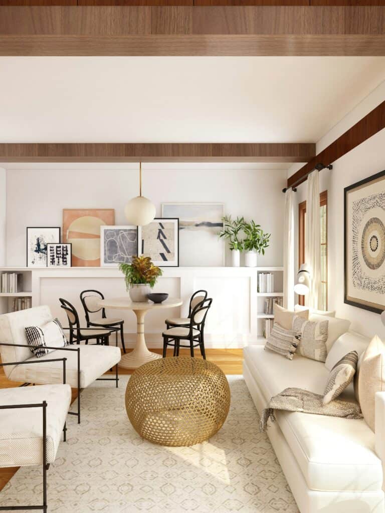
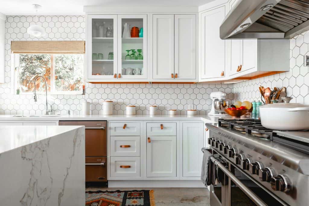
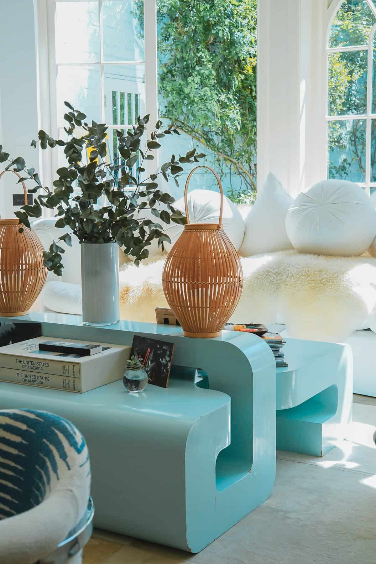
- Architectural Features: For interior design, consider the colors of existing furniture, fixtures, and architectural details.
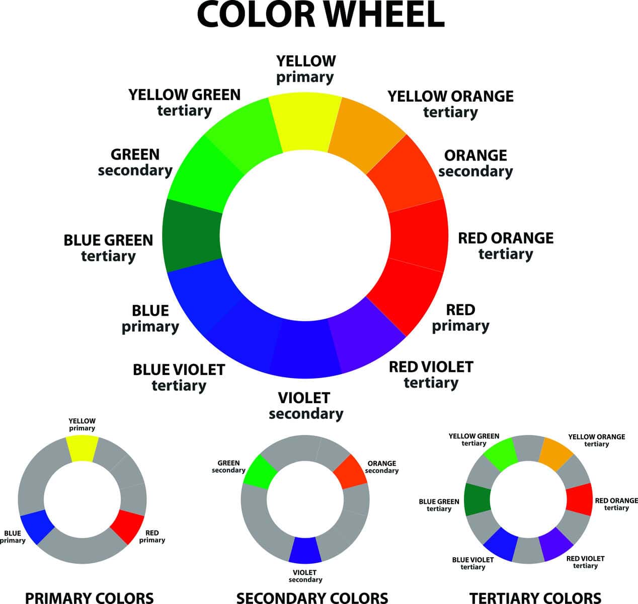
Step 4: Use the Color Wheel
The color wheel is an invaluable tool for selecting a base color and creating a harmonious color palette. Here are a few ways to use the color wheel in your selection process:
- Analogous Colors: Choose a base color and use the colors adjacent to it for a harmonious and cohesive look.
- Complementary Colors: Select a base color and use its complementary color for contrast and visual interest.
- Triadic Colors: Choose a base color and use two other colors that are evenly spaced around the color wheel for a vibrant and balanced palette.
Step 5: Test in Context
Once you’ve selected a potential base color, test it in the context of your design. This involves:
- Mockups: Create mockups of your design to see how the base color looks in various elements and layouts.
- Lighting: Consider how different lighting conditions affect the appearance of the base color. Natural and artificial lighting can significantly change how a color looks.
- Feedback: Gather feedback from others, especially those within your target audience, to ensure the base color resonates well and achieves the desired effect.
Tips for Using Your Base Color Effectively
- Balance: Ensure that your base color doesn’t overwhelm the design. Balance it with neutral colors or lighter shades to create a pleasing composition.
- Accents: Use complementary or contrasting colors as accents to highlight important elements and create visual interest.
- Consistency: Maintain color consistency across all elements of your design to create a cohesive and professional look.
- Adaptability: Ensure that your base color works well across different mediums, such as digital screens, print materials, and physical spaces.
Final Thoughts
Choosing the right base color is a critical step in any design project. By understanding the purpose and audience, considering the psychology of color, analyzing existing elements, using the color wheel, and testing in context, you can select a base color that sets the perfect tone for your design.
Stay tuned for more insightful articles from Indigo & Honeycomb COLOR LAB as we continue to explore the fascinating world of color. Next, we’ll provide practical tips on how to create balanced and harmonious color palettes for your projects.
Happy designing!