In a world where chaos often reigns supreme, there’s something undeniably comforting about the gentle embrace of color. February’s color of the month, Whisper Gently, embodies this sentiment with its subtle yet profound message of kindness, tenderness, and togetherness. Inspired by the recently announced 2024 Pantone Color of the Year, Whisper Gently is a gentle whisper of warm pastel peachy pink, calling us to connection and serenity amidst the chaos of the world.
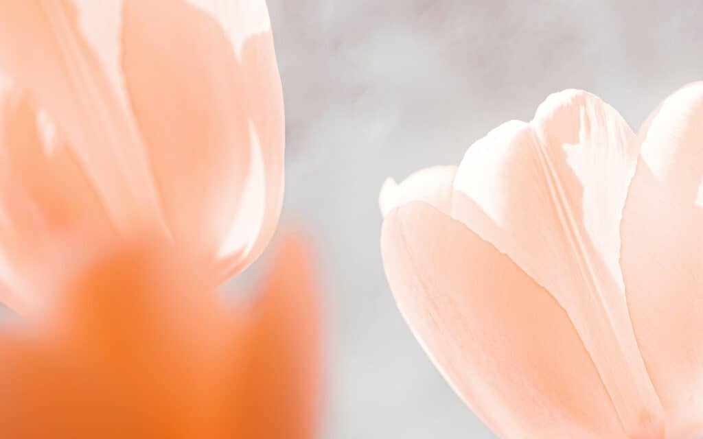
Imagine a hue that softly nestles between the delicate shades of pink and orange, evoking a sense of warmth and familiarity. This is Whisper Gently—a color that speaks to our innate desire for connection, community, and collaboration. It whispers of shared moments and quiet sanctuary, inviting us to pause, reflect, and find solace in the beauty of simplicity.
Whisper Gently: A Comforting Warmth
At its core, Whisper Gently is more than just a color. It’s an idea, a feeling, a state of being. It awakens our senses to the comforting presence of tactility and cocooned warmth. It envelopes us in a gentle embrace that soothes the soul. In a fast-paced world driven by technology and digitalization, Whisper Gently reminds us of the importance of reconnecting with the tangible and the tactile, of finding beauty in the analog amidst the digital noise.

A Nostalgic Color of the Month
There’s a timeless elegance to Whisper Gently—a poetic and romantic quality that transcends trends and fads. With its clean, vintage vibe, it reflects the nostalgia of days gone by while infusing a contemporary ambiance that feels fresh and modern. It’s a color that speaks to the past yet embraces the future—a delicate balance of tradition and innovation.

Wellbeing and Serenity
But perhaps what makes Whisper Gently truly special is its ability to impact our well-being on a deeper level. In its gentle lightness, we find a sense of calm and serenity that nurtures the mind, body, and soul. It’s a color that encourages us to slow down, to breathe, to be present in the moment—to find peace from within and flourish in its embrace.
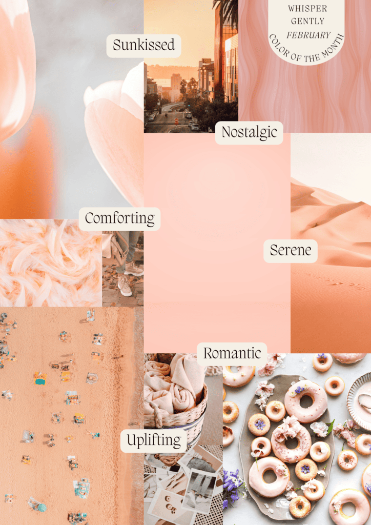
Embracing the Charm of Peachy Pink Colors
In the world of design and aesthetics, certain colors possess a timeless charm that effortlessly captivates the senses and evokes a myriad of emotions. Among these, the delightful spectrum of peachy pink colors stands out as a perennial favorite, offering a delicate balance of warmth, vibrancy, and sophistication. From soft pastels to bold hues, peachy pinks have long been celebrated for their versatility and ability to infuse spaces with a sense of serenity and elegance.
Peach and Pink
At the heart of peachy pink lies a delicate fusion of two beloved hues: peach and pink. Peach, with its warm undertones reminiscent of sun-kissed apricots and ripe summer fruits, exudes a sense of vitality and cheerfulness. Pink, on the other hand, embodies notions of romance, femininity, and tenderness, creating an atmosphere of softness and intimacy. Together, these hues form a harmonious blend that appeals to the senses and uplifts the spirit.
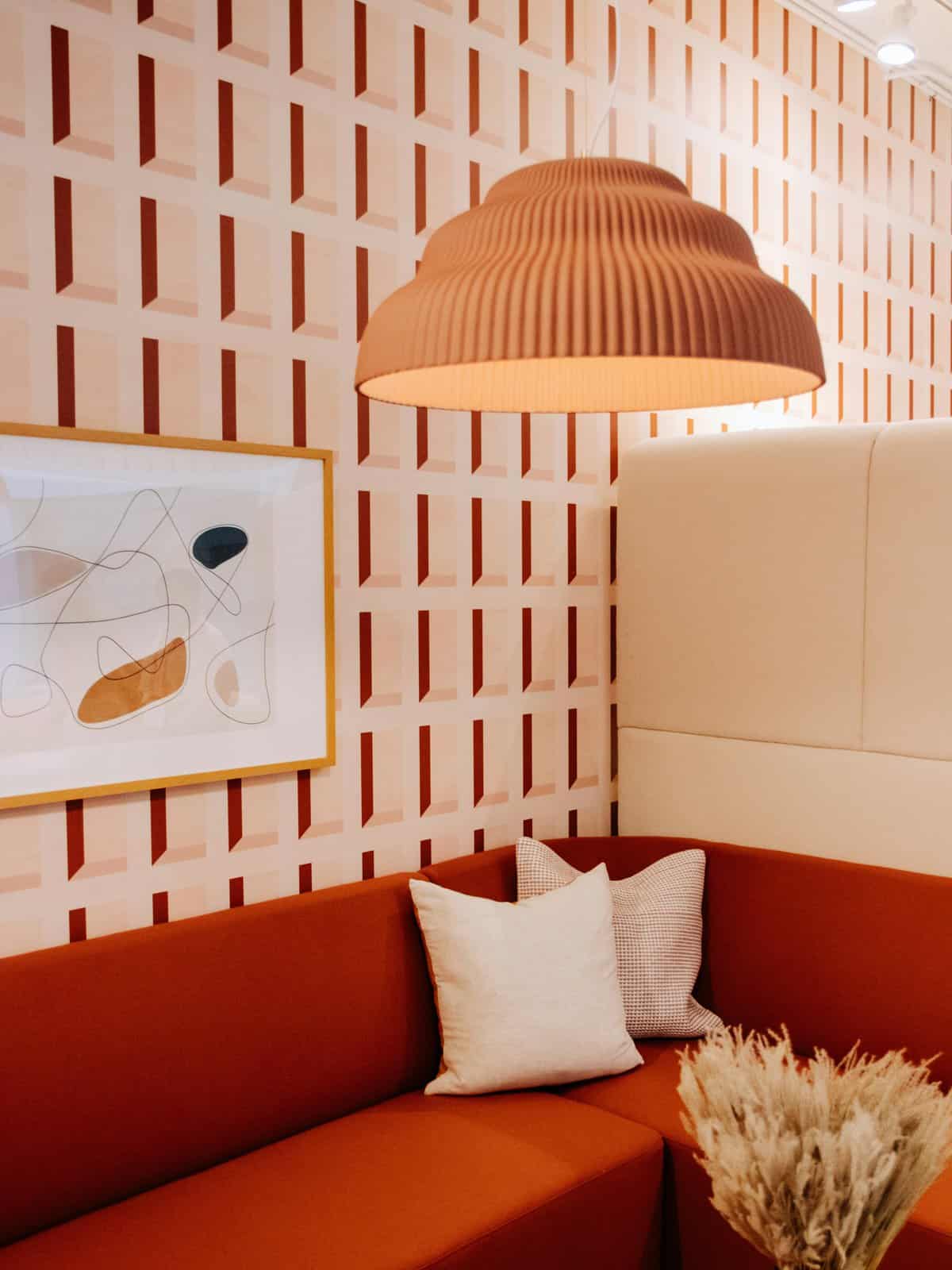
One of the most enchanting qualities of peachy pink colors is their ability to adapt to a wide range of design styles and aesthetics. So whether used as the primary palette for a room or as an accent color to add a pop of warmth, peachy pinks seamlessly complement various decor schemes, from minimalist modern to classic vintage. In interiors, they can create a sense of tranquility and comfort, transforming spaces into inviting sanctuaries where one can unwind and relax.
Incorporating Whisper Gently
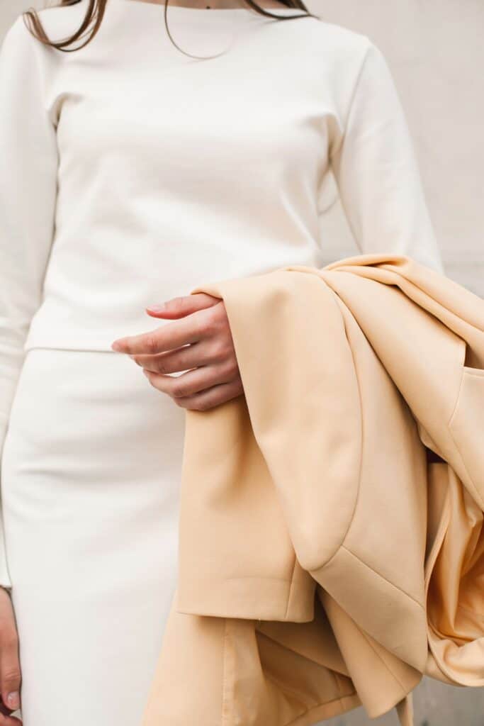
In fashion and beauty, peachy pink colors have also found a special place, offering a fresh and youthful alternative to traditional neutrals. From soft blush tones to vibrant coral shades, they add a touch of whimsy and playfulness to any look. So whether incorporated into a chic summer ensemble or a glamorous evening gown, peachy pinks exude an air of elegance and sophistication Undeniably, these are hues that transcend seasonal trends.
Moreover, peachy pink colors hold a special significance in the realm of psychology and wellness. As members of the warm color family, they are believed to have a calming effect on the mind and body. In short, they promote feelings of comfort, joy, and positivity. In fact, in color therapy, peachy pinks are often associated with emotional healing and self-love. Essentially, these hues encourage individuals to embrace their innate beauty and cultivate a sense of inner peace.
Conclusion
As we navigate the complexities of modern life, let us not forget the power of color to uplift, inspire, and unite us. Therefore, let us embrace the whisper of Whisper Gently. Allow its subtle warmth to guide us towards a more compassionate, connected world. For in its delicate hue lies the promise of a brighter, more harmonious future. A future where kindness and tenderness reign supreme, and togetherness is celebrated above all else. Lastly, are you looking for more color inspiration? Read on to catch up on January’s color of the month.

