Spring 2025 has arrived with a burst of playful nostalgia, and there’s one motif taking center stage in both fashion and interiors: strawberries. From embroidered dresses and whimsical wallpaper to ceramic kitchenware and berry-toned upholstery, this cheerful fruit has become a symbol of the season. At the heart of the trend is Strawberry Patch, a juicy red hue that perfectly captures spring’s sweetness and energy.
🍓 Why Strawberry Patch?
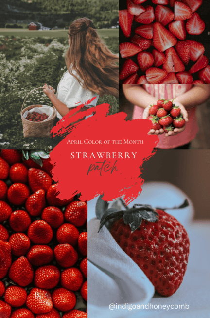
There’s something undeniably charming about a ripe, red strawberry in springtime. It’s one of the first fruits to arrive after a long winter—bright, juicy, and full of promise. Strawberry Patch (#E32E34) takes that exact sentiment and transforms it into a color: ripe with energy, full of warmth, and bursting with the optimism of a new season.
This hue feels perfectly at home in April. It reflects the seasonal shift toward longer days, brighter skies, and blooming gardens. It’s the color of sun-warmed berries, vintage roadside fruit stands, and gingham picnic blankets laid out in a field of wildflowers. In a season where we lean into whimsy and nature, Strawberry Patch is a natural fit.
Beyond its visual appeal, Strawberry Patch is part of a larger cultural trend. Spring 2025 has ushered in a resurgence of playful, feel-good motifs in both fashion and home décor. Strawberries in particular are popping up everywhere: dainty prints on sundresses, hand-painted ceramics, embroidered napkins, and retro-inspired wallpapers. They tap into our collective craving for nostalgia, comfort, and joy—and Strawberry Patch is the color that brings it all together.
This isn’t just red—it’s a storytelling red. It’s approachable, slightly romantic, and undeniably fresh. Compared to deeper, moodier reds of winter, Strawberry Patch feels lighthearted and invigorating, making it an ideal pop for spring collections.
Retailers like Anthropologie, Sézane, and Urban Outfitters are showcasing this tone in curated product drops, suggesting its rise in both high street and boutique spaces. Whether it’s a ruffled blouse, a throw pillow, or a glossy tiled backsplash, Strawberry Patch adds a sweet, confident touch without overpowering the scene.
This shade fits beautifully within the broader dopamine dressing and decorating trend, where bold, joyful colors are embraced as emotional pick-me-ups. It’s the kind of hue that can make you smile when you walk into a room—or pull you in when you scroll past it on your feed.
In short? Strawberry Patch is spring distilled into a single shade: bright, bold, ripe with possibility.
❤️ The Power of Red in 2025
Red is trending, and for good reason. This year’s color forecasts point to the rise of bold, expressive hues that spark emotion. Red represents energy, warmth, courage, and passion—all feelings we’re embracing in a post-muted minimalist world. In fashion, red has dominated recent runways in both tonal looks and vibrant accents.
It’s showing up everywhere—from strawberry motifs in spring fashion to unexpected red accents in minimalist spaces. Designers and stylists alike are leaning into red’s ability to add drama, depth, or even a touch of playfulness, depending on the shade and setting.
And this season, we’re seeing Strawberry Patch pop up in some especially swoon-worthy ways…
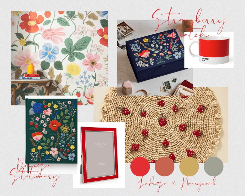
🍓 Strawberry Patch Product Picks
Add a splash of juicy red to your world with these curated finds:
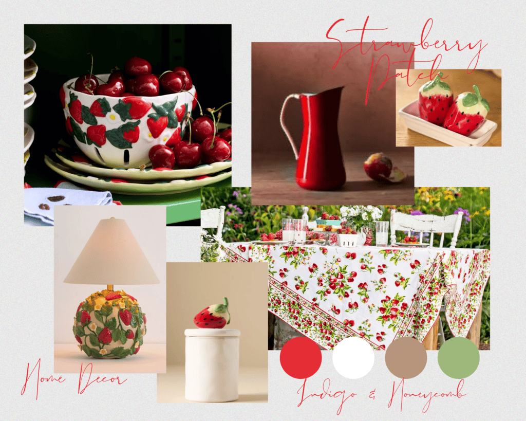
🏡 Home Décor
- Strawberry Stoneware Colandar– Anthropologie
🍓 Playful and fresh for springtime kitchens. - Red Enamel Pitcher – Food52
🍒 The perfect farmhouse touch in a bold, functional red. - Strawberry Basket Tablecloth – April Cornell
🍓 Pairs beautifully with blush florals and seasonal fruit displays.
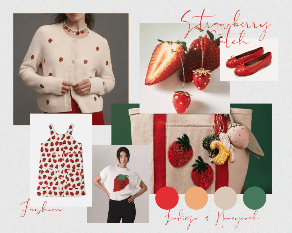
👗 Fashion & Accessories
- Strawberry-Print Sleeveless Dress – Stella McCartney
🍓 Cottagecore meets spring romance. - Red Ballet Flats – Margaux
💃 A nostalgic nod with a modern silhouette. - Strawberry Drop Earrings – Anthropologie
🍓 Whimsical, colorful, and instantly mood-boosting.
🖌️ Design & Stationery
- Strawberry Fields Embroidered Sketchbook – Rifle Paper Co.
🍓 A fan favorite in fresh spring red. - Red Lacquered Frame – Addison Ross
🔴 Add a pop to gallery walls or side tables. - Pantone Wide Tea Cup in 2035 (close match to Strawberry Patch) – MoMA Design Store
☕ A designer-approved hit of color for your coffee break.
🕰️ A Quick History of Red
Red is one of the oldest pigments used by humans, with roots in prehistoric cave art, Roman ceremonial robes, and centuries of cultural significance. It has symbolized everything from love and power to revolution and celebration. In design, red has always been a bold choice—it commands attention, creates contrast, and infuses energy into a space. Strawberry Patch is a modern take on this legacy: bright, clean, and irresistibly sweet.
🛋️ 5 Design Styles That Love Red
While red can sometimes feel like a bold choice, it’s surprisingly versatile—especially when you find the right shade. Strawberry Patch strikes the perfect balance: vibrant yet soft, warm without being overpowering. Whether you’re drawn to rustic charm or modern flair, this berry-bright red can add just the right amount of energy and sweetness to your space.
Here are five design styles that embrace Strawberry Patch and use it to full effect:
Modern Farmhouse
Think cozy textures, natural wood tones, and charming vintage touches. Red has always had a place in farmhouse design—think of classic barn doors, checked tablecloths, and hand-painted signs.
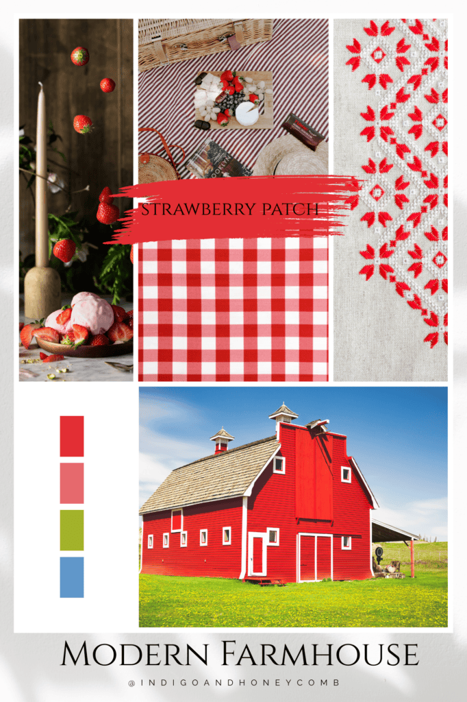
How to use it:
- A Strawberry Patch-painted front door or pantry cabinet
- Vintage-inspired red and white ticking stripe cushions
- Kitchenware with strawberry or floral prints
- Embroidered linen napkins for spring hosting
This style leans into the nostalgic warmth of red, making it feel timeless rather than trendy.
Bohemian
Boho design is all about eclectic layers, earthy materials, and artistic expression. Strawberry Patch adds a sense of vibrancy and warmth that plays beautifully with jewel tones, terracotta, ochre, and botanicals.
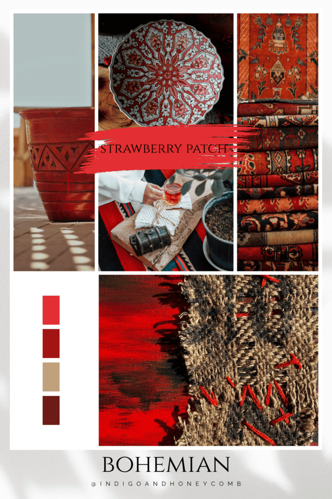
How to use it:
- A patterned area rug with pops of red
- Macramé wall art or pillows with strawberry-toned embroidery
- Global textiles that incorporate red with sunset hues
- Accent vases or pottery on open shelving
Here, red becomes expressive and grounded—a joyful accent amid a rich, collected space.
Midcentury Modern
Clean lines, wood furniture, and bold, intentional use of color are hallmarks of midcentury design. Red was a favorite in the 1950s and ’60s, often used in geometric prints and sleek statement pieces.
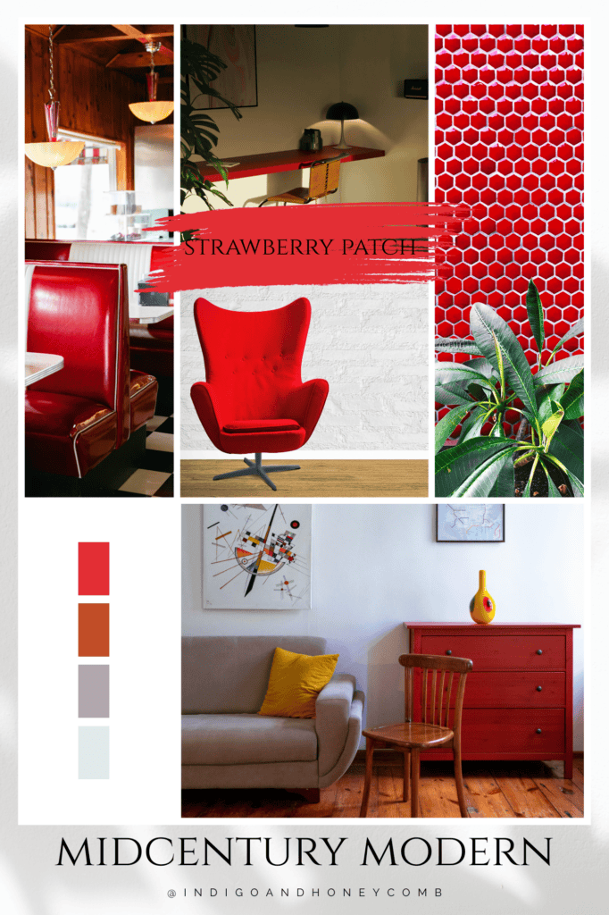
How to use it:
- A red Eames-style accent chair or ottoman
- Strawberry Patch throw pillows on a walnut-tone sofa
- Wall art with retro shapes in coral, teal, and red
- A kitchen backsplash with glossy red tiles
In this style, red isn’t afraid to shine—it becomes a focal point with purpose.
Eclectic Maximalism
If you believe more is more, this one’s for you. Bold colors, mixed prints, and unexpected combinations are key. Strawberry Patch is the perfect high-energy tone to mix in with your already expressive space.
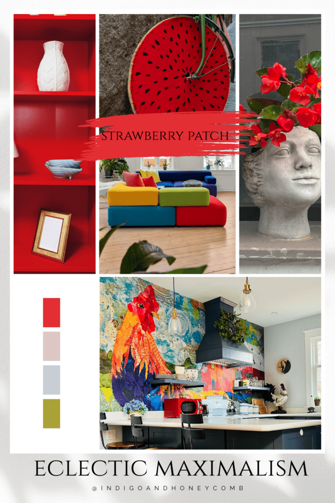
How to use it:
- A gallery wall that includes strawberry-themed art or typography
- Mixed-print bedding with red as a grounding hue
- Color-blocked walls with clashing but complementary shades
- Vintage finds (like a painted side table or ceramic lamp) in punchy red
Red is your best friend here—it keeps things fun, fiery, and full of personality.
Cottagecore
Soft florals, lace details, and pastoral charm define this romantic style. Red here leans more delicate—evoking baskets of berries, wildflower fields, and heirloom quilts.
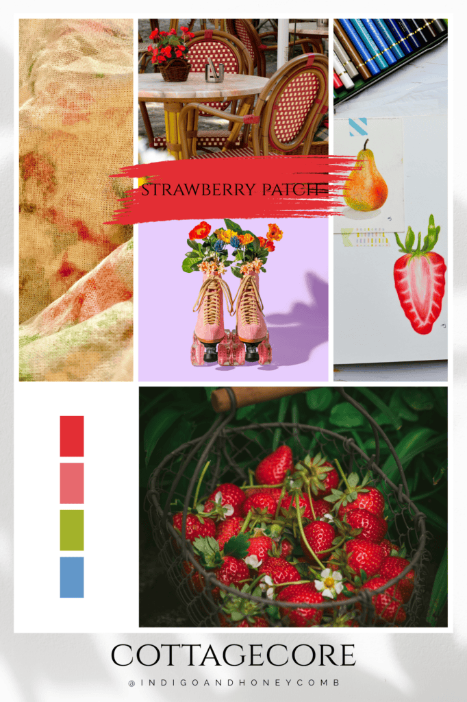
How to use it:
- Strawberry-printed wallpaper or curtains
- A red-painted garden bench or bistro table
- Patchwork quilts or table runners with berry tones
- Vintage kitchenware like enamel teapots or mixing bowls
Strawberry Patch brings a storybook sweetness that feels right at home in a whimsical, nature-inspired space.
🎨 5 Color Palettes Featuring Strawberry Patch
Strawberry Patch is more than just a pretty red—it’s a mood, a memory, a pop of personality. Depending on how you style it, it can lean fresh and flirty, rich and rustic, or clean and contemporary. Here are five curated palettes that show off its full versatility.
🍓 Berry Brunch
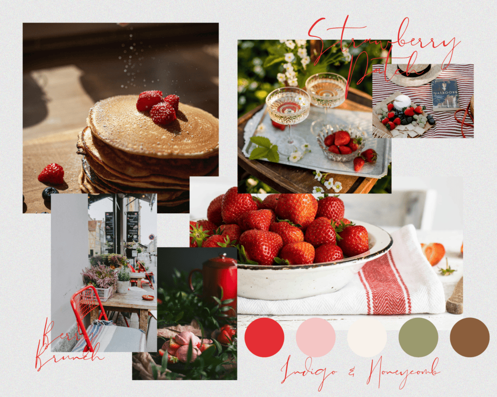
Strawberry Patch (#E32E34), Blush Pink (#F4C6C5), Cream (#F8F2EB), Olive Leaf (#9B9A6E), Warm Walnut (#8B5E3C)
Inspired by: a Sunday morning table set with vintage china, fresh pastries, and bowls of sun-warmed strawberries.
Use it for: farmhouse kitchens, spring tablescapes, floral branding, cozy living rooms with a vintage touch.
🌿 Rustic Garden
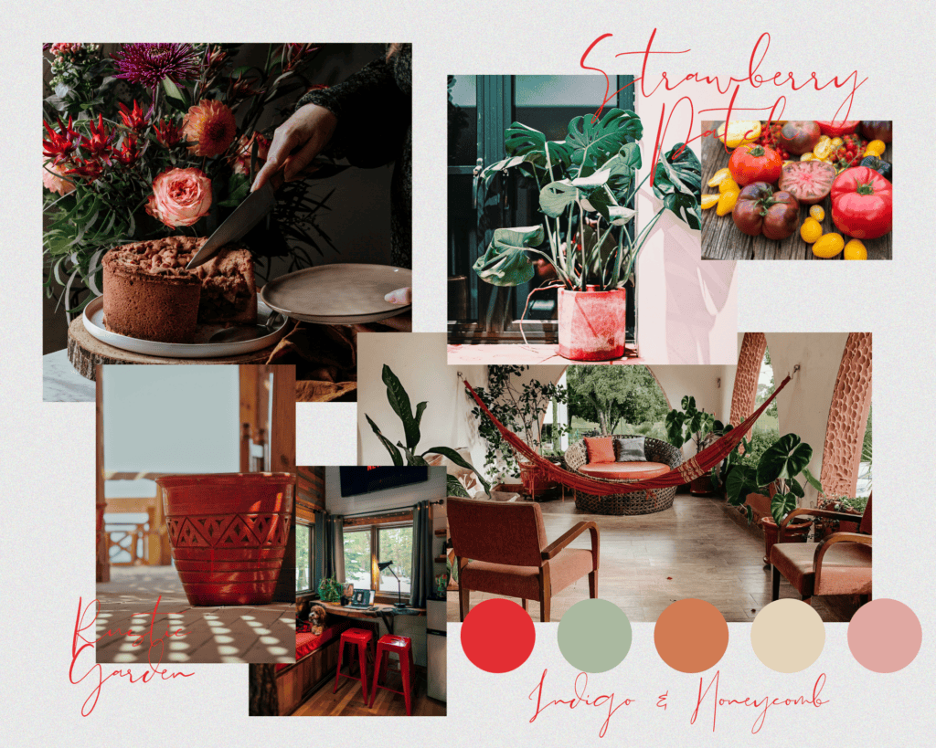
Strawberry Patch (#E32E34), Sage Green (#AAB9A0), Terracotta (#D17B52), Wheat Beige (#E4D4BA), Dusty Rose (#DFA8A2)
Inspired by: terracotta planters, handpicked blooms, weathered wood, and heirloom tomatoes at the garden gate.
Use it for: cottagecore bedrooms, garden party invitations, bohemian textiles, farmhouse bathrooms.
✨ Retro Pop
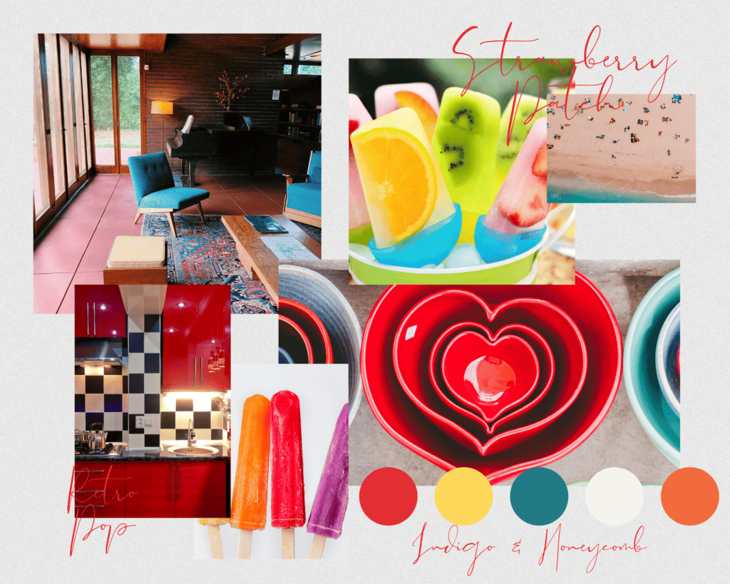
Strawberry Patch (#E32E34), Sunbeam Yellow (#FFD75E), Teal Blue (#247B84), Ivory (#F5F3ED), Burnt Orange (#F16B3C)
Inspired by: midcentury kitchens, vintage Pyrex, popsicle wrappers, and sunshine through mod curtains.
Use it for: statement walls, brand identities with bold personality, kitchen décor, colorful maximalist spaces.
🌸 Spring Romance
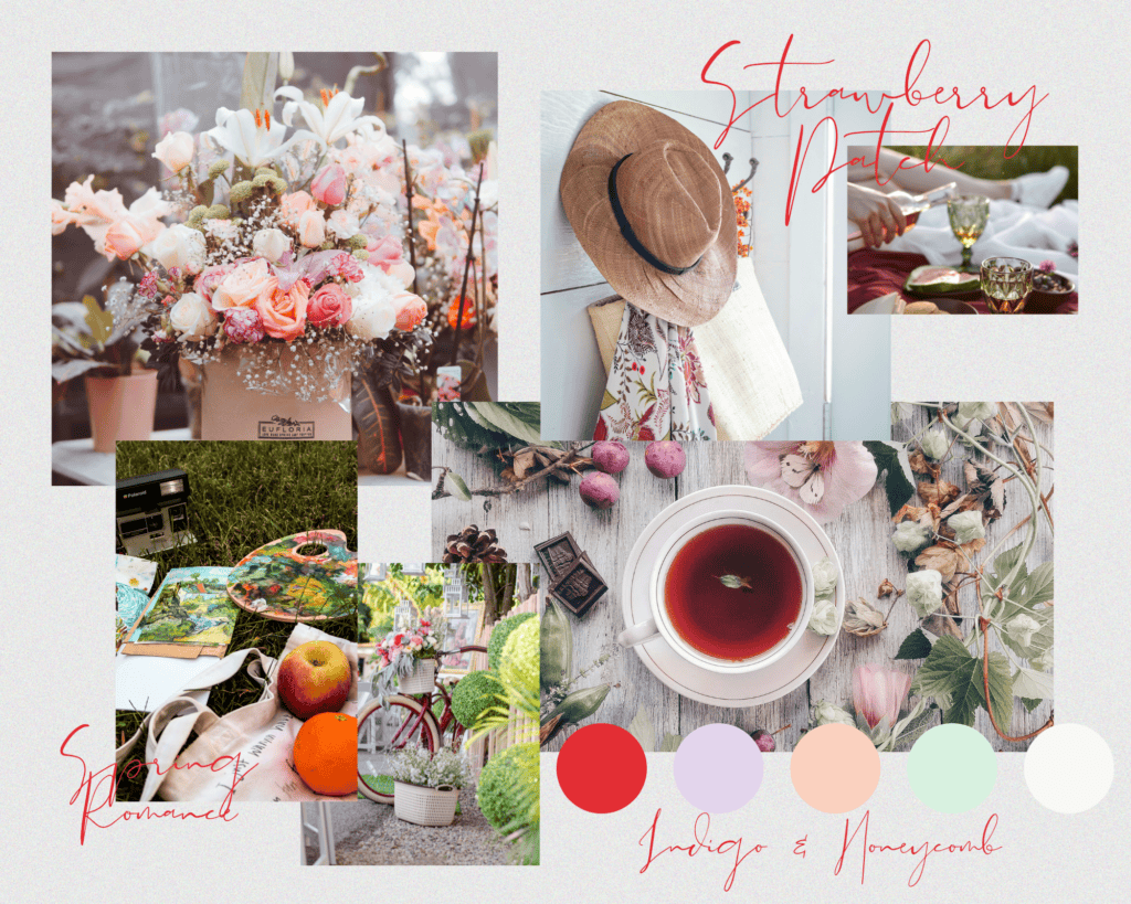
Strawberry Patch (#E32E34), Lilac Mist (#E3D5EC), Peach Fuzz (#FAD1BF), Pale Mint (#D8F1DF), Cloud White (#F9F8F6)
Inspired by: garden weddings, fresh florals, spring skincare packaging, and soft daydreams in pastel shades.
Use it for: feminine interiors, boutique branding, stationery design, romantic spring looks.
🧱 Urban Earth
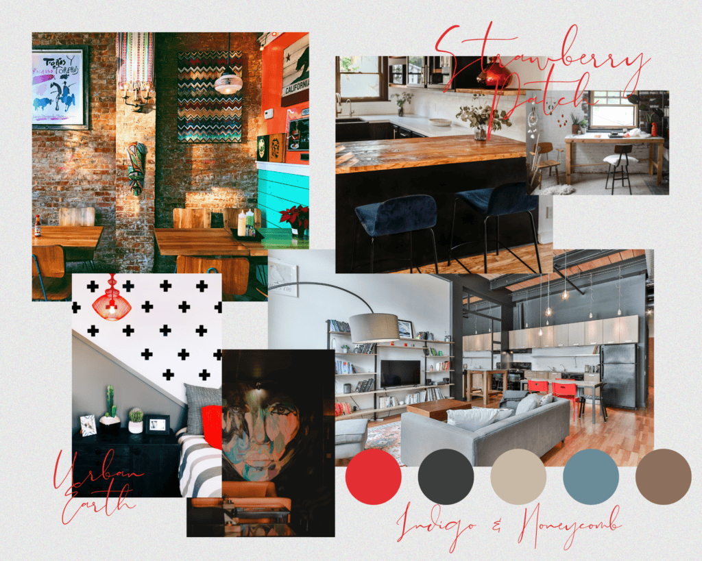
Strawberry Patch (#E32E34), Charcoal (#3D3D3D), Clay Beige (#C8B8A6), Steel Blue (#6A8C97), Dust Brown (#8D6F5D)
Inspired by: city rooftops at dusk, exposed brick walls, warm ceramics, and rich earth tones with an industrial edge.
Use it for: modern loft spaces, product packaging, home decor with an urban-meets-nature aesthetic.
Final Thoughts
Strawberry Patch is more than a color—it’s a mood. It’s childhood summers, farmers’ markets, gingham tablecloths, and the smell of fresh blooms in the air. Whether you’re layering it into your wardrobe or home this spring, this bold red is sure to sweeten the season.


Leave a Reply